// article
Where Energy Comes From
Where the world's energy actually comes from
The world ran on 176,737 TWh of primary energy in 2024, and 80.6% of it came from coal, oil, and gas. Solar and wind together supplied 6.4%. I went looking for the energy transition in the numbers and found something slower and heavier: a fossil system that now supplies 142,421 TWh a year, more than three times the entire world supply of 1965 (43,360 TWh), and still four out of every five units of energy people burn. The transition is real, but it is a thin layer on a pile that keeps getting taller.
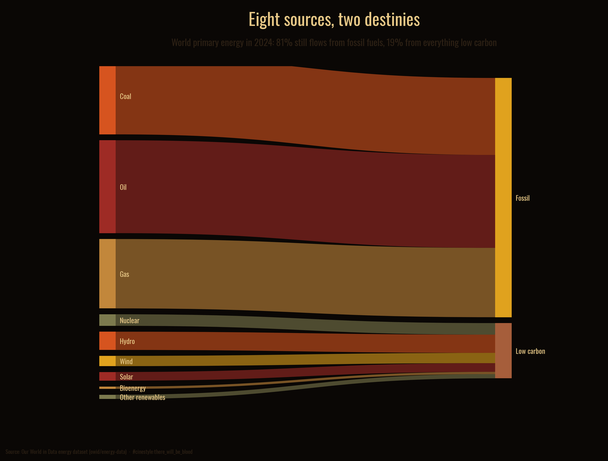
Every unit of energy starts as a source and ends in one of two destinations. The wide channels on the left are oil, coal, and gas, and they all drain into the same fossil reservoir. Everything low carbon, nuclear included, fits into the thin band at the bottom. The rest of this post takes that picture apart.
The data is the Our World in Data energy dataset, 23,377 rows covering every country from 1900 to 2025. I work from the “World” aggregate for the global mix and from the 12 largest energy consumers for the country story. The complete source breakdown runs 1965 to 2024, so 2024 is the latest full year and every share below is computed against that year’s total.
The mix in one year
Oil is still the single largest source of energy on the planet at 31.3%. Coal is second at 25.9%, gas third at 23.4%. Add them and fossil fuels are 80.6% of the total, 142,421 TWh. The low-carbon column is 18.6%. The two do not quite reach 100% because OWID takes the total from a different agency than the source breakdown, so a sliver of the total is not assigned to any source.
Inside that low-carbon slice the order surprises people. Hydro is the largest single source at 6.1%, larger than nuclear at 3.9%, larger than wind at 3.5%, larger than solar at 2.9%. Bioenergy and the small “other renewables” bucket round out the rest. The two sources that dominate every transition headline, solar and wind, have only just passed dams together: 6.4% against hydro’s 6.1%.
So the honest one-line summary of the global energy system is this: it is an oil-coal-gas machine with a hydro footnote and a fast-growing solar-and-wind seedling. The seedling matters, but it is not yet the machine.
The pile keeps growing
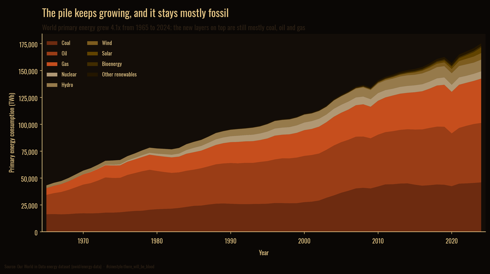
Here is the part the share numbers hide. World energy use did not hold steady while clean sources crept in. It grew 4.1 times over, from 43,360 TWh in 1965 to 176,737 in 2024. The fossil bands at the bottom of that chart are not shrinking. They are thicker now than the entire global energy supply was in 1965.
This is why a rising renewable share is compatible with rising fossil consumption. Picture a swimming pool you are filling with two hoses, a fat one running coal-oil-gas and a thin one running clean. You open the thin hose wider every year, and its share of the inflow climbs. The fat hose never closes, so the pool keeps rising on mostly old water. Clean energy has mostly been added to demand growth, not subtracted from fossil supply.
Sixty years to move the needle this far
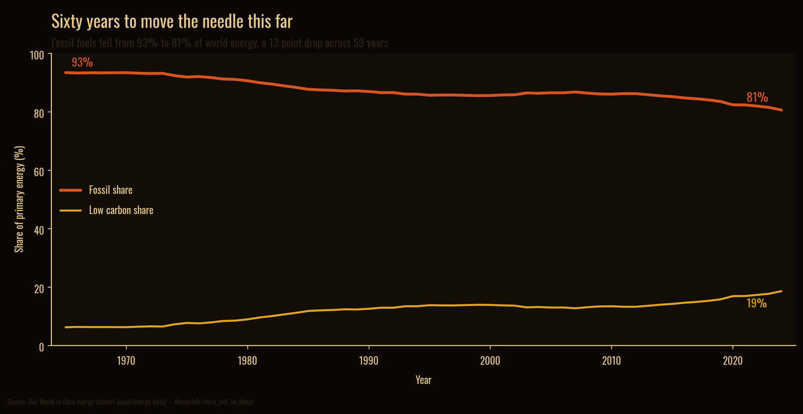
Track the fossil share across the whole record and the decline is unmistakable and small. In 1965 fossil fuels were 93.4% of world energy. In 2024 they were 80.6%. That is a 12.8-point drop spread across 59 years, roughly two tenths of a percentage point per year. At that pace the back half of the transition takes longer than a human career.
The decline came in two bursts with a long stall between them. The share fell from 93.4% in 1965 to 87.7% in 1985. Through the late 1980s, 1990s, and 2000s it barely moved, hovering in the mid-eighties, 85.6% in 1995 and 86.5% in 2005. The line only starts bending again in the last decade, when solar and wind went from 1.8% of world energy in 2015 to 6.4% in 2024. After a thirty-year stall, the needle is moving again.
Who is transitioning, and who is not
National averages hide enormous spread. I took the 12 largest energy consumers and measured the change in their low-carbon share between 2010 and 2024.
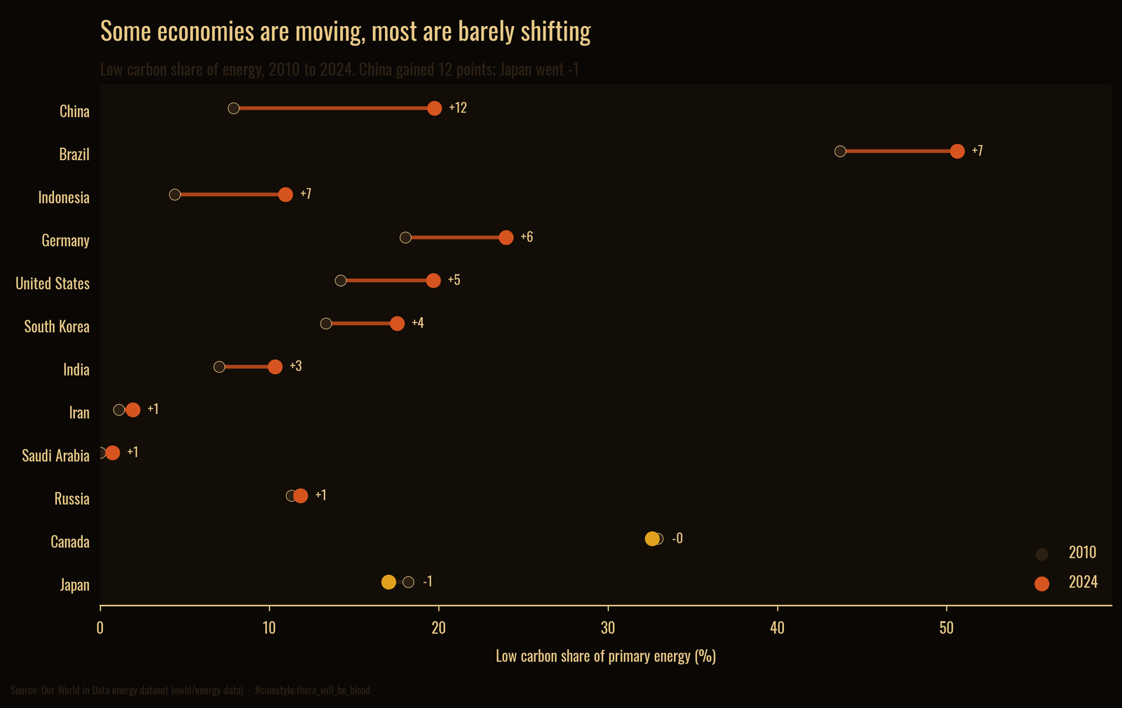
China moved the most, from 7.9% low carbon to 19.7%, a gain of 11.9 points. That is the largest absolute shift in the group, and it happened in the country that also burns the most coal, which is the contradiction at the center of global energy. Brazil sits highest in level at 50.6%, on the strength of hydro and biofuels, and still added 6.9 points. Germany, the United States, Indonesia, and India all moved meaningfully upward.
Then there are the countries that did not move. Saudi Arabia went from 0.0% low carbon to 0.7%. Iran went from 1.1% to 1.9%. Both remain effectively all fossil, which is what you expect from economies built on selling the stuff. Japan slipped 1.2 points, because it idled nuclear plants after Fukushima and refilled the gap with gas. Canada slipped 0.3. They are the only two fallers in the group. The spread runs from China’s 12-point sprint to Japan’s small reverse, and the average hides every bit of it.
How the accounting shapes these numbers
Primary energy has an accounting choice baked in. OWID’s codebook says the low-carbon columns (solar, wind, hydro, nuclear, and other renewables) use the substitution method: each unit of clean electricity is credited with the fuel a thermal plant would have burned to make it. A coal plant throws away roughly two thirds of its energy as waste heat, so that credit is large. The 18.6% low-carbon share is therefore already the generous count. Count clean electricity at its raw output instead and the fossil share would come out higher than 80.6%, not lower. The direction of every finding holds either way. The source breakdown comes from the Energy Institute’s Statistical Review, which covers commercially traded fuels, so wood and dung burned for cooking are not in these totals, and “bioenergy” here means liquid biofuels. I am also reading 2024 as a full year from a dataset that may revise it, and one aggregate cannot capture how uneven the picture is country to country, which is exactly why the dumbbell exists.
I started this expecting to measure how far the transition had come. The honest answer is that the world still runs four-fifths on fossil fuels, the pile of them is larger than ever, and the share has fallen twelve points in sixty years. The transition is not a story about clean energy replacing fossil energy yet. It is a story about clean energy starting to grow faster than a fossil system that has not stopped growing either. Which hose wins is still being decided, and right now the fat one is ahead.