// article
Anatomy of the VIX
The VIX spends most of its life bored, then loses its mind
The VIX is the market’s fear gauge, and most days it has nothing to fear. Over 9,206 trading days from January 1990 to June 2026, the median close sits at 17.61, and on roughly a third of those days the index reads below 15. Then, on rare occasions, it triples in a week and prints 80. The whole personality of the index lives in that gap between the boring middle and the violent tail.
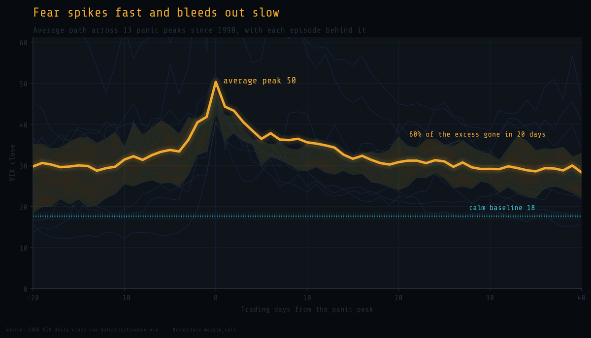
The thick line above is the average path of the VIX across every panic peak in the record, the thirteen times it closed above 40, lined up at their peaks. Fear arrives fast and leaves slow. The climb into a spike is steep, the fall out of it is a long bleed, and 60% of the excess over baseline is gone within twenty trading days. The faint lines behind it are the individual episodes, no two alike but all the same shape.
A short animation of that average path forming and decaying:
The data is the CBOE VIX daily history from the datasets/finance-vix project: one row per trading day, open, high, low, and close, from 1990-01-02 to 2026-06-12. I use the close throughout. No cleaning saga. It loads and it is right.
The distribution is the whole story
Plot every daily close as a histogram and the shape tells you almost everything you need to know.
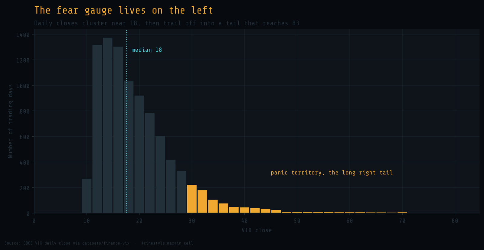
The mass piles up between 12 and 20. The mean is 19.45, but the median is 17.61, and that gap is the first clue. When the mean sits above the median, the data has a long right tail pulling the average up. The skew is 2.21, which is a polite way of saying the index is far more likely to surprise you upward than down.
There is a floor and there is no ceiling. The lowest close on record is 9.14, set on 2017-11-03. The highest is 82.69, on 2020-03-16. Calm has a hard bottom near 9 because realized volatility cannot go negative. Panic has no such limit. The 99th percentile is 46.72, which means one day in a hundred the index reads worse than 47, and the worst of those days are not crowded together near 47. They run all the way out to 83.
The fear gauge is not symmetric, and pretending it is will cost you.
Panic is rare, measured by the clock
The tail is dramatic, but it is also thin. Count the days.
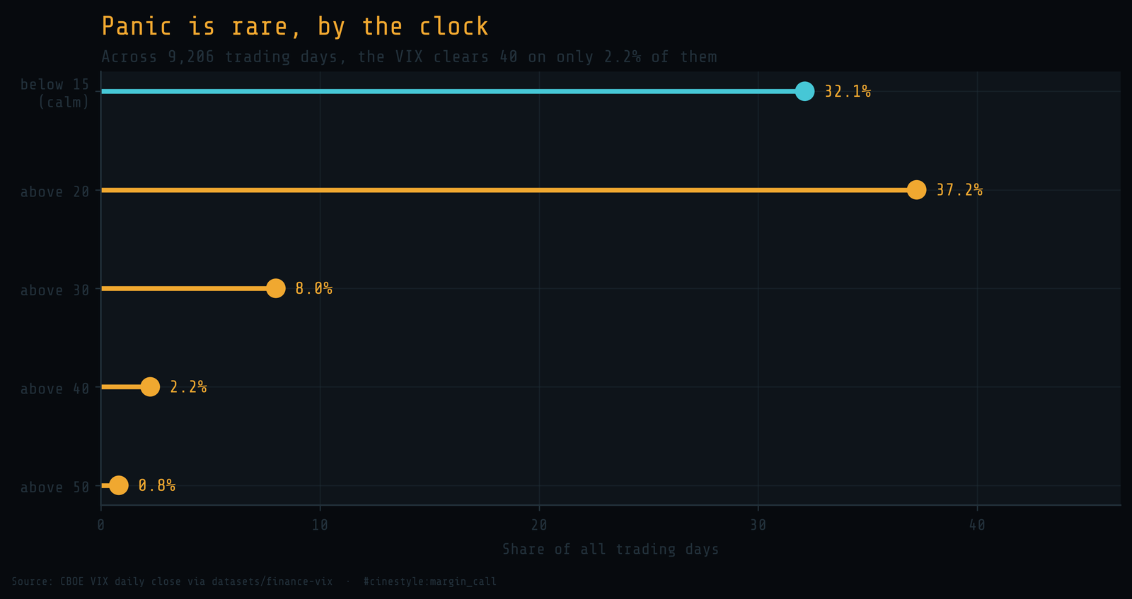
The VIX clears 30 on 8.0% of all trading days, clears 40 on 2.2%, and clears 50 on 0.8%. Eight days in a thousand. A reading above 50 is not a market state you should plan around. It is a once-every-few-years event, and most careers in finance see only a handful of them.
Calm is the default. The index reads below 15 on 32.1% of days and below 20 on the majority. The picture is a market that is quiet most of the time, mildly nervous a third of the time, and genuinely afraid almost never. The danger is not that panic is common. It is that panic is rare enough to feel impossible right up until it happens.
The great spikes, by size
Three events define the modern tail, and the full history shows where they sit.
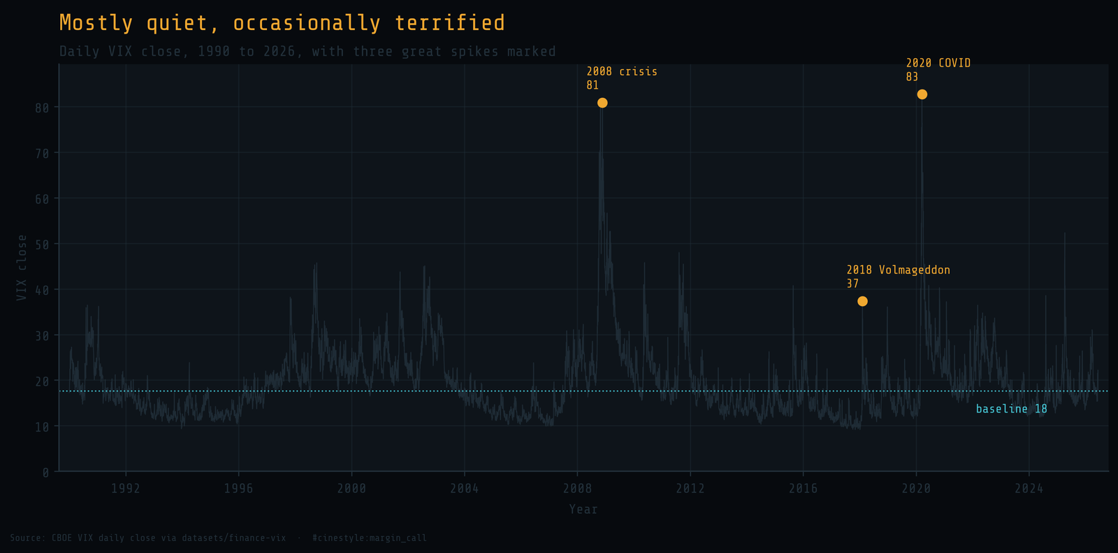
The 2008 financial crisis drove the close to 80.86. The 2020 COVID crash edged past it to 82.69, the highest daily close in the record. Those two are the giants, the only times the index has lived above 75.
February 2018 is the strange one. Volmageddon did not produce the highest level, it closed at 37.32, well below the 2008 and 2020 peaks. What it produced was the fastest move. On 2018-02-05 the VIX rose 20.01 points in a single day, from 17.31 to 37.32, a jump of 115.6%. That is the largest one-day percentage move in the entire history. The index more than doubled between one close and the next, and it did so because a crop of products that were short volatility unwound all at once. Size and speed are different axes. The 2018 spike was small in level and enormous in velocity.
The biggest number is not always the most violent event.
How fast does fear decay
A spike is only half the anatomy. The other half is the climb back down, and there are two honest ways to measure it.
The slow measure is mean reversion across the whole series. Fit the simplest possible model, today’s close as a linear function of yesterday’s, and you get an AR(1) coefficient of 0.9769. That implies a half-life of about 30 trading days: left to its own devices, a typical deviation from the long-run level decays halfway back in roughly six weeks. That is the gravity of the index, the slow daily pull toward its mean.
But the great spikes do not decay at that leisurely pace. Measure the local half-life instead, the trading days for the excess over the baseline to fall by half after each of the thirteen panic peaks, and the median is 8 trading days. Picture a struck bell. The first half of the ring dies away fast, the long faint tail of the tone lingers. The biggest spikes shed the bulk of their height in under two weeks, then spend a month or more drifting the rest of the way home.
This is why the composite path in the lead image looks the way it does. The peak averages 50, and twenty trading days later the average has fallen to 31, with 60% of the excess already gone. The remaining decay is slow because the AR(1) gravity is slow, but the violent part is over quickly. Fear is expensive to manufacture and cheap to abandon.
The caveat I owe you
This is one index, the CBOE VIX, and it measures one thing: the 30-day implied volatility of S&P 500 options. It is a forecast of fear priced into options, not realized fear, and the two can diverge. The thirteen panic peaks are a small sample, and the composite path averages episodes as different as a 2008 banking collapse and a 2018 product unwind. The shape is consistent across them, but thirteen is thirteen, and the next spike will have its own face. CBOE also revised its calculation methodology in 2003 and backfilled the earlier years, so the pre-2003 readings are reconstructions, not contemporaneous prints.
I started this expecting the spikes to be the story. They are the loud part, but the quiet part is the real finding: the VIX is a calm number that occasionally detonates, lives most of its life below 20, and pays for every panic with a long slow walk back to boredom. The tail is what you remember. The middle is where you live.