// article
How People Tip
Tip 18.6% on a small check, 13.3% on a big one
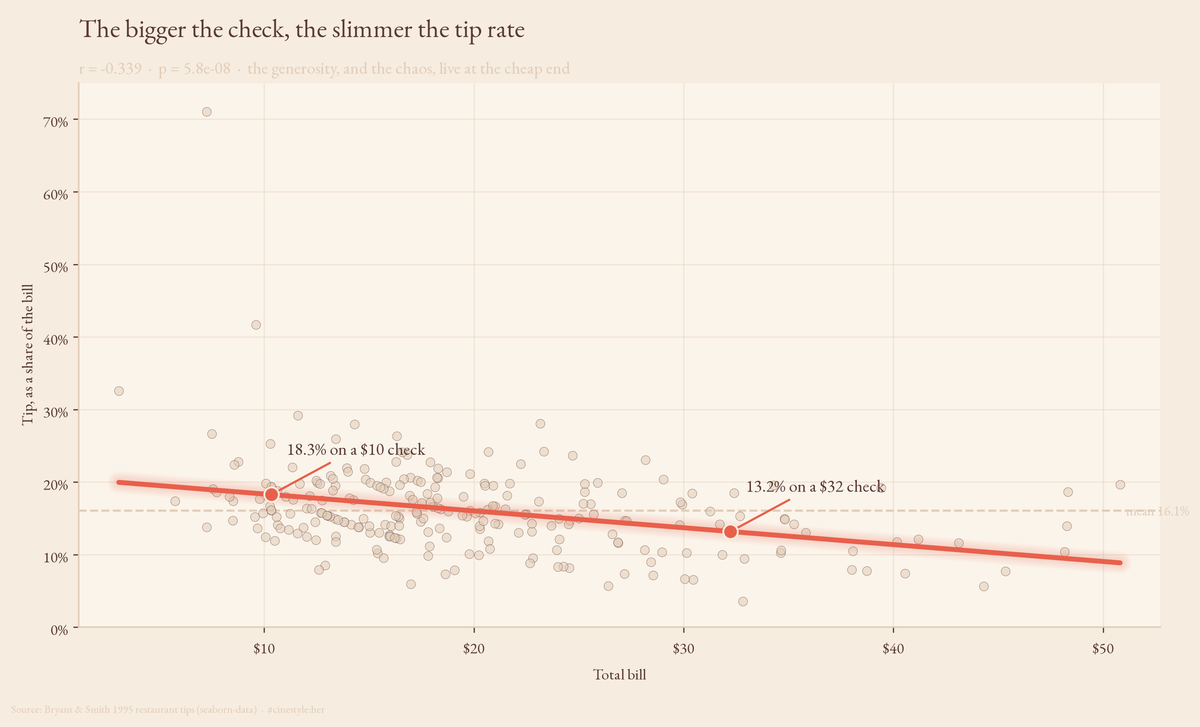
People tip a roughly fixed fraction of the bill, until you sort the checks by size. Then the rate slides: 18.6% on the cheapest quartile, 13.3% on the priciest. That 5.3-point gap, between the table staring at a $9 lunch and the one splitting a $40 dinner, is the most reliable pattern in the data. It is also the one almost nobody admits to.
The line in that chart is the whole article. Each dot is one party’s check; the rate slides from roughly 18% on a cheap tab down to 13% on an expensive one, and the scatter narrows as you move right. Everything below is me trying to break that pattern and failing.
The data is the Bryant & Smith 1995 tips set, served through seaborn. One waiter, one restaurant, 244 parties, seven columns: the bill, the tip, party size, day, meal, the server’s read on the customer’s sex, and whether the table smoked. It is tiny and it is old. Keep that in your back pocket; I come back to it.
The headline number, and the one that matters more
People do tip a roughly fixed fraction. The mean tip is 16.08% of the bill, the median 15.48%. Stop there and you write the same “tip about 16%” line every etiquette column writes, and you miss the interesting part.
Because the rate is not fixed. It drifts down as the bill climbs. Regress tip percentage on the total bill and the slope is -0.00232 per dollar, with a p-value of 5.85e-08. Plain version: every extra $10 on the check knocks about a quarter-point off the tip rate. Run the fitted line out to a $10 bill and it predicts 18.3%; out to a $32 bill it predicts 13.2%. The Pearson correlation between bill size and tip rate is -0.339. Not huge, but for a single noisy human behavior measured 244 times, dead solid.
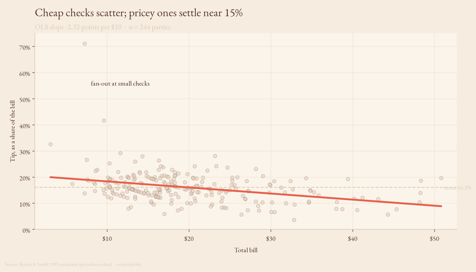
The scatter is the thing to look at. The regression line slopes down, fine, but the real story is the shape of the cloud. At small bills the points fan out wildly. One table left over 70%, several hover near 25%. As the bill grows, the spread collapses toward the 15% line. Picture a tipper handing over a round number rather than computing a percentage: a $3 tip on a $10 lunch is an easy round-up that happens to be 30%, and nobody rounds a $58 dinner up to $75. The generosity, and the chaos, both live at the cheap end.
Party size does more than I expected
This is the one that made me re-run the cell. Bigger parties tip a smaller percentage each, and the effect actually shows up. Tables of two or fewer tip 16.7%; tables of four or more tip 14.6%. Welch’s t-test puts that at p=0.016. Regress tip rate straight on party size and each added person shaves about 0.9 points off the rate (p=0.026); Spearman’s rho is -0.152. It is a modest result, not the hammer that bill size is, and at p=0.016 it sits close enough to the line that a strict multiple-comparisons correction could blunt it. But it survives the controlled model below, which is what tips me toward believing it.
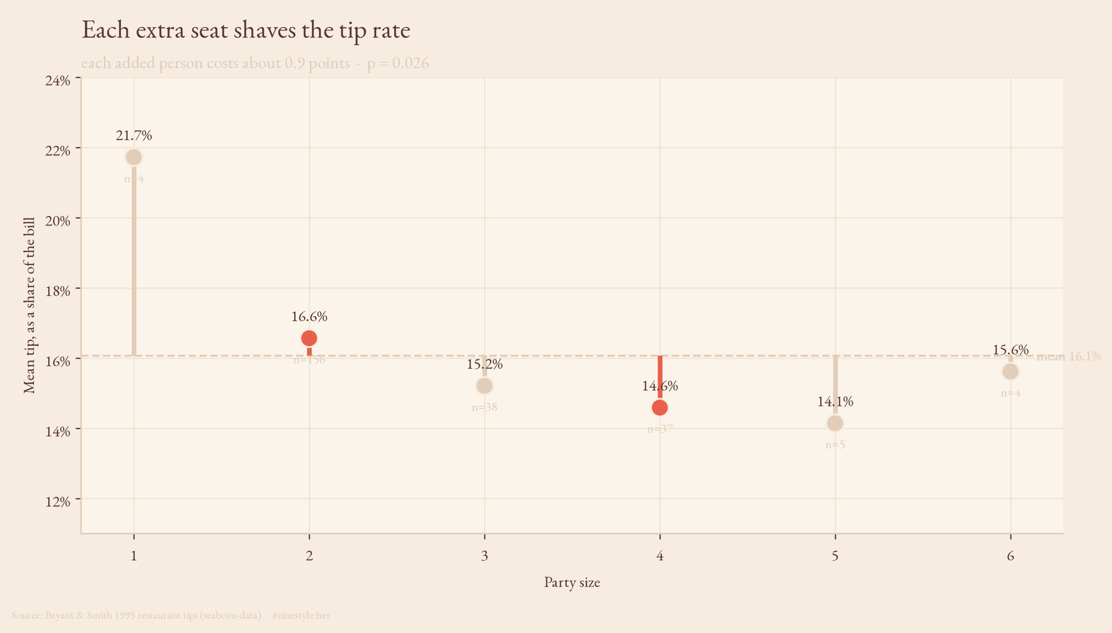
The bar chart is not perfectly monotonic, and I will not pretend it is. Parties of one tip a hair more than parties of two, and the size-5 and size-6 bars wobble. But those bars sit on tiny counts: only 4 tables of one, 5 of five, 4 of six. The trend from the 156-table cluster of twos out to the bigger groups is the part you can trust. Picture eight people around a table, each one assuming someone else is covering the gratuity, so the per-bill rate sags. Responsibility diffuses, and so does the tip.
Both effects survive together. Model the tip in dollars as tip ~ total_bill + size and you get +$0.093 per dollar of bill (p=1.9e-20) plus an extra +$0.19 per head (p=0.025), R squared of 0.468. The bill does most of the work; size adds a real, smaller nudge on top. The marginal $0.093-per-dollar is the giveaway: a strict percentage tipper would post a coefficient near 0.16. Getting 0.093 means the high bills are dragging the slope down, the same falling-rate story told in dollars.
The famous differences that are not there
Now the part where the data refuses to cooperate, which is the part I trust most. This dataset gets cited for “smokers tip differently” and “lunch crowds are cheap” and gendered tipping takes. I tested all of it on tip percentage. At n=244, almost none of it holds.
Smokers versus non-smokers: 16.3% against 15.9%, p=0.682. That is noise. Lunch versus dinner: 16.4% against 16.0%, p=0.514. Noise. Male versus female payer, the one that launches the most arguments: 15.8% versus 16.6%, p=0.254. Still noise. Day of week, Thursday through Sunday, a one-way ANOVA gives F=0.85, p=0.469. Nothing.
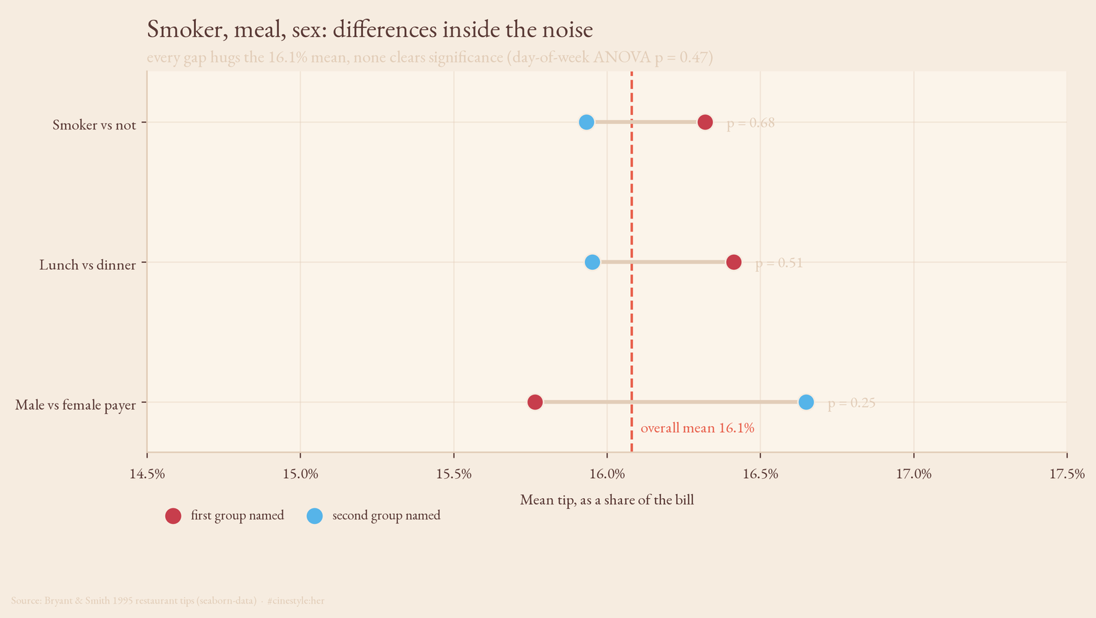
Every bar in that chart hugs the 16% mean line. The gaps are there if you squint, but they are the kind of gaps that groups of this size, anywhere from 19 Friday checks to 176 dinners, throw off by chance. None clears the bar that bill size cleared at p<0.0000001 and party size cleared at p around 0.02. A difference of half a percentage point on a couple hundred checks is the statistical equivalent of a shrug.
A null result is not proof of zero effect, and I will not claim one. With 93 smokers or 68 lunches, a real two-point difference could easily hide under this much noise; failing to find it here is not the same as it not existing. What I can say is that none of these clears the bar that bill size and party size clear, and that is after running four or five tests, so a borderline p around 0.05 would deserve a multiple-comparisons discount anyway. The variables people love to moralize about, who smokes, who pays, which meal, do not show up. The two boring structural ones, how big the check is and how many people are at the table, do. Behavior here looks shaped less by who you are than by the arithmetic in front of you.
The caveat I owe you
One waiter. One restaurant. Sometime around 1990. 244 tables. This is a teaching dataset, not a census of American tipping, and the falling-rate slope is a correlation, not proof that handing someone a bigger bill causes them to tip a smaller fraction. Maybe expensive meals draw a different crowd. Maybe the big-bill tables skewed toward larger parties, and I am partly seeing the size effect twice. The combined regression argues against that, since both terms stay significant, but with this much data I call it suggestive rather than settled.
Still, the pattern is clean enough that I would bet on it replicating. Next time someone tells you the rule is a flat 15 or 20%, ask them how big the check was. The number you tip is anchored to the number you are looking at, and it bends.