// article
NYC Taxi Zones
43 zones carry 80% of the trips. Plan your partitions accordingly.
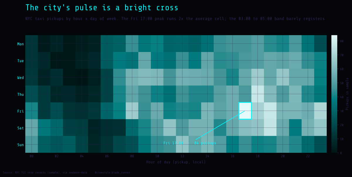
Taxi demand concentrates in space far harder than it does in time. Before any of the zone math, look at when the trips happen. Laid out as an hour-by-day grid, the demand has a shape you can almost feel: a bright cross of daytime-and-evening activity, a dead band before dawn, and a single hottest cell at Friday 17:00. That cell runs about 2x the average cell, modest as spikes go, which is itself the point. The volatility that actually hurts you is spatial, not temporal.
Here is the number that decides your storage layout before you have written a line of schema. In this sample of 6,433 NYC taxi trips, 43 pickup zones out of 194 account for 80% of all rides. Midtown Center alone is 3.6%. The top 20 zones are 51.4%. The Gini coefficient of zone demand is 0.71, closer to “one zone takes everything” than to “evenly spread.” Partition by pickup zone, which is the obvious move because that is how everyone wants to query it, and you have built yourself a hot-partition problem on day one.
The rest shows the work, because the data has a few other opinions worth hearing.
What I am looking at
This is the seaborn-data sample of NYC TLC trip records: 14 columns, pickup and dropoff timestamps, zones and boroughs, fare, tip, tolls, distance, passenger count, payment type. The window is tight, 2019-02-28 through 2019-03-31, about a month. The honest caveat up front, because it matters for every capacity number below: this is 6,433 rows, not the TLC firehose. The real feed is hundreds of millions of trips a year. Treat the ratios here as directionally real and the absolute counts as a toy.
I parsed the timestamps and computed trip duration as dropoff minus pickup. Median trip is 10.9 minutes, mean 14.35, p95 38.2. Six trips came back zero or negative (clock skew or a meter quirk), and the max is 108 minutes. The dataset is not clean, but it is clean enough that I trust the distributions.
The demand curve is spiky, but less than I feared
I expected the evening rush to dwarf everything. It does dominate. The peak hour is 18:00 with 417 trips and the dead zone is 05:00 with 51, but the peak-to-average ratio is only 1.56x. Peak-to-trough is 8.18x.
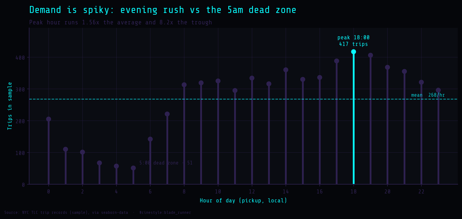
Those two ratios pull your design in opposite directions, and which one you optimize for is a real money decision. Size steady-state ingest for the average and let the evening burst queue, and you provision 1.56x headroom, which is cheap, and a buffered queue absorbs the spike fine because trip records are not latency-critical to write. Serve a live dashboard that has to read current demand, though, and the 8.18x swing between 5am and 6pm is what your autoscaler sees; a fixed cluster sized for the trough falls over by dinner. At the cell level the grid runs from 84 pickups (Friday 17:00) down to zero (Wednesday 04:00). The curve also has a fat plateau from roughly 8:00 to 23:00. Demand does not really rest until after midnight. There is no sharp lunchtime dip the way I assumed; 12:00 (334) is barely below 14:00’s 360. Across days, Friday leads at 1,115 trips and Monday trails at 708. The two ratios disagree, and the one you build for is the one that bills you.
Cash trips record no tips, and the zero is an artifact
100% of cash trips show a $0 tip. All 1,812 of them. Credit card trips average a 23.8% tip rate, median 25.5%, mean $2.78, with only 9.9% showing zero.
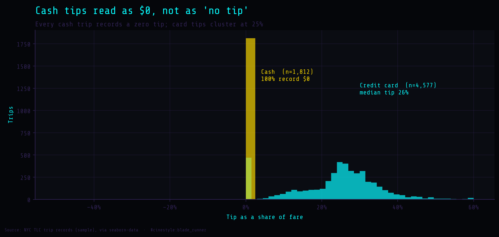
Cash tippers obviously exist. They hand over a couple of bucks and the driver pockets it; the meter never sees it, so the record reads $0. The number is not measuring generosity; it is measuring what the meter can observe. This is the one thing in the dataset most likely to wreck downstream analytics. Compute “average tip rate” across all payment types and you get a number that is wrong by construction, dragged down by 28% of trips that are structurally incapable of recording a tip. The architectural fix is not in the storage layer at all; it is a contract. Tip metrics get computed over payment = 'credit card' only, and that filter lives in a governed view or a semantic-layer definition, not in whatever notebook the analyst opens on a Tuesday.
44 rows have a null payment type, and 26 have a null pickup zone. Small, but if payment or zone is your partition key or a join key, nulls need a defined bucket, not a crash. Bake the caveat into the schema, or you relitigate it forever.
Fare versus distance: a clean line with a flat-rate ghost
Fare and distance correlate at r=0.95. The fit is fare of about $2.80/mile plus a $4.49 base. As a model, that is almost boring: distance explains nearly everything.
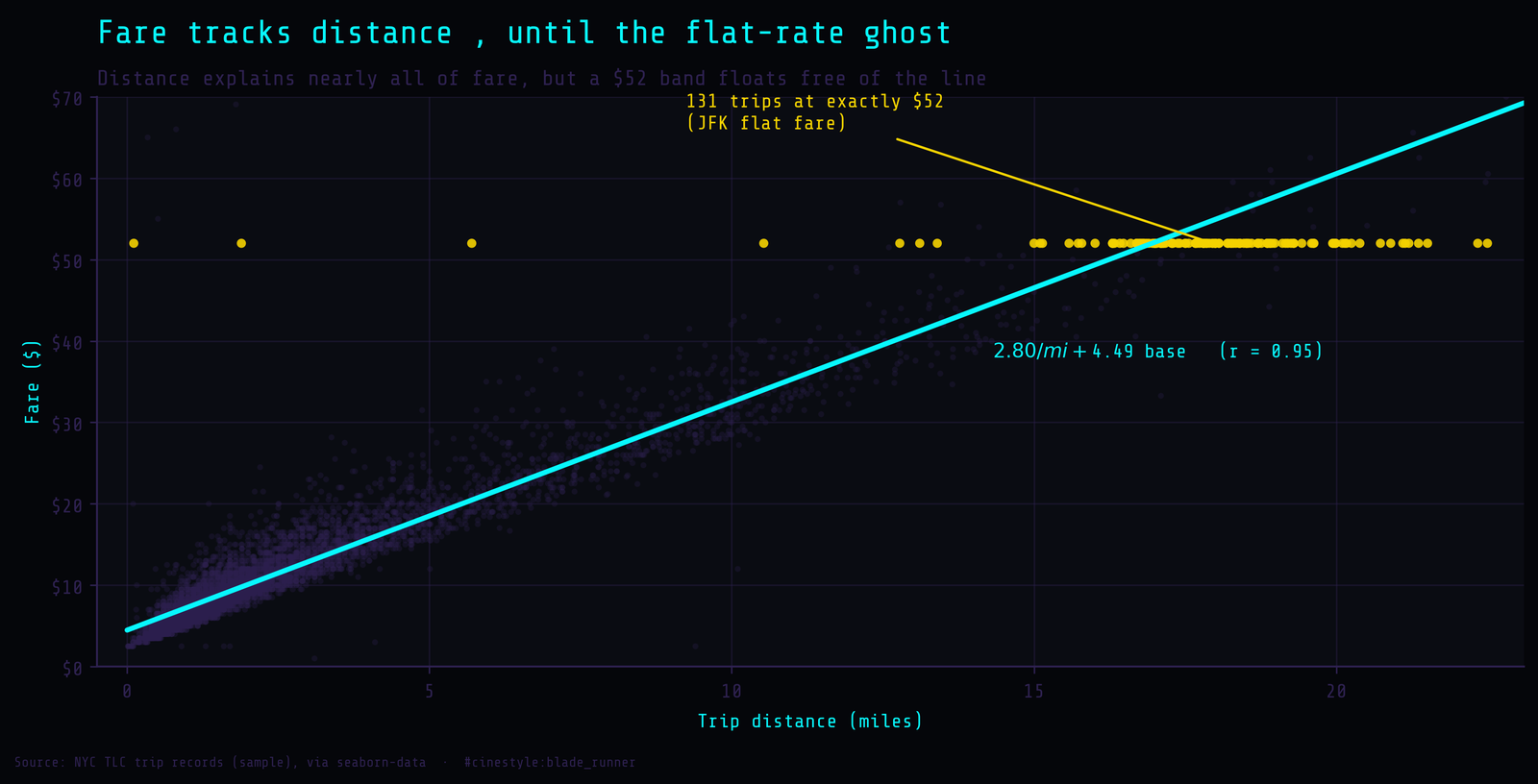
Almost. 131 trips sit at exactly $52.00. That is the old JFK-to-Manhattan flat fare, and on the scatter it shows up as a horizontal line of points: the shorter ones float above the regression line and the longer ones sit near it. Picture two pricing rules sharing one column: a meter that scales with distance, and a flat charge that ignores it. Those $52 trips are the second rule leaking through. My residual-outlier check flagged 34 trips beyond 4 standard deviations, and 10 of those 34 sit exactly at $52. The rest of the $52 trips ride long enough that they fall near the line and never trip the residual filter, which is its own warning: the flat-rate regime is mostly invisible to an outlier check. There are also 51 trips with zero distance but a positive fare: meter started, ride cancelled, or a GPS dropout. The design lesson is that fare is not a pure function of distance, even though it looks like one. Carry a flat-rate flag in the schema so nobody re-derives it badly. Sort this table by distance and the $52 trips will not cluster, so know that before you tune anything.
So how would I lay this out
Partition by time (day or hour), not by zone. Time is how the data arrives, day-of-week volume runs from 708 (Monday) to 1,115 (Friday), lumpy but far flatter than zones, and the 1.56x peak-to-average write load is easy to buffer. Zone is the tempting partition key precisely because it is the popular query filter, but the skew (top zone 3.6%, top 20 at 51.4%, 43 zones holding 80%, Gini 0.71) means a Midtown Center partition would take 230 pickups, 3.6% of the month, while Staten Island does not register among pickup boroughs at all. The busiest 5 zones take 16.5% and the busiest 10 take 30.4%. Manhattan alone is 82.2% of pickups, against 10.3% for Queens, 6.0% for Brooklyn, and 1.6% for the Bronx. You would be sharding by the one dimension guaranteed to be lopsided.
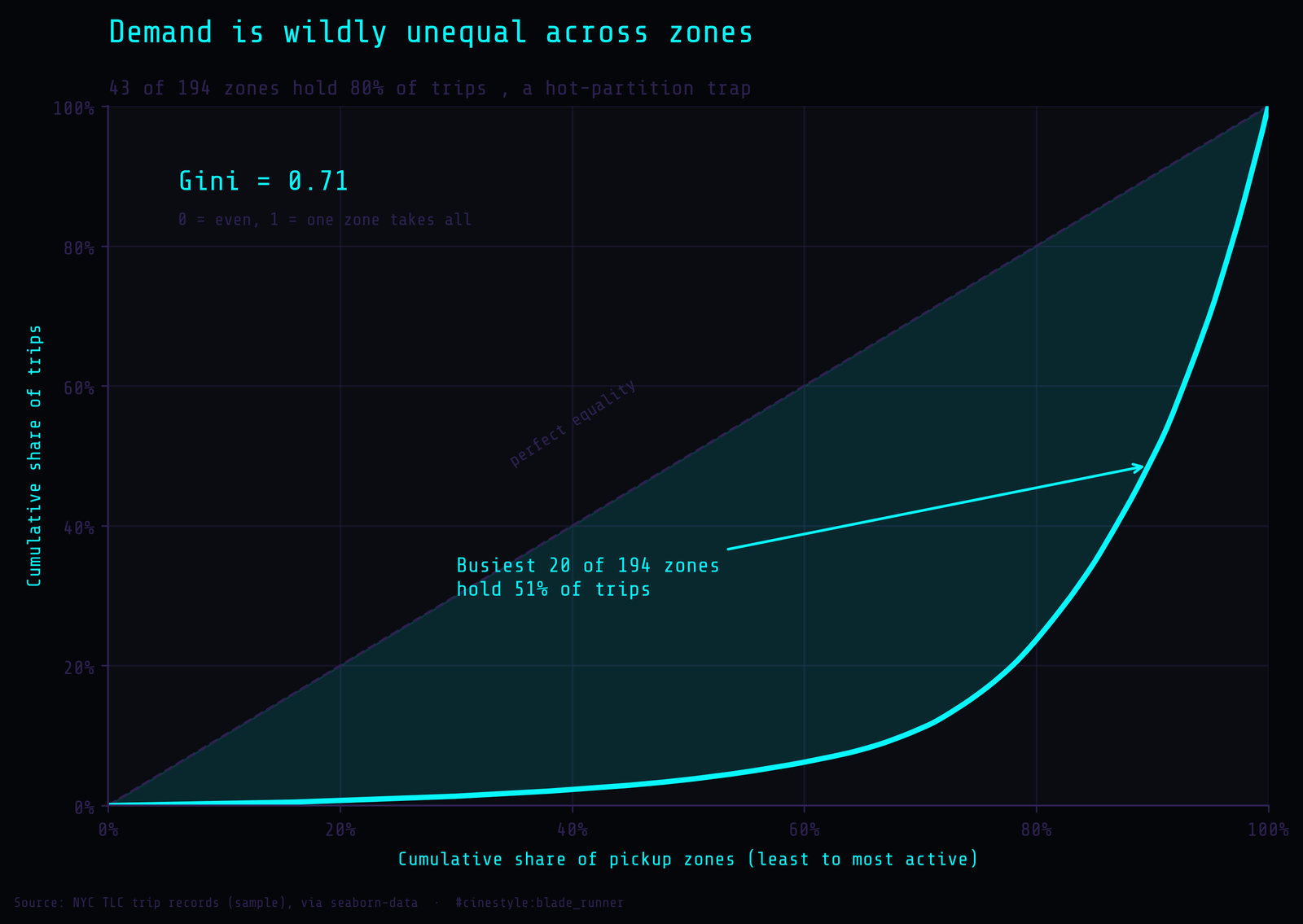
The Lorenz curve makes the inequality literal: plot cumulative trips against cumulative zones and the line sags hard away from equality. Twenty zones hold half the trips and 43 hold 80%; the top sliver carries the load.
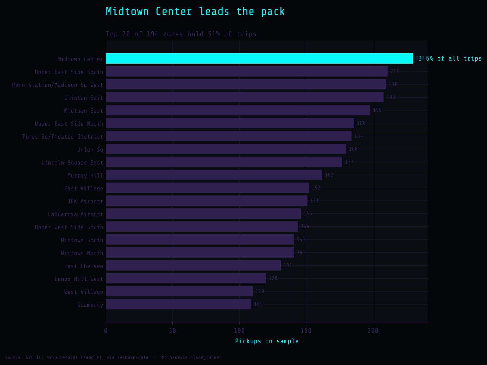
Keep zone as a secondary index or a clustering/sort key within time partitions, so “all Midtown trips last Friday” stays fast without making Midtown its own overloaded shard. Store pickup_zone as a dictionary-encoded category: 194 distinct values across thousands of rows compresses to almost nothing. And write down, in the schema, the two things the data will not tell a fresh analyst on its own: cash tips read as zero, and $52 means flat-rate, not distance.
The data is a month of one city, and nothing in it suggests the zone skew flattens at full scale.