// article
Stocks Versus Bonds
Stocks vs bonds since 1871: the long run is real, and it is paid for
Over 152 years of monthly data, a dollar in stocks beat a dollar in bonds by about 4.5 percentage points a year after inflation. That gap compounds into a fortune over a lifetime and into almost nothing over a bad afternoon. The premium is real, and so is the cost of collecting it, which the slogan leaves out.
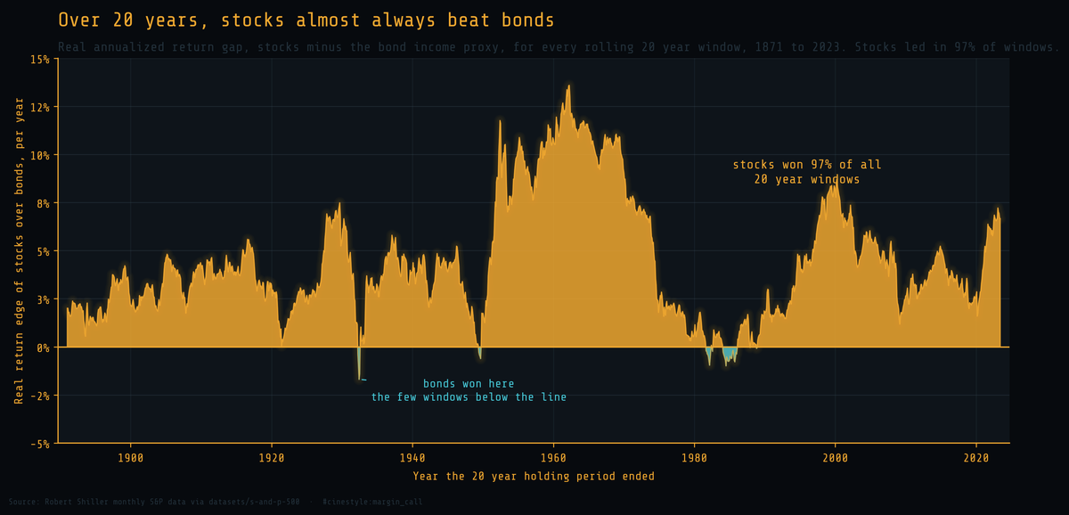
Each point on that chart is a full 20-year holding period ending on that date. Above the line, stocks won that stretch in real terms. Below it, bonds did. The amber swallows the chart: across every rolling 20-year window since 1871, stocks beat the bond proxy 97% of the time. The teal dips are the exceptions, and they are small and rare. That is the honest version of “stocks always win over the long run,” and it is almost, but not quite, the whole truth.
What the data is, and what the bond number is not
The source is Robert Shiller’s monthly S&P 500 series, 1871 to the present, pulled from the public datasets mirror. It carries price, dividends, earnings, the Consumer Price Index, and the Long Interest Rate in one table. The feed publishes price ahead of the slower dividend and CPI series, so the last clean total-return month is June 2023. That leaves 1,830 months, just over 152 years.
Stocks are easy to do right. Each month is the price change plus that month’s dividend reinvested at the prior price, chained from 1871 and then deflated by CPI. That is the real total return an actual buy-and-hold investor lived.
Bonds need a confession. The dataset has no bond price index and no short rate, only the Long Interest Rate, which is the 10 year government yield. So the bond series here is an income-only proxy: each month earns that yield divided by twelve, as if you clipped a coupon and nothing else happened. That ignores the capital gains bonds make when yields fall and the losses they take when yields rise. It understates bond volatility, and it misses the post-1981 windfall when falling rates handed bondholders years of price appreciation. Read the bond line as a floor on what bonds returned, not a precise measurement. Cash gets no line at all, because the dataset carries no short-term rate and I will not invent one.
The premium, measured
Over the full window, stocks compounded at 6.90% a year after inflation. The bond proxy managed 2.41%. Inflation itself ran 2.12%, which means the bond income proxy barely outran the cost of living.
The real equity risk premium, the geometric gap between those two CAGRs, is 4.49 percentage points a year. On an arithmetic monthly basis it is 5.24%. Pick whichever framing you like; both say the same thing. Stocks paid you several percent a year on average, real, for a century and a half.
Now watch what 4.49% a year does over 152 years.
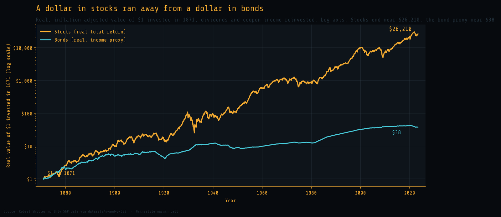
The axis is logarithmic, so every gridline is a tenfold jump and the gap between the lines is far larger than it looks. A dollar of real stock total return in 1871 became about $26,210 by 2023. The same dollar in the bond proxy became about $38. The stock dollar finished roughly 697 times larger. That ratio is 4.5% a year, compounded for 152 years.
The premium did not pay evenly
A single full-sample number hides the eras. Split the record into roughly thirty year blocks and the premium swings hard.
- 1871 to 1899: stocks 8.13% real, bonds 5.68%, gap 2.46 points.
- 1900 to 1929: stocks 7.07%, bonds 1.31%, gap 5.77.
- 1930 to 1959: stocks 7.12%, bonds 0.94%, gap 6.18.
- 1960 to 1989: stocks 5.02%, bonds 2.72%, gap 2.30.
- 1990 to 2023: stocks 7.29%, bonds 1.64%, gap 5.64.
The narrowest era still handed stocks more than two points a year. The widest, 1930 to 1959, handed them more than six. The premium is not a constant of nature. It is a wide, noisy thing that has never once, in any of these blocks, turned negative.
How often, and over what horizon, stocks actually win
The slogan says stocks always win over the long run. The data lets you ask the harder question: over what run, exactly, and how always?
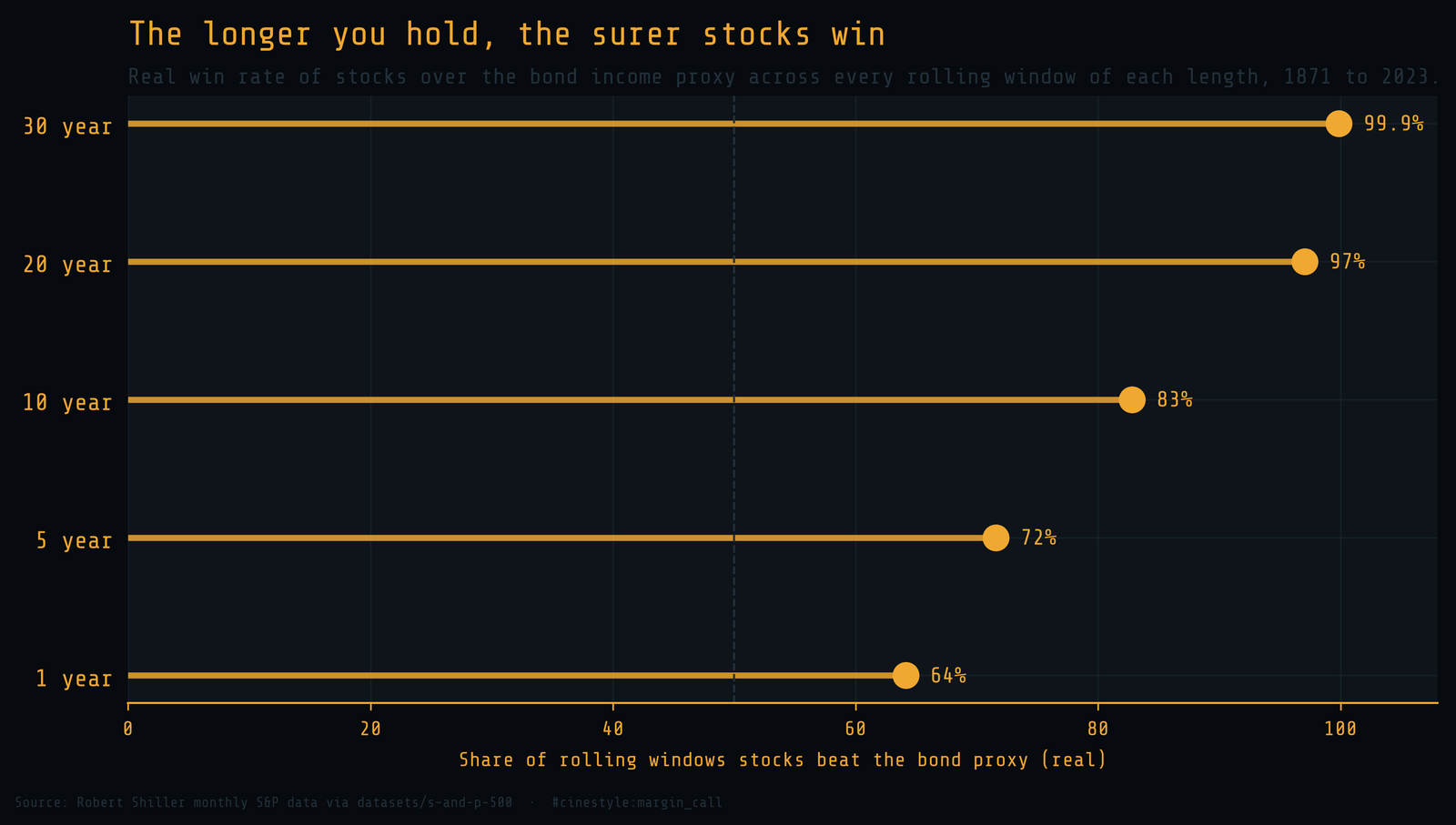
Count every rolling window of each length and tally how often stocks finished ahead of the bond proxy in real terms:
- 1 year: stocks won 64.1% of windows.
- 5 years: 71.6%.
- 10 years: 82.8%.
- 20 years: 97.0%.
- 30 years: 99.9%.
The one-year coin is barely weighted: 64 to 36 is a real edge, but it is a long way from “always.” Stretch the horizon and the odds climb toward certainty. At 30 years stocks won 99.9% of 1,470 windows. At 20 years bonds still won 47 of 1,590, and the worst of those, ending in June 1932, left stocks 1.69 points a year behind. “Always” is a rounding error away from true, and the rounding error is real money to whoever lived it.
The cost of the premium
Nobody hands you 4.5% a year for nothing. The price is volatility you feel and drawdowns you may not survive.
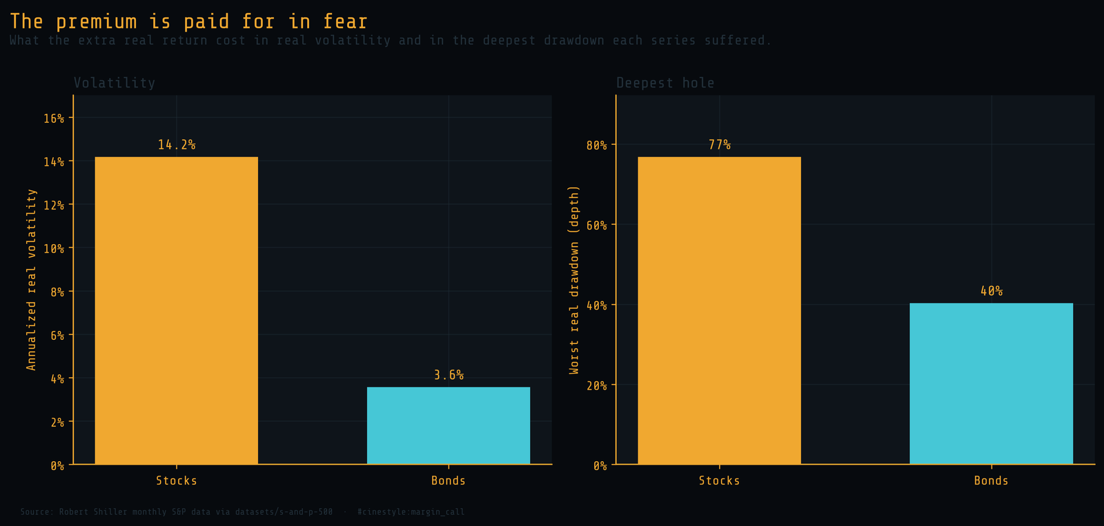
In real terms the stock series swung at 14.2% annualized volatility against 3.6% for the bond proxy, nearly four times as jumpy. And the deepest hole was deeper: stocks lost 76.8% of their real value at the worst point, peak to trough, against 40.3% for bonds. Remember that the bond figure is flattered by the proxy, which ignores the price losses bonds take when rates rise, so the true bond drawdown was worse than 40%. Even so, the asymmetry is the point. The asset that wins almost every long race is the one most likely to terrify you out of it before the race is run.
What the numbers actually say
I went in expecting the data to either crown stocks or hedge the claim into mush. It does neither. Over any horizon a real person plans around, ten years and up, stocks beat the bond proxy in four windows out of five, and over twenty years in nineteen out of twenty. The “long run” in the slogan is not vague. It starts somewhere around a decade and hardens into near-certainty by three.
But the premium is conditional on a behavior the chart cannot show. A 4.5% real edge only reaches you if you hold through a 77% real drawdown without selling, and almost nobody does. The 97% win rate belongs to the investor who sat still. The volatility is what makes sitting still the hard part.
So the slogan is true, with an asterisk you pay in your stomach: the long run costs more than most people have the nerve to spend.