// article
Apple Versus the Field
Apple turned $1 into $8.60. Everyone else mostly stood still.
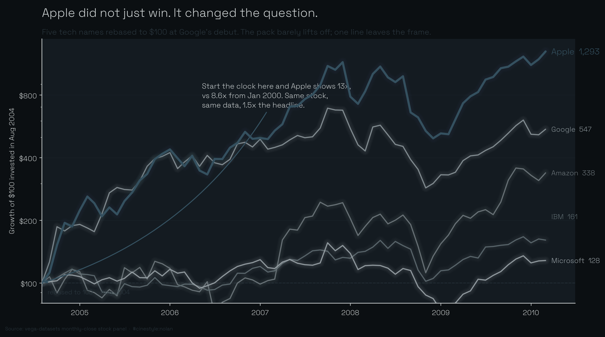
A dollar in Apple at the start of 2000 came back as $8.60 ten years later. Over the same decade Microsoft lost money. AAPL ran an 8.6x growth multiple from January 2000 to March 2010 while the other four big tech names in the dataset limped along or, in Microsoft’s case, ended at 0.72x its starting price. You held Microsoft for ten years and came out with 28% less than you put in.
The data is the stocks panel from vega-datasets: monthly closes for five symbols, 560 rows, AAPL, AMZN, GOOG, IBM, and MSFT. The full span runs January 2000 to March 2010, except Google, which IPO’d partway through and shows up in August 2004. So GOOG is a short-timer here: 5.47x, but over five and a half years, not ten. That asterisk is the first place the “who won” story falls apart.
Normalization changes who is winning
Plot raw prices and the chart is useless. IBM trades near $100 at the start, Apple near $26, and the eye just tracks the expensive one. Divide every series by its own first value and each line starts at 1.0. Now the slope is return, not dollars.
Do that and the ranking by full-window multiple is Apple at 8.60x, Google at 5.47x, Amazon at 1.99x, IBM at 1.25x, and Microsoft at 0.72x. Apple is the only name that did anything dramatic across the whole decade. Amazon roughly doubled. IBM crept up 25%. Microsoft is underwater.
Then normalization bites back. Pick a different start date and the story flips. Clip everyone to August 2004, the first month all five symbols are live, re-normalize from there, and Apple’s multiple jumps to 12.9x while Amazon’s rises to 3.38x, because the dot-com crash that wrecked their early years is gone. Same stocks, same data, different anchor, and the growth multiple you would quote in a headline changes by a factor of two for Amazon. The number is not lying in either case. It is answering a different question, and most people never say which start date they used.
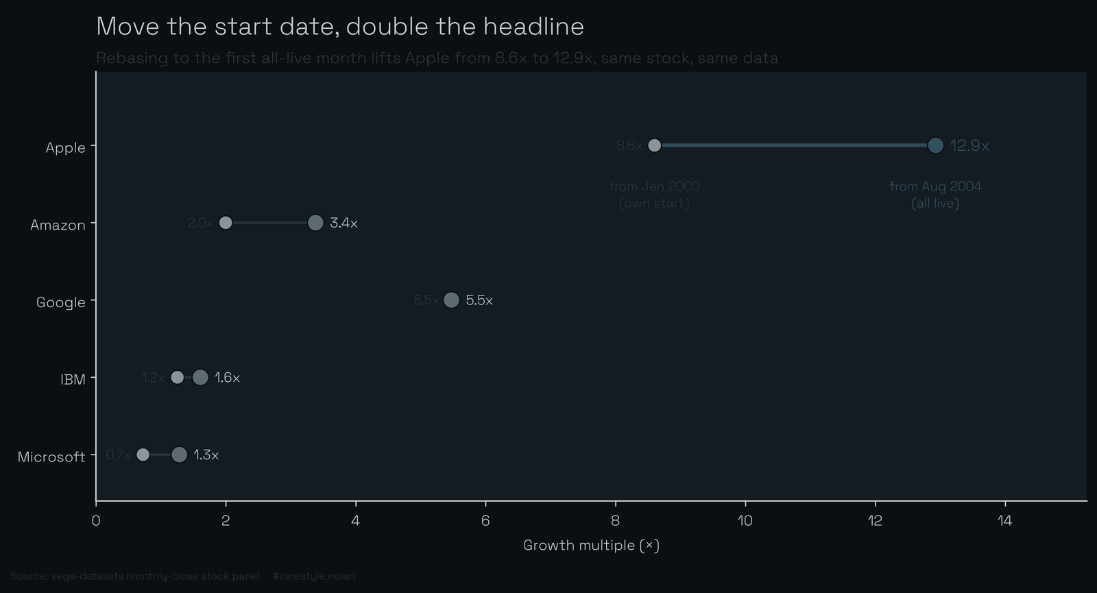
The dumbbell makes the move literal. Picture sliding a ruler’s zero mark forward in time: every series slides right when you shift the anchor from each stock’s own debut to the shared August 2004 start, because the dot-com drawdown is deleted from the front. Microsoft is the cleanest tell. A 0.7x loser over the full window becomes a 1.3x winner just by refusing to count the years it spent underwater. Google does not move, because it has only one start date to begin with. Pick the anchor and you pick the winner’s margin.
The crashes were not shared equally
Two recessions sit inside this window, and the drawdown numbers, peak-to-trough on the monthly closes, show how differently they landed. Amazon’s worst drawdown was -91.3%, peaking February 2000 and bottoming September 2001. That is a near-total wipeout, and it is the dot-com bust, not 2008. Apple lost 79.2% over roughly the same era, peaking March 2000 and not finding its floor until March 2003.
Microsoft’s worst stretch is the strange one: a -63.4% drawdown that peaks March 2000 and does not bottom until February 2009. Nine years to make a new low. A drawdown that deep and that long means the stock spent the entire decade trying to climb back to a peak it set on day one and never reached, which is exactly why its full-window multiple is below 1. Google, late to the party, dodged the dot-com crater entirely; its deepest hole is the 2008 one at -58.6%, October 2007 to November 2008. IBM, the boring one, took the shallowest hit at -55.3%.
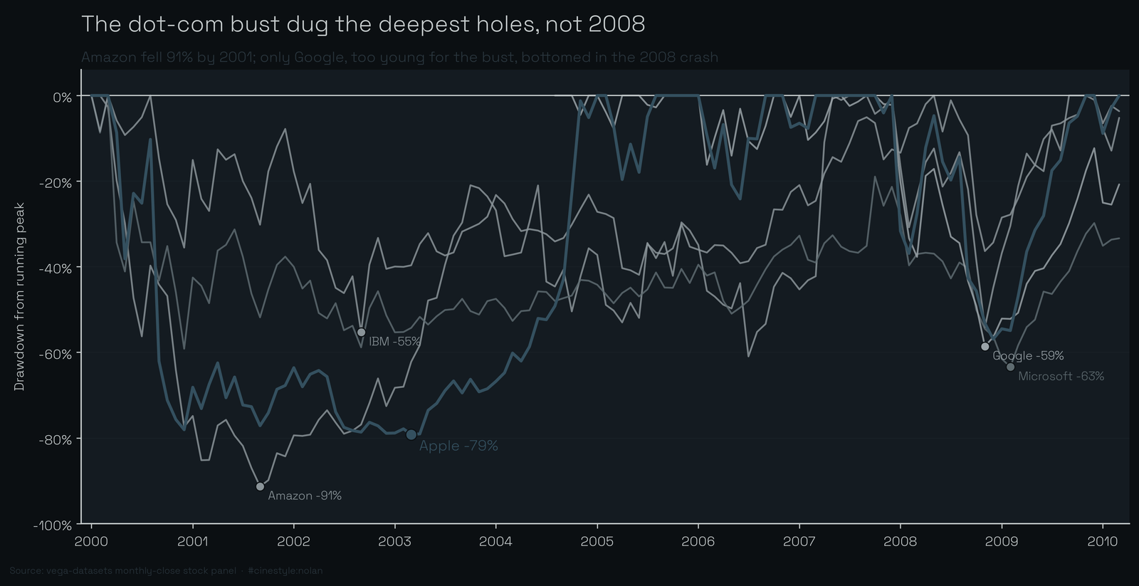
The dot-com crash is the real villain in this dataset, not 2008. The four stocks that lived through 2000 all carved their deepest holes then. Only Google, which was not around for it, has 2008 as its worst moment.
They move together more than the rankings suggest
This is the finding I went in skeptical about. The returns are scattered, 8.6x against 0.72x is a wild spread, but the monthly moves are correlated. I took log returns month over month and built the correlation matrix. The average pairwise correlation across all ten stock pairs is 0.43.
That is high for things people treat as independent bets. Apple is the most coupled of the bunch: its average correlation to the other four is 0.46, and its single tightest link is to Google at 0.56. The loosest pair in the whole matrix is Google and IBM at 0.24, which makes intuitive sense. A search-ad company and an enterprise-services dinosaur do not share many shocks.
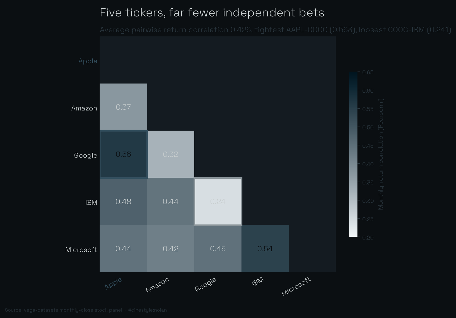
These stocks are not interchangeable. The terminal multiples prove that. But on any given month, when one tech name dropped, the others tended to drop with it. Think of five boats in one harbor: the tide lifts and drops them together even though one is a yacht and one is a dinghy. A 0.43 average correlation means a basket of these five holds far fewer independent bets than the count of names suggests. You own five tickers and far fewer than five real wagers.
Volatility tracks the same intuition. Annualized from monthly returns, Apple and Amazon are the wild ones at 54.7% and 59.2%. IBM is the calmest at 29.1%, with Microsoft at 34.4% and Google at 39.2%. The biggest winner and the biggest gambler were also the two most violent rides. Risk and return came bundled.
A few honest limits. These are monthly closes, so intra-month crashes and recoveries vanish, and the real drawdowns were worse than what I measured. This is a survivor set: five names big enough to matter and all still trading, which quietly omits everything that went to zero. The window also stops in March 2010, so the post-iPhone Apple supercycle is only half-captured. None of this is advice; it is a decade-old panel I pulled to see how much the framing matters.
It matters a lot. Pick the start date and you pick the winner’s margin. The one thing that survives every reframe is the correlation: whatever you bought in this group, you mostly bought the same month-to-month weather.