// article
The Arctic's Shrinking Ice
The Arctic's September floor is dropping 0.84 million km² a decade
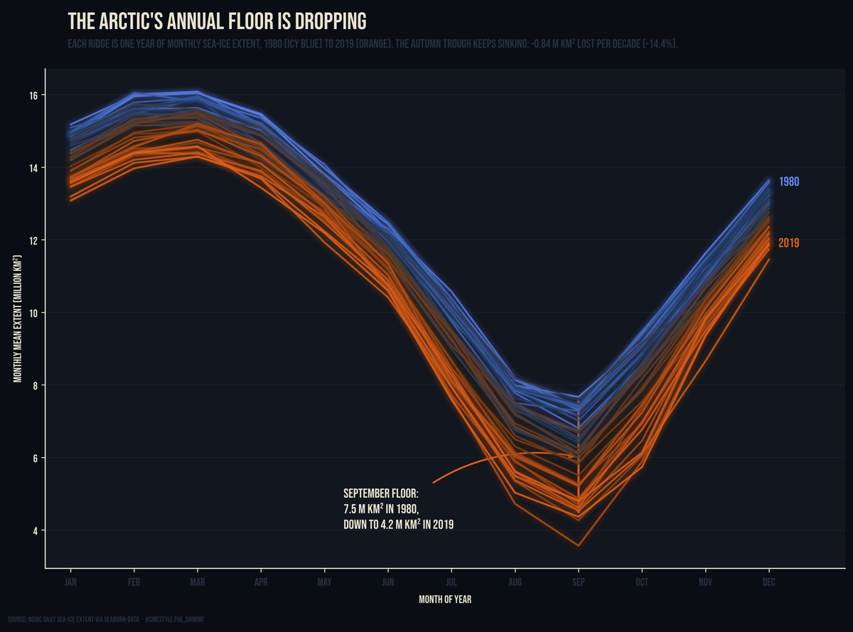
The Arctic loses about 0.84 million square kilometers of its September sea ice every ten years, and it has done so for forty years straight. That is a chunk a bit larger than Texas, gone from the late-summer minimum each decade. The number sits at the bottom of a dataset that, on first glance, looks like mostly noise.
I pulled the seaice table out of utils.datasets: 13,175 daily observations, two columns, Date and Extent in million km². It is NSIDC’s record, distributed via seaborn-data, running 1980-01-01 to 2019-12-31. Forty complete calendar years, no partial ones to throw out. The catalog lists the source as “NSIDC via seaborn-data,” so this is the satellite passive-microwave record everyone cites, just packaged for a Python import.
The first thing you see when you plot all 13,175 points is a huge sawtooth.
The loud part
Average every January together, every February, and so on, and the seasonal cycle is enormous. Ice peaks in March at a mean extent of 15.19 million km² and bottoms out in September at 5.93. That is a swing of 9.26 million km² between the high and the low. The ocean freezes over a surface roughly the size of Canada and then melts most of it back, every single year. March max, September min, right where the freeze-melt calendar puts them.
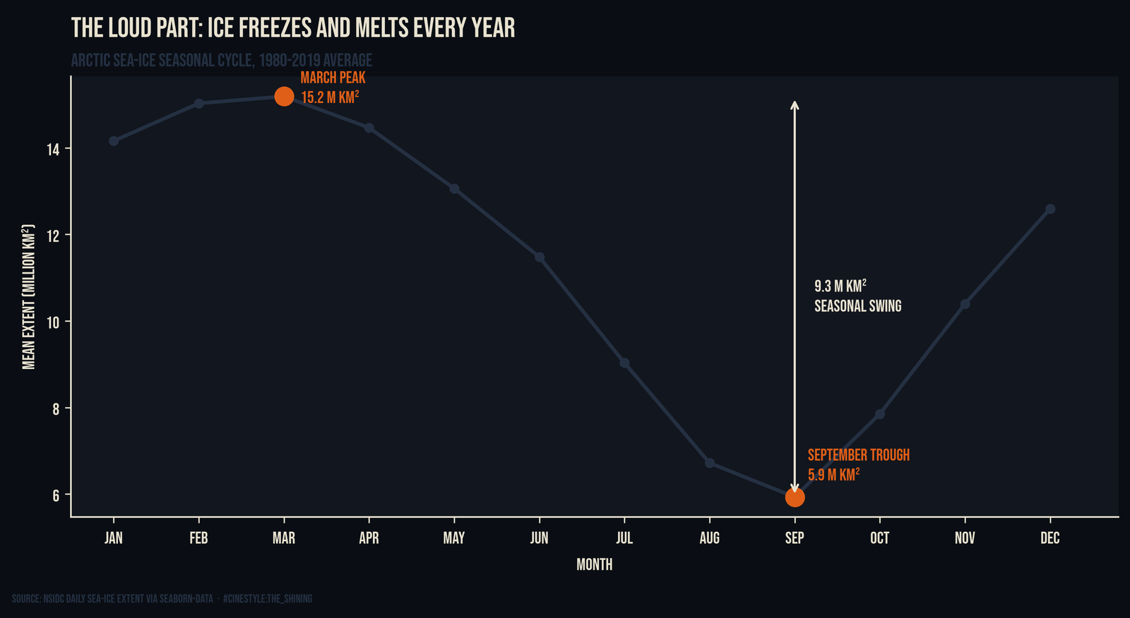
That is the problem with the raw series. The seasonal signal is so loud it drowns everything else. If you eyeball the daily trace, your eye locks onto the up-down-up-down and the long-term drift is invisible underneath it. A 9.26 million km² annual oscillation hides a 0.84-per-decade trend the way a marching band hides someone whispering. To hear the trend, stop looking at the whole signal and look only at the part that does not repeat.
The quiet part
Take just the annual minimum, the single lowest daily extent each year, which lands in late summer, and the noise collapses. One number per year, forty years, the late-summer floor. Fit a line through it.
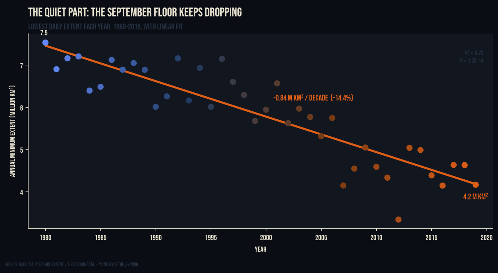
The slope is -0.084 million km² per year, or -0.84 per decade. In relative terms that is -14.4% per decade against the 40-year mean minimum of 5.82 million km². R² is 0.79 and the p-value is 1.7e-14. The slope’s standard error is 0.007 per year, so the per-decade rate is -0.84 give or take about 0.14 at two standard errors. I expected the scatter to be messier. Sea ice has loud years: a stormy August, a weird wind pattern, and the minimum jumps around. But a straight line explains 79% of the variance over four decades. This is not a trend you have to squint at.
The endpoints alone make the case: 7.53 million km² in 1980, 4.17 in 2019. The first-versus-last-decade comparison makes it concrete. Average the annual minimum across 1980-1989 and you get 6.96 million km². Do the same for 2010-2019 and it is 4.43. The September floor dropped 2.54 million km² between those two decades, a 36% loss against the 1980s baseline. The floor did not drift down; it fell.
Putting the season back, carefully
There is a cleaner way to show the same thing without throwing away all but one day of every year. Take a 12-month rolling mean of the daily series. A 365-day window averages over exactly one full seasonal cycle, so the sawtooth cancels and whatever is left is the underlying level.
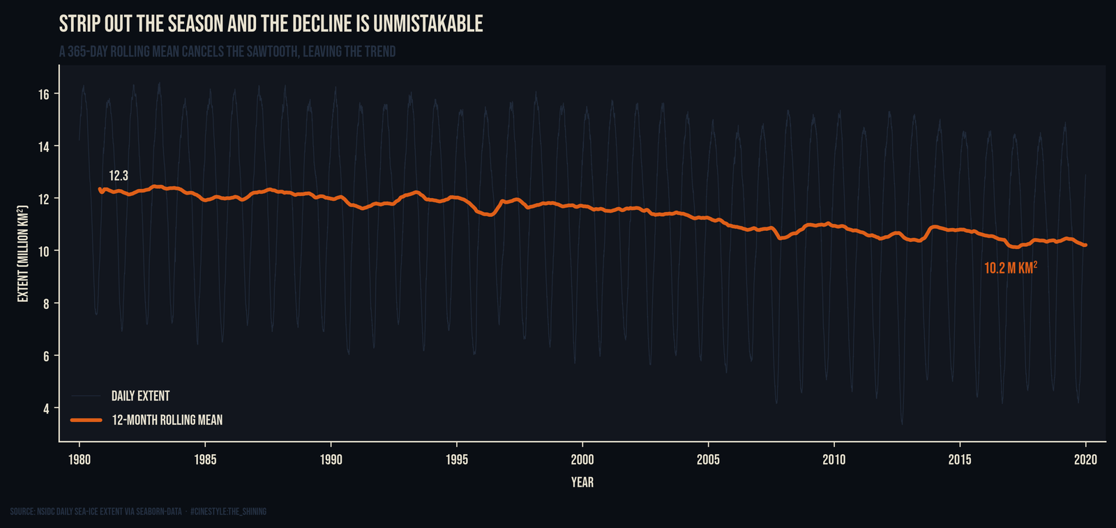
The gray daily trace still oscillates wildly. The blue rolling line glides underneath it, and it slopes down. It is not a straight ruler-line, but the level falls from 12.34 million km² at the first full window to 10.20 at the end of the record. This is the same decline the annual-minimum fit found, just shown as a continuous level instead of forty dots. Having both helps. The minimum-only fit gives you a clean slope and a p-value; the rolling mean shows the trend is not an artifact of picking one day a year.
One honest caveat on method. I restricted the trend fit to full calendar years, meaning years with data present from January through December, so a missing chunk at the start or end could not bias the minimum. Here it did not matter; all 40 years are complete. But the annual minimum is, by definition, the most extreme point in a year, which makes it more sensitive to a single anomalous melt season than a monthly mean would be. I kept the daily minimum because it is the number that actually corresponds to the least ice there was that year.
The early observations are also sparser. The satellite record sampled every other day until 1987, which is why the file has 13,175 rows instead of the roughly 14,600 you would get from truly daily coverage. For monthly and annual statistics that spacing washes out.
What the split tells you
Splitting a signal into its repeating and non-repeating parts is the core move here. The seasonal cycle is 9.26 million km² of motion that nets to nothing; it comes back every March. The trend is 0.84 per decade that never comes back. The seasonal swing is about eleven times the size of a full decade of trend, and the trend is the one that matters.
If the 40-year trend held, you do not need a model to see where a 4.43 million km² floor losing more than a Texas every decade is headed. The line does not have to bend for the September Arctic to run low.