// article
Aging and Sex Ratios
At 90, there are three women for every man
At age 90 and over in the 2000 US Census, the sex ratio is 31.59 men per 100 women. Flip it and it reads cleaner: 316.6 women per 100 men. Walk into a room of the oldest Americans and three out of four people in it are women.
That number is not a fluke of the top bracket. It is the end of a slope that starts above parity and falls the whole way down. I pulled the US Census age-and-sex tables bundled in vega-datasets, population counts by five-year age group and sex for every census year from 1850 to 2000, to check two things I half-remembered: that the sex ratio flips with age, and that the classic population pyramid has stopped being a pyramid. Both held up. The second one more dramatically than I expected.
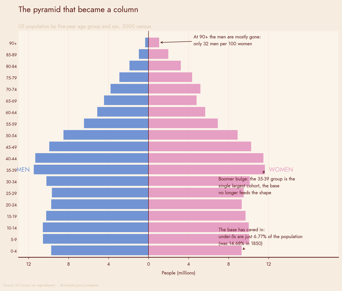
That chart is the whole argument in one frame. A textbook pyramid has a wide base of children narrowing smoothly to a point. This is a column with a boomer-shaped lump in the middle and a heavily female cap. Two findings sit right on it: the youngest base has collapsed to 6.77% of the population, and at 90-plus there are about 32 men for every 100 women. The shape that every textbook draws is no longer the shape in the data.
Verifying which code is which
The data codes sex as 1 and 2, with no labels. Before trusting any of this I had to figure out which was which, and I did not want to guess. There is a clean physical handle: more boys are born than girls, reliably, everywhere. So I summed the age-0 group in the latest year. Code 1 came in at 9,735,380 and code 2 at 9,310,714. Code 1 is bigger at birth, so code 1 is male.
It passes a second sniff test. Across the whole 2000 population, code 2 outnumbers code 1 by 5,693,835: 137.9 million men against 143.6 million women, women outliving men in aggregate. The convention that survives both checks is the one the rest of the analysis runs on.
The ratio that crosses 100
Here is the slope. At ages 0-4 the sex ratio is 104.56 men per 100 women, the birth surplus of boys still mostly intact a few years on. It stays above 100 through the 30-34 group, where it is 100.86, just barely holding. Then it goes under: at 35-39 it is 98.62, and it never comes back. By 65-69 men are clearly the minority, and the bottom drops out at the top, hitting 31.59 at 90-plus.
So the crossover age, where men stop outnumbering women, is 35. I expected it later, somewhere in the sixties where the mortality gap usually turns dramatic. The deficit shows up in midlife instead, then compounds.
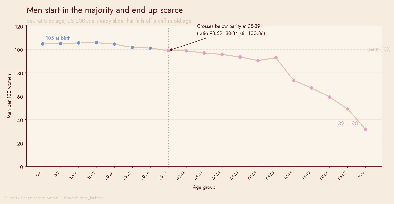
The curve is smooth and monotonic until the last couple of points, where it falls off a cliff. Think of the oldest bar as a funnel, not a snapshot: “90 and over” pools everyone aged 90 and up into one open-ended bucket, and the longer the tail you fold in, the more lopsided it gets, because the survival gap keeps widening past 90. Part of the cliff is real mortality and part of it is that funnel. Treat 31.59 as directionally honest, not as the ratio at exactly 90.
The pyramid that isn’t
The other claim was about shape. A population pyramid is supposed to look like a pyramid: a wide base of children, each older rung narrower than the one below, tapering to a point. That is what high-birth, high-mortality populations produce.
In 1850 the US fit the picture. The 0-4 group was 14.68% of everyone. For every person aged 40-44 there were 3.25 in the 0-4 base. The median person fell in the 15-19 age group, so half the country was a teenager or younger.
By 2000 that base has caved in. The 0-4 share is 6.77%, less than half what it was. The base-to-midlife ratio dropped from 3.25 to 0.84. There are now fewer small children than there are forty-somethings, and the median age group moved from 15-19 to 35-39, twenty years older. The pyramid has inverted at the bottom.
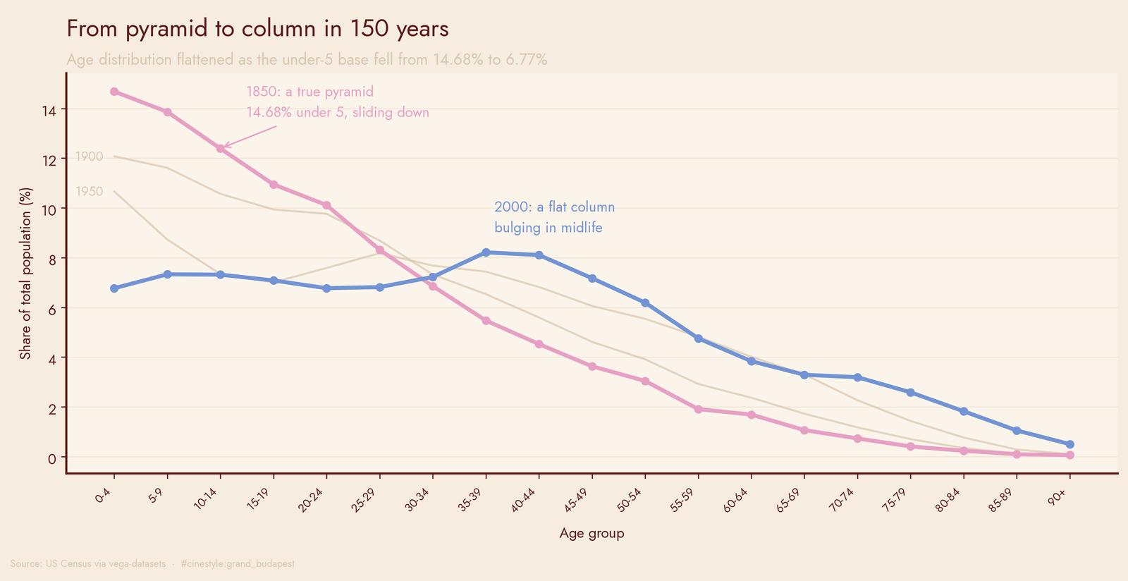
Plot the age shares for 1850, 1900, 1950, and 2000 on the same axes and you watch it happen. The 1850 line starts high on the left and slides down. The 2000 line is nearly flat across the working-age groups, a column rather than a triangle. The rungs that used to tower over the rest now sit about level with the ones above them.
The top end moved the opposite way. People 65 and over were 2.58% of the population in 1850 and 12.43% in 2000, almost a fivefold jump in share. The point of the pyramid grew into a slab.
The boom you can still see
One bump survives the flattening. In the 2000 pyramid there is a clear bulge in midlife: the 35-44 groups hold 45.9 million people, against 38.2 million in the 20-29 groups right behind them and 24.2 million in the 55-64 groups ahead. That is the baby boom, people born roughly 1946 to 1964, sitting in their late thirties and forties, fatter than the cohorts on either side.
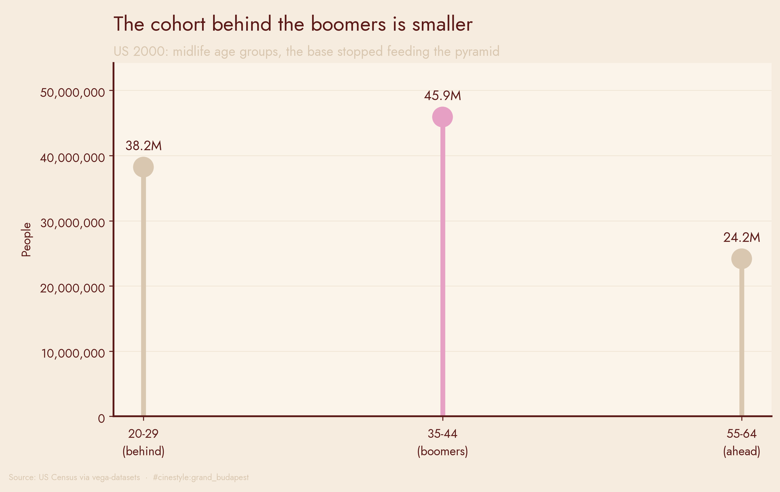
In a true pyramid each younger cohort is larger than the one above. Here the cohort behind the boomers is smaller than the boomers themselves. The base has stopped feeding the shape. That bulge will slide upward over the coming decades and pile into exactly the brackets where the sex ratio is already three-to-one.
One caveat I want to keep honest: these are census-year snapshots from 1850 through 2000, and the data stops there. They are counts, not projections, so I am not extrapolating past 2000, and every “90+” number carries the top-coding asterisk above. The trend lines still do not describe a population about to get younger.
The headline survives all the hedging. The shape every textbook draws as a pyramid is, in the actual numbers, a column with a boomer-shaped lump in the middle and a heavily female cap. Half the country used to be children. Now the largest single age group is people in their late thirties, and at the very top, the men are mostly gone.