// article
Lessons from 30 Datasets
Three numbers off a wine label, and four other things 30 datasets taught me
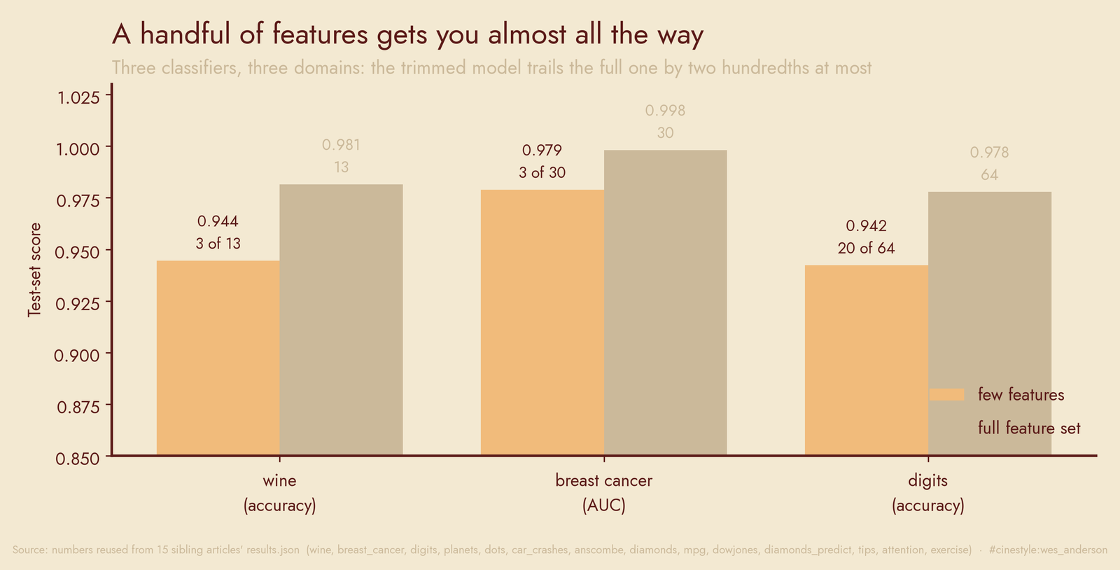
Three columns out of thirteen on a wine label classified the cultivar at 0.944 accuracy. The full model, with all thirteen, hit 0.981. The gap is four hundredths. That was the moment a year of one-dataset-at-a-time posts stopped feeling like thirty separate stories and started feeling like one argument I kept losing the same way.
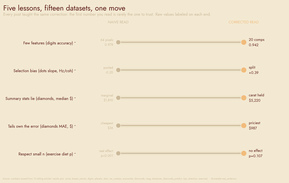
Every row above is one post, and every post taught the same correction. The first number you read is rarely the one to trust. The naive dot and the corrected dot sit on the same line because they came from the same data; the gap between them is the lesson. I ran these the same way every time. Load one real public dataset, run a genuine analysis, write up what showed up, and let an adversarial reviewer re-run the code before it shipped. No grand thesis up front. But five patterns showed up often enough that calling them coincidence would be dishonest. One caution before the list: these fifteen datasets are the examples that fit the five lessons, picked out of thirty posts, so read them as illustrations, not as a random sample of what data does.
A handful of features does most of the work
The wine result was not a fluke. In breast_cancer, three features out of thirty land at 0.979 AUC against the full model’s 0.998, a drop of 0.019. On digits, 20 PCA components get you to 0.942 test accuracy where all 64 raw pixels reach 0.978. The pattern holds across three domains. The last dozen-or-more inputs buy you a couple hundredths and not much else.
The reason is not magic; it is redundancy. Picture an 8 by 8 grid where a hand-drawn digit lives. The ink only ever lands in the middle. digits_pixels makes that concrete: 12 of the 64 pixels have variance below 0.5, the dead corners where no digit puts ink. A model that drops them loses nothing because there was nothing there. Most feature sets carry that kind of dead weight. The trick is admitting it before you spend a week tuning on noise.
The sample is a map of how you collected it
The exoplanet catalog looks like a census of the galaxy. It is a census of our instruments. In planets, radial velocity alone accounts for 53.4% of the catalog, and radial velocity surveys found planets with a median orbital period of 360.2 days; transit surveys found a median of 5.715. Same sky, two methods, periods two orders of magnitude apart, because each technique can only see a narrow slice. Transit detection overtook radial velocity in 2010, which means the typical planet in the catalog changed character on a date set by telescope budgets, not by anything orbiting a star.
The same trap, smaller and meaner, shows up in car_crashes. Insurance premiums correlate with insurer losses at r=0.623 but with the actual fatal-crash rate at r=-0.2 (p=0.16, not significant). Premiums track what the insurer pays out, not how dangerous the road is. Read the premium as a safety signal and you have drawn a map of accounting and labeled it risk.
And dots is the version I checked twice before believing. Pool all the neural firing data and coherence has a slope of -0.1994 Hz per coherence step. Stronger evidence, weaker response, which is backwards. Split by the choice the monkey made and the slope is +0.3936 for one target and -0.2336 for the other.
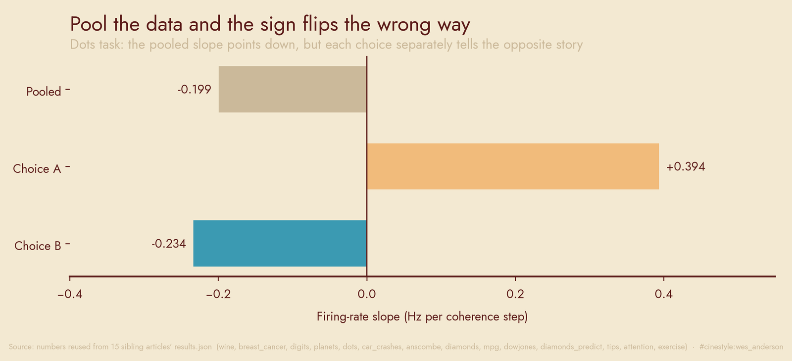
This is Simpson’s paradox: the pooled slope does not understate the effect, it reverses it.
Summary statistics are confident liars
Anscombe built four datasets in 1973 that share a slope of 0.5 and a correlation of 0.82 and look nothing alike when you plot them. One of them is a parabola: fit a line and you get R²=0.67, add an x² term and it jumps to 0.9999995. I keep that quartet pinned up as a reminder that identical numbers can hide opposite shapes.
It is not a museum piece. In diamonds, the best-cut (Ideal) stones have a median price of $1,810 and the worst-cut (Fair) stones a median of $3,282. Better cut, lower price, which is nonsense until you notice Ideal diamonds are smaller. Hold carat roughly fixed and the order flips back. In the 0.9 to 1.1 carat band, Ideal runs $5,220 against Fair’s $3,730.
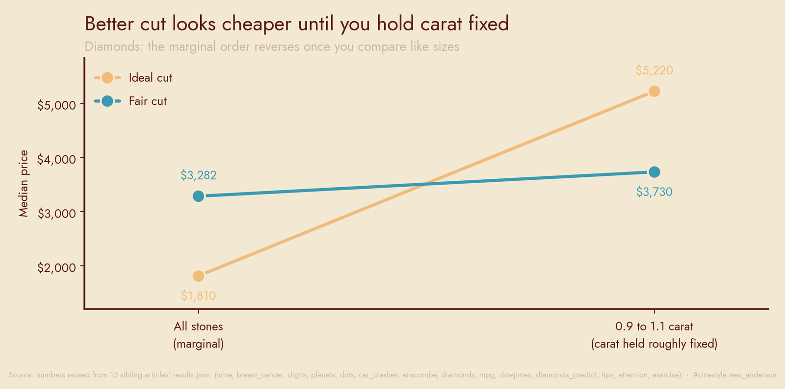
The marginal summary told a story exactly inverted from the conditional one. mpg is the regression-flavored version. Displacement correlates with fuel economy at -0.8051 on its own. Bigger engine, worse mileage, obviously. Throw it in a model alongside weight, horsepower, and cylinders (displacement’s VIF is 10.31, badly collinear) and its coefficient comes out at +0.00014. The sign flips. Take that coefficient at face value and you would claim a bigger engine helps. Check the VIF before you read a sign.
The tails own the error budget
Average behavior is a story about the middle, and the middle is rarely where you get hurt. dowjones monthly returns carry an excess kurtosis of 6.98. Under a normal distribution you would expect 0.0004 months past five sigma in that span; there are 3. The worst single month fell 21.7%, when the 1929 crash hit. A Gaussian risk model calls a month like that effectively impossible, and the record has one.
The modeling consequence shows up cleanly in diamonds_predict. A gradient booster prices diamonds with overall MAPE 6.79%, which sounds uniform. It is not. Mean absolute error runs $36 in the cheapest decile and $987 in the priciest, a 27.2x spread. The single worst miss was $6,926 off on a 4.5-carat stone.
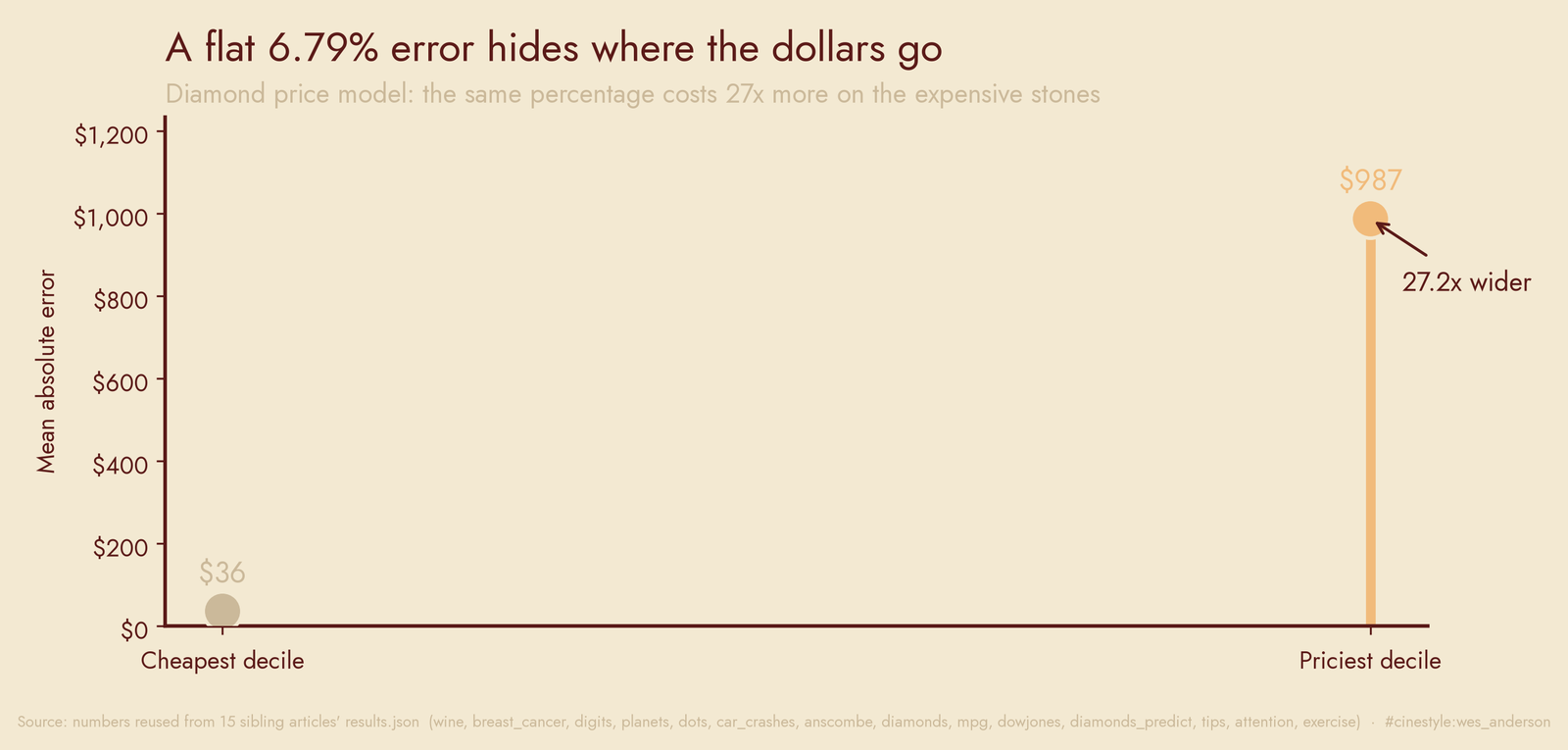
Report one error number for that model and you have hidden where all the dollars actually go. The percentage stayed flat while the dollars exploded, and dollars are what the jeweler loses.
Say “no effect” out loud, and respect small n
The least glamorous lesson and maybe the most useful: a lot of the columns you would expect to matter do not, and the right move is to print the null. In tips, whether the table smoked (p=0.68) and which day of the week it was (ANOVA p=0.47) make no difference to tip percentage. Exactly one effect survives: tip rate slides down as the bill climbs, at p well below 0.001. One real signal, several tempting dead ends, and the writeup says so.
Small samples demand the same discipline from the other direction. attention has 20 subjects and a focused-versus-divided effect of Cohen’s d=1.208. The effect is large. But the interaction term sits at p=0.01, and with cells of ten I trust the headline effect a lot more than the subgroup story it implies. exercise is the cautionary one. 30 people measured three times each, with repeated measurements correlated at r=0.638. Treat those 90 rows as independent and your effective sample size is a fiction. Pool them and the standard errors lie to you. The diet effect there lands at p=0.107, not significant, and the right call is to report that flatly, not to go fishing for the slice where it crosses 0.05.
Five lessons, fifteen datasets, and the one I would tattoo on my arm is the cheapest: plot it before you trust the number. The wine model did not need thirteen features, the Dow did not read its own kurtosis, and the diamonds lied about their own cut until I held carat still. The data will tell you what you collected and how you sliced it, in that order, whether or not you asked.