// article
The Warming Rate
The warming rate has sextupled, and the line cannot keep up
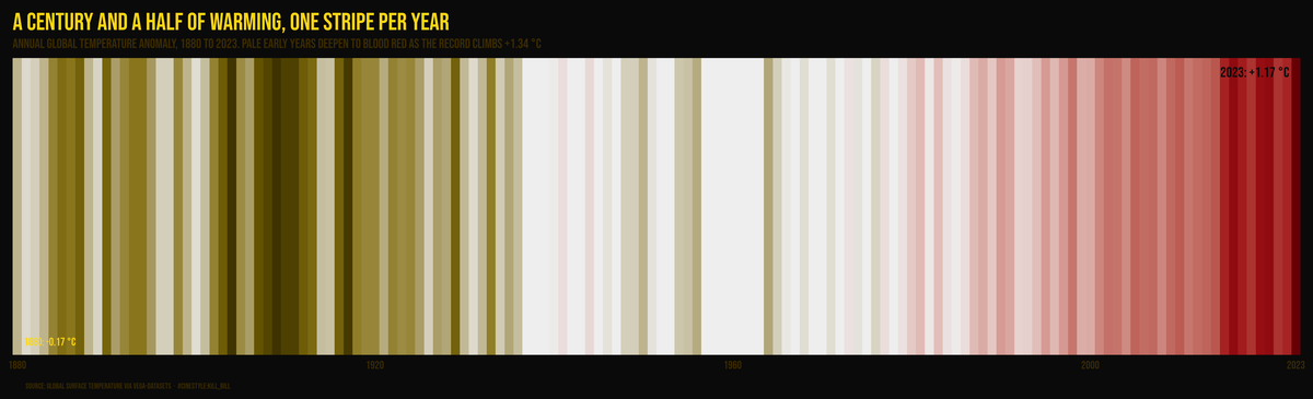
Ed Hawkins’ warming stripes strip the chart down to the one thing that matters. Each bar is a year, its color is that year’s anomaly, and you read the whole 144-year record left to right with no axes to get in the way. The pale early stripes deepen into a wall of red on the right, a +1.34 °C climb that the rest of this piece pulls apart number by number.
Fit a straight line to 1880-1951 and the planet warms at 0.035 °C per decade. Fit one to 1984-2023 and it is 0.212 °C per decade. That is a sixfold increase. The headline number for global warming usually gets quoted as a single slope, and that single slope averages away the thing that matters. The rate has been speeding up, and the recent record makes that obvious once you stop fitting one line through 144 years and start asking where the bend is.
The data is the annual global temperature anomaly series distributed with vega-datasets, sourced as global surface temperature. Two columns, year and temp, 144 rows running 1880 through 2023. temp is an anomaly in degrees Celsius, a departure from a baseline rather than an absolute temperature, so the values are small and can go negative. They run from -0.17 in 1880 to +1.17 in 2023. End minus start is +1.34 °C over the record. That difference is the part everyone already knows. How you get there is the part worth looking at.
One line, and why it is not enough
A linear fit over the whole record gives 0.079 °C per decade with an R² of 0.76. Respectable. The line explains three-quarters of the variance, and if someone asked me for one number to describe the last century and a half of warming, that is the one I would hand over.
But R² of 0.76 against a series this smooth is a tell. A linear process with this little year-to-year noise should fit much tighter. The missing variance is structure the line cannot bend to follow. So I plotted the residuals.
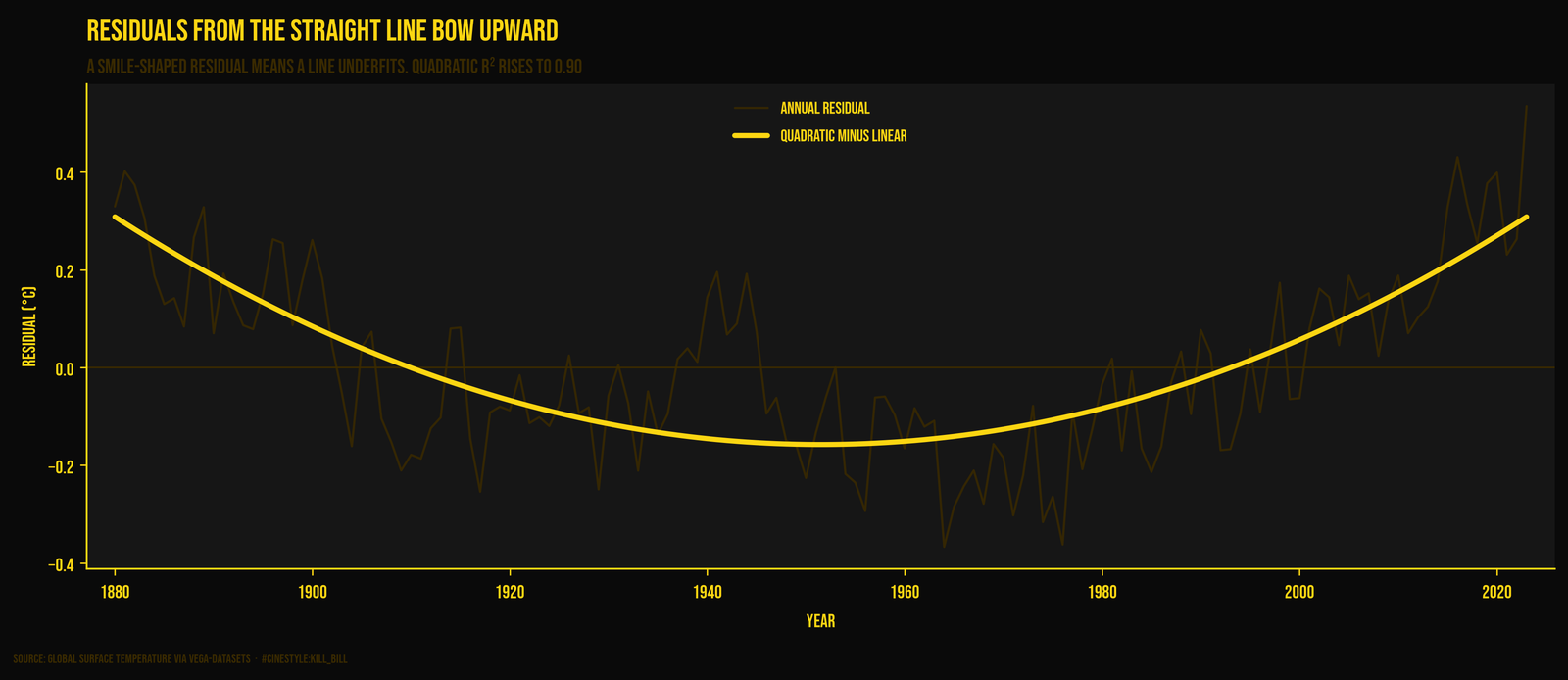
The residuals bow. Picture the line as a ruler laid across a shallow bowl: it touches the rim at both ends and floats over the dip in the middle. Early decades sit above the line, the middle dips below, and the recent years pull hard above it again. They form a smile rather than random scatter, and a smile means the second derivative is positive.
Splitting the record
So I split it. The midpoint of 1880-2023 is 1951. Fit the early half (1880-1951) on its own and the slope is 0.035 °C/decade, barely warming, almost flat. Fit the second half (1952-2023) and it is 0.157 °C/decade, 4.5x steeper. Narrow the recent window to the last 40 years (1984-2023) and you get 0.212 °C/decade, the 6.05x figure I opened with.
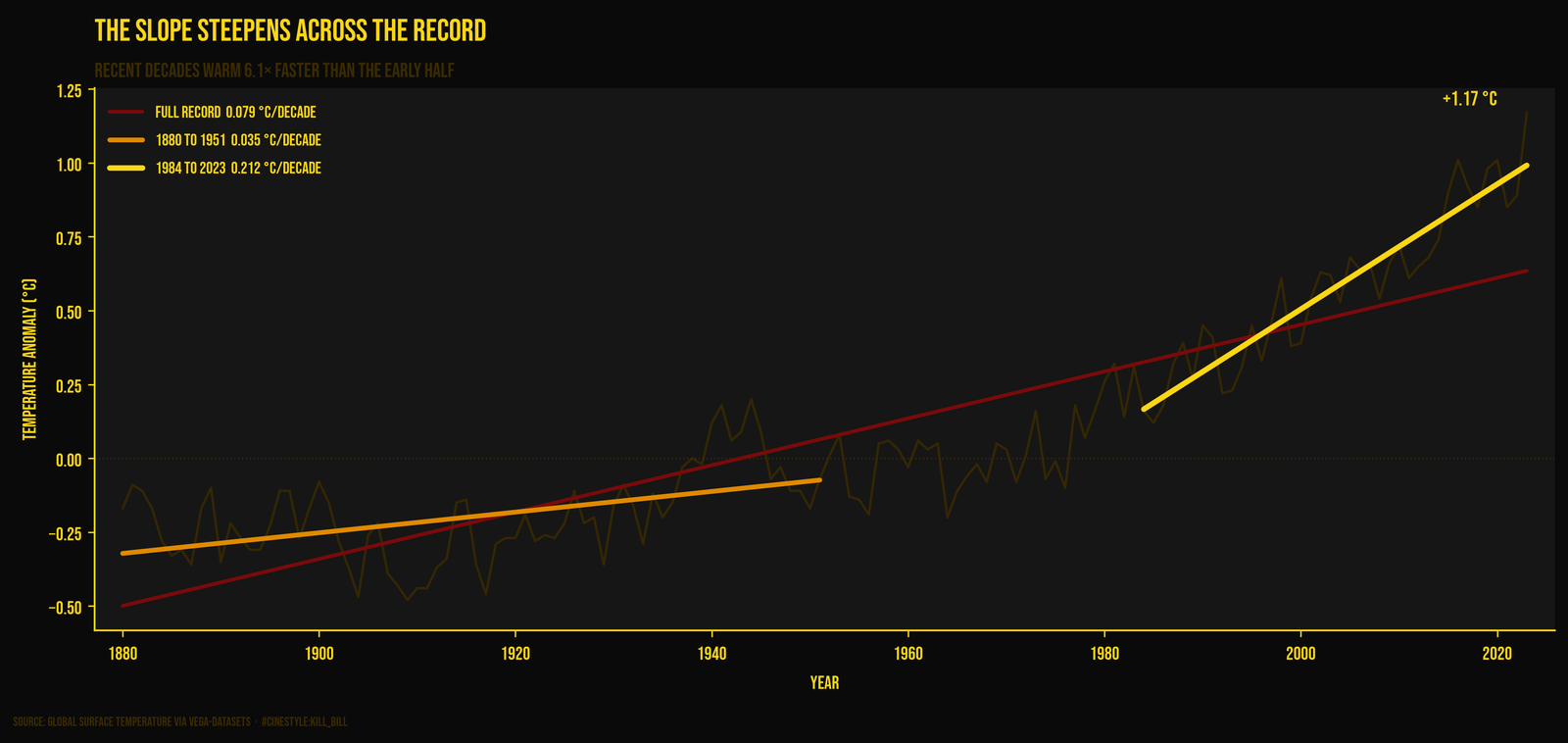
The chart makes the cheat visible. The dark red full-record trend line runs through the middle of everything and fits nobody well. It sits below the early years, above the middle, and badly understates the last two decades. The orange early-half line is nearly horizontal. The yellow recent line is the one that hugs the data on the right side of the plot.
Breaking it down by decade sharpens it further. The 1880s warmed at -0.10 °C/decade, which means it cooled within that window. The 1900s, 1920s, 1940s, and 1960s also post negative within-decade slopes. Then the 2010s come in at 0.40 °C/decade, the steepest decade in the record by a wide margin.
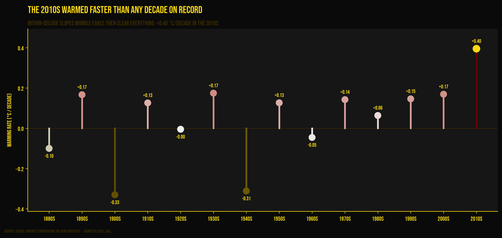
I want to be careful here. Decade-length slopes are noisy. Ten points is not much, and a couple of those negative early decades are riding on a few cold or volcanic years, not a real cooling trend. The decade bars wobble all over the early record precisely because the signal back then was small relative to the wiggle. What is not noise is the trajectory. The wobble has a rising floor, and the most recent decades clear everything before them.
Is the acceleration real, or am I fitting noise?
The clean test is to fit a quadratic and check whether the curvature term earns its place. I centered the year so the linear and squared terms do not fight each other, then read off the coefficient on the squared term: 9.1e-05 °C/year², with a standard error of 6e-06. That is a t-statistic of 14.2 and a p-value around 4e-29. The quadratic R² is 0.90, up from the line’s 0.76.
The acceleration term is fourteen standard errors from zero. Whatever else is going on, “the warming rate is constant” is not a model this data supports.
Does the recent trend beat the noise?
The obvious objection to all of this is volatility. The series jumps around year to year. The standard deviation of year-over-year changes is 0.113 °C. A single year’s worth of recent warming is 0.021 °C, smaller than that wiggle by a factor of five. So no, you cannot see warming in any one year-to-year step. That is the trap deniers used to set: pick two adjacent years where the anomaly dropped, declare a pause.
The trend lives at a longer scale. The recent decadal rate of 0.212 °C is 1.9x the year-to-year noise, so the decade-scale signal already clears the wiggle. Stretch to the full 40-year recent window and the fitted rise is 0.83 °C, 7.3x the noise standard deviation. The signal is strong on the right timescale, and a single year is the wrong one.
The caveat
This is one global-mean series with an unstated baseline, and an anomaly’s zero point is a convention, not a fact. Change the baseline and every number shifts by a constant. The slopes do not, which is why I leaned on slopes. Annual means also flatten an enormous amount: regional swings, seasonal structure, the El Niño years that drive a lot of that 0.113 °C of jitter. A single curve through global averages is the most compressed possible view of the climate.
But for the one question I asked, is the warming rate steady or speeding up, the compression does not hurt. The recent four decades warm six times faster than the first seven. The curvature term sits fourteen standard errors above zero. The recent trend stands seven noise-widths clear of the year-to-year scatter. If you have read the companion piece on Mauna Loa CO₂, where the annual rise grew 3.35 times between the 1960s and the 2010s, none of this should land as a coincidence.