// article
The 2021 Inflation Surge
The 2021 inflation surge was the broadest in decades, not the worst
Inflation came back everywhere at once. In 2020 the typical country in the World Bank record ran 1.86% consumer inflation. By 2022 the typical country ran 7.16%, nearly four times as much, and the surge reached almost every economy on the map. I went in expecting the worst inflation in modern history. The breadth was historic. The level was not.
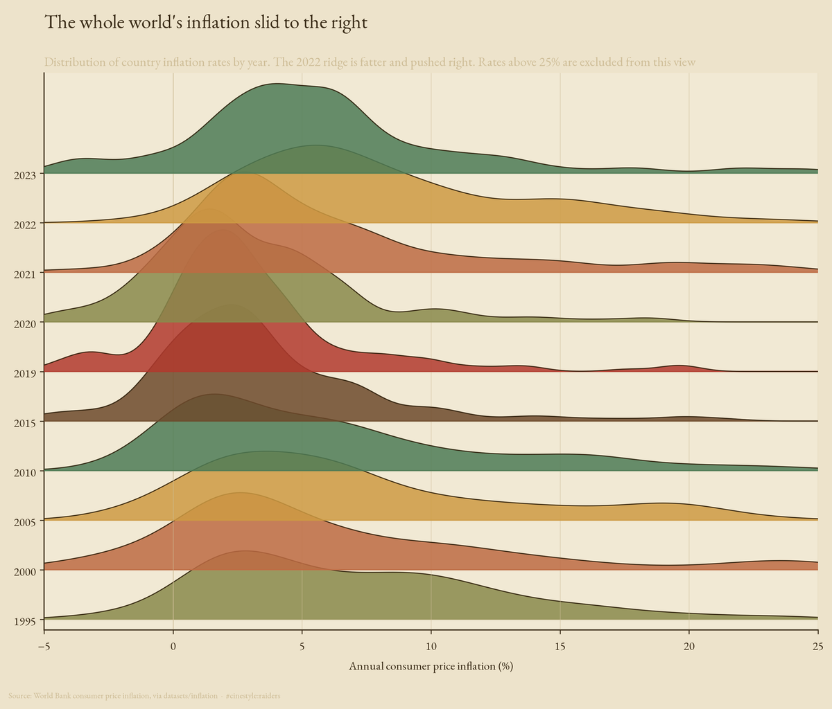
Each ridge above is one year’s distribution of inflation across countries. For two decades the ridges sit quietly near 2 to 4 percent. Then 2021 and 2022 fatten and slide right, the whole world’s price level lurching together. That single rightward shove is the story, and the rest of this post measures it.
The data is the World Bank’s consumer price inflation series, one annual figure per country from 1961 to 2023, pulled from the datasets/inflation mirror. I dropped the 49 regional and income-group aggregates the World Bank ships alongside real countries (World, Euro area, Low income, and the rest), which leaves 213 countries and 11,004 country-year observations. Every number below comes from that filtered set.
Why the median, not the average
Inflation has a long right tail. A handful of countries run hyperinflation in any given year, and the average inflation rate is hostage to them. In 2022 Zimbabwe printed 267% and Sudan 117%; let those into a mean and they drown out the other two hundred economies. So the central trend here is the cross-country median, the rate the typical country actually faced. When I say the world ran 7.16% in 2022, I mean the median country did. The mean is a number about Zimbabwe.
Bad, but not the worst the world has seen
Rank the yearly medians across the whole record and 2022 comes in 22nd. The 1970s oil shocks ran hotter, and it is not close. The worst single year was 1974, when the median country ran 16.5% inflation, more than double the 2022 figure.
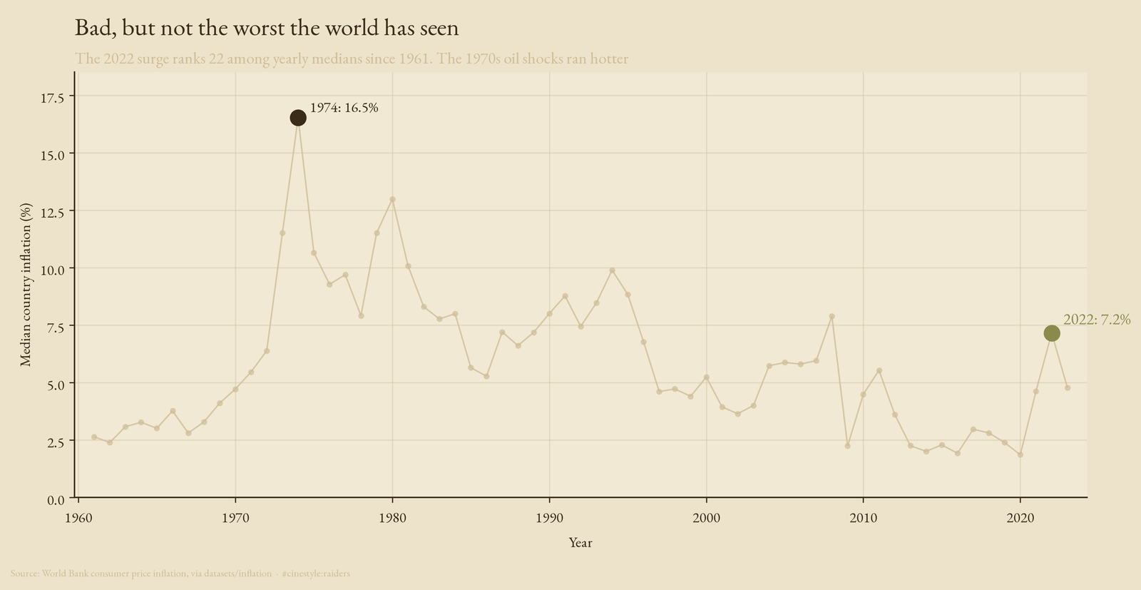
The 1974 spike towers over everything after it. Through the late 1970s the median country lived above 10% for years at a stretch. The 2022 bump is real and sharp, but on this axis it is a foothill beside that range. Anyone who lived through the 1970s and called 2022 unprecedented was remembering the wrong decade. The surge was a return of an old enemy, not a new one.
The breadth is what made it feel new
So why did 2022 feel like the worst inflation in living memory? Because it hit nearly everyone, and most people alive today were not yet earning a wage in 1974. In 2020, 23% of countries ran inflation above 5%. By 2022 that share hit 70%.
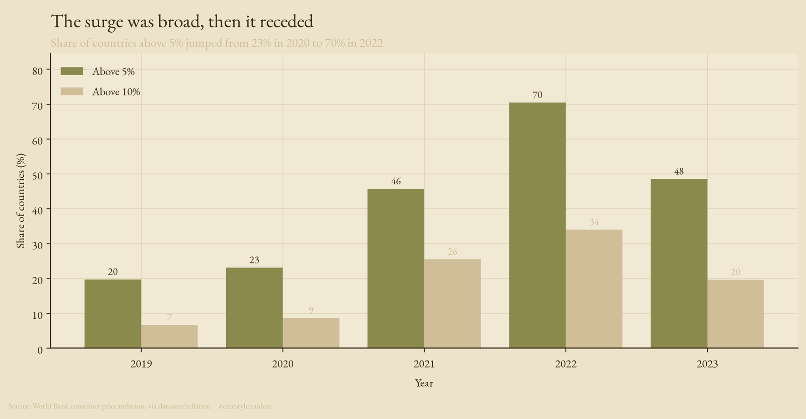
Above 10% the jump is just as stark, from 9% of countries in 2020 to 34% in 2022. Then the bars recede. By 2023 the share above 5% had fallen back to 49%, still elevated but well off the peak. The shock was synchronized, which is what made it visible on every front page at once, and it was fast to crest. A flood that covers every field at once looks worse than a deeper flood in one valley, even when less water fell.
Almost nowhere was spared
Map the peak each country reached anywhere in the 2021 to 2023 window and the synchrony is undeniable. Of the 162 countries that match the natural-earth boundaries, almost none stayed pale.
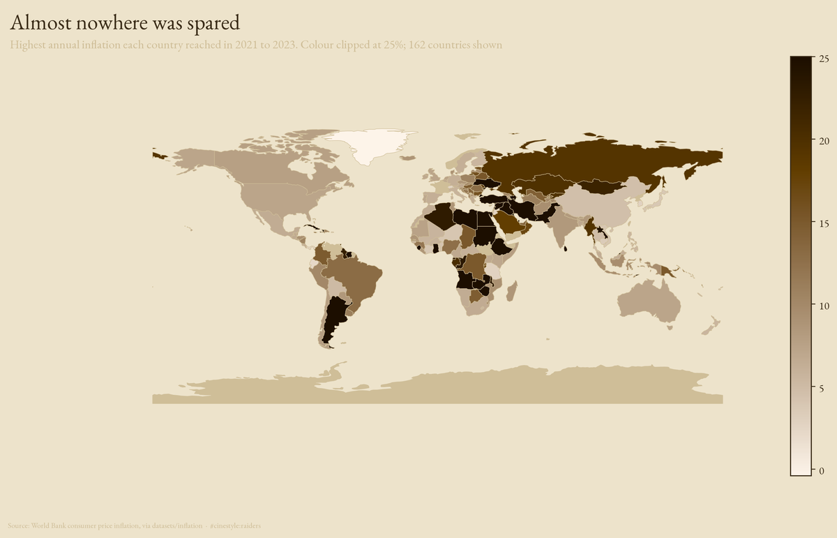
The advanced economies clustered tightly. The United States peaked at 7.1% across the window, the United Kingdom at 7.3%, Germany at 6.1%, Japan at a comparatively mild 3.8%. Those are the rich-world numbers that drove the headlines, and they are remarkably close to each other. The darkest shading sits where it usually does, across countries already prone to monetary stress. The colour scale is clipped at 25% so the global pattern reads; without the clip, seven hyperinflations would saturate the legend and flatten everyone else into the same pale wash.
Same shock, very different bills
Behind the synchronized map is a wide spread in how hard the shock landed. Set the hyperinflations aside, the seven countries above 50% in 2022, and the worst of the rest still ran punishing rates. Suriname peaked at 49.4%, Sri Lanka at 47.5%, Libya at 42.7%.
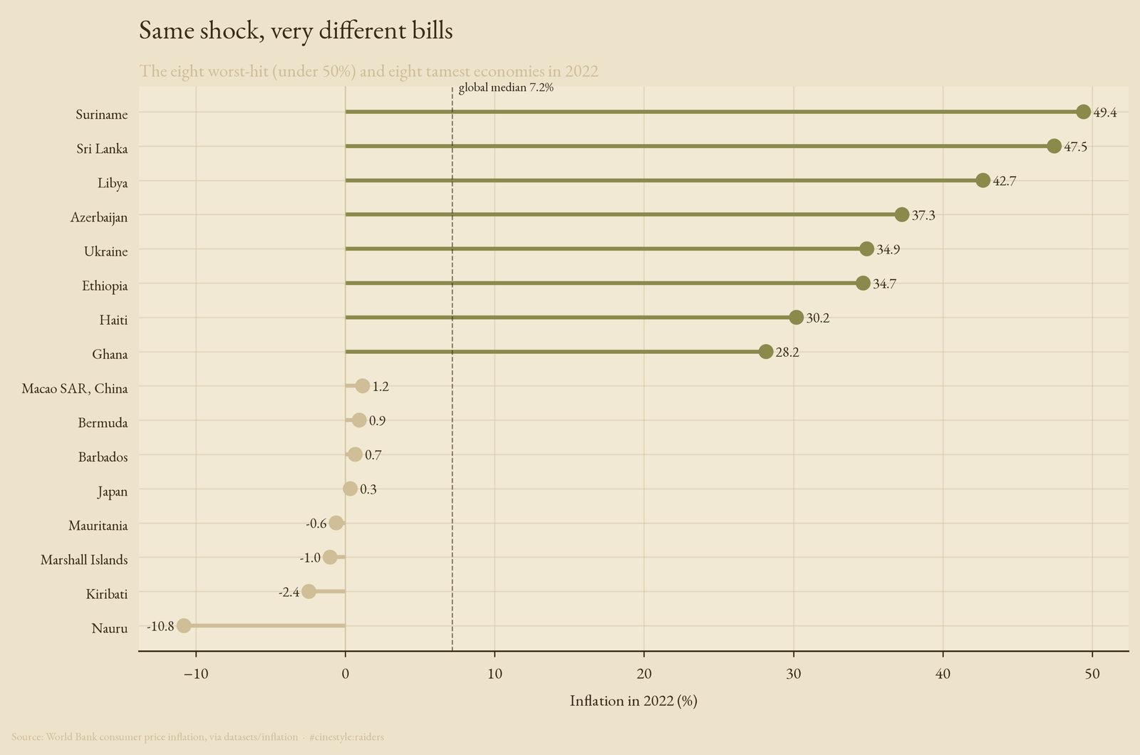
At the other end, a cluster of economies barely moved. Japan came in at 0.3%, and several small Pacific and Caribbean states actually saw prices fall: Nauru at minus 10.8%, Kiribati at minus 2.4%, the Marshall Islands at minus 1.0%. The same global shock, the same energy and supply-chain pressure, produced a 60-point gap between the worst and tamest economies in a single year. The shock was global. The exposure was local.
The honest caveats
Two things to flag. First, the hyperinflations. I excluded the seven countries above 50% from the distribution views and the colour scale, not to hide them but because they are a different phenomenon, monetary collapse rather than the demand-and-supply inflation the rest of the world felt. They are named here and counted in the results file; leaving them in the main charts would have told you about Zimbabwe instead of about the world. Second, this is annual data and it stops in 2023. The series cannot see the within-year peaks that monthly figures catch, and it does not show whether 2024 brought the world back to its old 2 to 4 percent range.
I started this expecting to find the worst inflation in modern history. The record says otherwise. The 1970s were worse, and by a wide margin. What 2021 to 2023 actually delivered was the most synchronized inflation in the data, a shock that arrived in seventy percent of the world’s economies in the same two years and then began to drain away. Breadth, not depth, was the historic part.