// article
Money and Life Expectancy
Money buys life expectancy, but the receipt is brutal
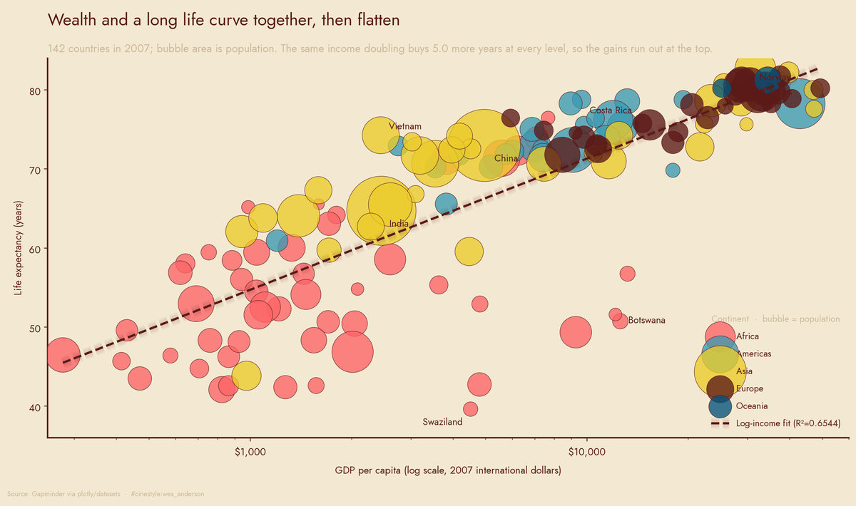
The first few thousand dollars a country earns buy more years of life than any dollar that comes after. This is the chart Hans Rosling built a career on, redrawn from the 2007 panel: every country a bubble, sized by population, placed by income on a log scale against lifespan. The curve is steep where countries are poor and nearly flat once they are rich. The outliers carry the story. The southern-African bubbles slump far below the fit line; China and India haul more than two billion people up the steep early stretch.
Fit life expectancy against GDP per capita across 142 countries in 2007 and a straight line explains 46% of the variance (R² = 0.4606). Swap in the log of GDP and the same fit jumps to 65% (R² = 0.6544). That gap is the story. Life expectancy does not track income. It tracks the logarithm of income, and a logarithm is a polite way of saying the returns collapse.
The data is the Gapminder country panel (Gapminder via plotly/datasets): 1,704 rows, 142 countries, six columns, every five years from 1952 to 2007. Three columns matter here: lifeExp, gdpPercap, continent. The GDP figures are inflation-adjusted international dollars, which makes them comparable across countries, though “comparable” is doing real work in that sentence. More on that at the end.
What “diminishing” actually looks like
The log fit gives a clean coefficient: every doubling of GDP per capita is worth about 4.99 more years of life. Not every extra dollar. Every doubling. Going from $1,000 to $2,000 buys five years. Going from $2,000 to $4,000 buys another five. From $25,000 to $50,000, also five in theory, except by then a country has nearly run out of life expectancy to buy.
You do not need to trust the regression to see it. Split 2007 into income quartiles and watch the mean life expectancy climb.
- Q1 (mean GDP $986): 53.12 years
- Q2 (mean GDP $3,564): 64.39 years
- Q3 (mean GDP $10,390): 71.56 years
- Q4 (mean GDP $31,518): 79.01 years
Each step up roughly triples income. The first step (Q1 to Q2) adds 11.27 years. The last step (Q3 to Q4), a comparable income leap, adds 7.45. The same money keeps buying less life. In the poorest quartile the dollars do the heavy lifting: sanitation, vaccines, not dying in childbirth. In the rich quartile the money pays for marginal gains against a biology that does not care how rich anyone is.
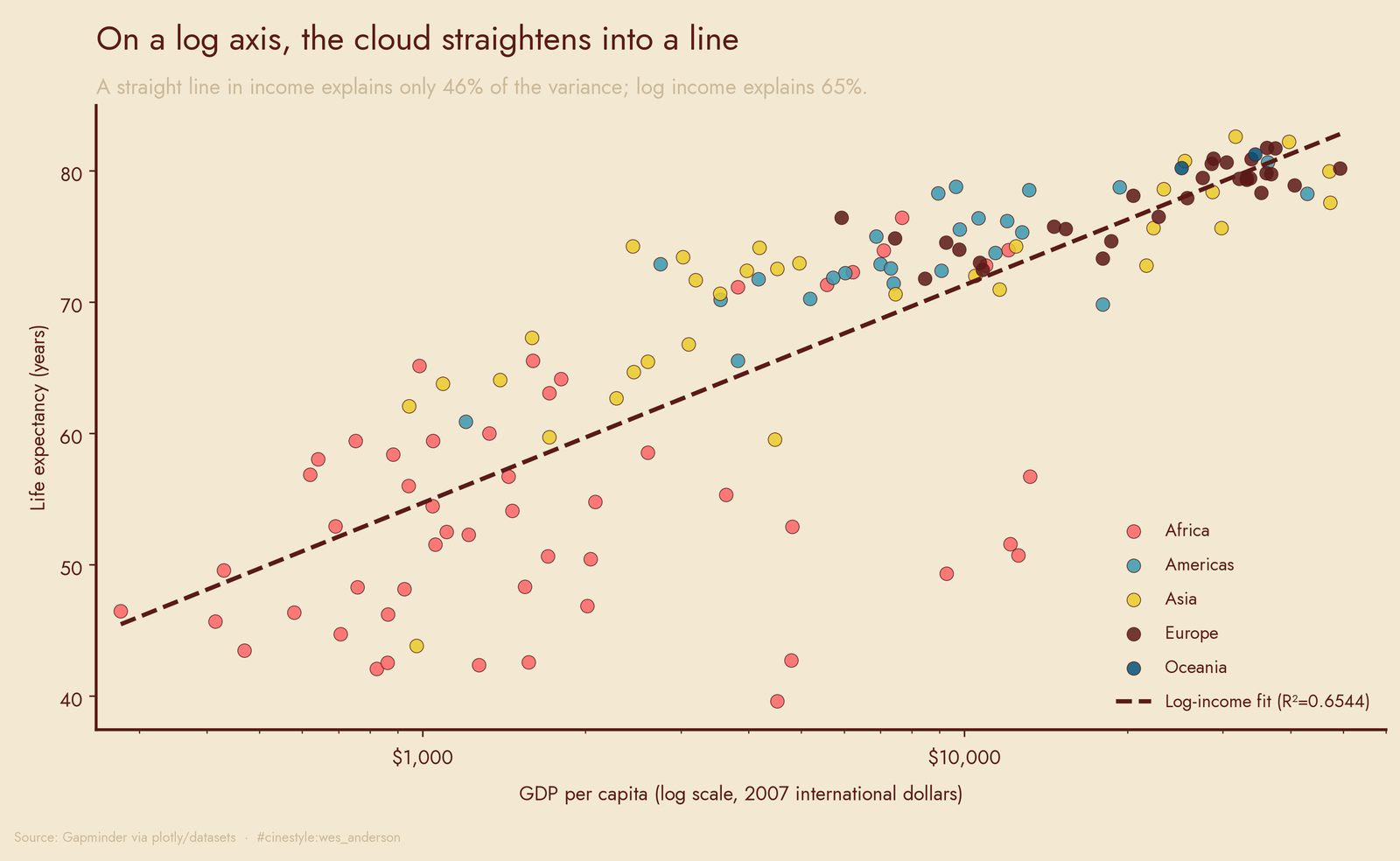
On a log x-axis the cloud almost straightens into a line, which is why the log fit wins. The dashed white line is that fit. The interesting part is the spread at the bottom left, which is enormous. At low income, life expectancy ranges from the high 30s to the low 70s. Money explains some of it. Something else explains the rest, and a model that only knows income cannot tell you what.
The half-century everyone forgets to be amazed by
Here is the number that made me stop. Mean life expectancy across these countries went from 49.06 years in 1952 to 67.01 in 2007, a gain of 17.95 years. The median moved harder still, from 45.14 to 71.94, a jump of 26.8 years. The median outran the mean because the gains landed where they were largest. The poor countries dragging the bottom of the 1952 distribution caught up fast.
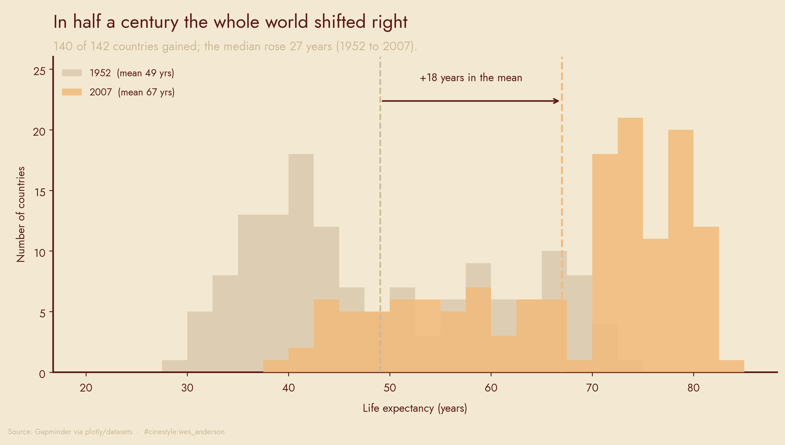
The whole distribution slid right. In 1952 the bulk of countries sat in the 30s and 40s. By 2007 the mass piles up in the 70s. This was not a few winners pulling an average. Of 142 countries, 140 improved. Two regressed.
The two are Zimbabwe (48.45 to 43.49, down 4.96 years) and Swaziland (41.41 to 39.61, down 1.79). Both are HIV/AIDS stories, and both are African. The biggest gainer, for contrast, was Oman at +38.06 years over the same window, with Vietnam (+33.84) and Indonesia (+33.18) close behind. Africa is the thread running through every dark corner of this dataset.
The Africa gap, and the countries that break the model
By 2007 the continental medians spread wide. Africa’s median life expectancy was 52.93 years. Europe’s was 78.61. That is a 25.68-year gap between the median African country and the median European one, alive at the same moment in history. Africa’s median GDP per capita ($1,452) is also the lowest, so part of the gap is the income story above. Not all of it.
The countries that break the log-GDP fit hardest are the ones worth staring at. Rank by residual and the four most over-performing, long lives on modest income, are Vietnam ($2,442, 74.25 years), Nicaragua ($2,749, 72.9), West Bank and Gaza ($3,025, 73.42), and Comoros ($986, 65.15). Vietnam lives 13 years longer than its income predicts.
Costa Rica does not even make that top four, but it is the cleanest illustration: $9,645 per capita, 78.78 years. Norway, the richest country in the 2007 panel at $49,357 per capita, more than five times Costa Rica’s income, lived 80.2 years. Five times the money. Less than a year and a half of extra life. That is one pair of numbers that explains diminishing returns.
The other tail is darker, and it is entirely southern Africa. The four countries living shortest relative to their income are Swaziland, Angola, Botswana, and South Africa, all middle-income by Gapminder standards, all roughly 21 to 26 years below what their GDP predicts. Botswana earned $12,569 per capita in 2007, well into the global middle class, and posted a life expectancy of 50.73. The 2000s HIV epidemic snapped the income-lifespan link in exactly the places the model expected to do well.
The caveat I cannot wave away
Every count here is country-weighted, not population-weighted. China and Tonga each count once. So “140 of 142 improved” is a statement about countries, not about humans. Given that China and India both sit in the improving 140, population weighting would only make the gains look larger. The GDP figures are inflation-adjusted, but cross-country purchasing-power comparison is genuinely imperfect, and the panel stops at 2007. Whatever the last seventeen years did to these curves, this data will not tell you.
What it does tell you is clean. The first few thousand dollars of income are the most valuable thing a country can get its hands on, and almost everyone got more of them.