// article
Decomposing Air Travel
44 passengers in 1949, 232 in 1960, the same summer bump
That is the number I keep coming back to. Take the airline-passenger series, look at how far apart the busiest and quietest month of each year sit, and in 1949 the gap was 44 passengers. By 1960 it was 232. The seasonal swing got 5.27 times wider over twelve years. But it is the same seasonality the entire time. Nothing about travel habits changed. The airline just got bigger, and a bigger airline has a bigger summer.
That fact is the difference between a model that works on this series and one that limps. So I will pull the series apart and show it.
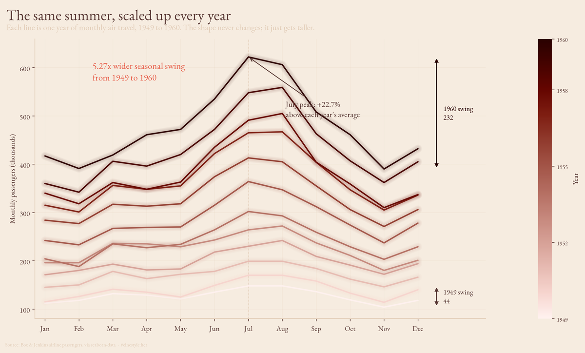
Stack every year on the same twelve-month axis and the whole argument is right there. Each line is one year. They all bend the same way, up into July and down into November, but the later, fatter lines swing through a much taller arc. The shape is fixed; only the amplitude grows. That is what “multiplicative” looks like before you have fit a single model.
The data is the Box & Jenkins airline series via seaborn-data: 144 monthly passenger totals, January 1949 through December 1960, running from a low of 104 to a high of 622. It is the textbook seasonality set, which is exactly why I am using it and exactly why you should not read a real-world capacity plan off it. Twelve years, one industry, the Eisenhower era. It is a clean teaching series, not a forecast for your business. With only 144 points, treat every decimal below as illustration, not gospel.
Three layers
Decomposition says any series is trend plus season plus whatever is left. The question is whether you add those layers or multiply them. I ran seasonal_decompose both ways and an STL fit on the logs, and the choice between additive and multiplicative is not cosmetic here. It is the central fact.
Start with the trend, the slow part. The 1949 monthly average was 126.7 passengers; by 1960 it was 476.2. That is a 3.76x increase, up 275.9%, which works out to a compound annual growth rate of 12.79% across the eleven year-over-year steps. The trend panel is a near-straight climb with a slight upward bend, growth a touch faster than linear. Air travel in the 1950s was a rocket leaving the pad.
Now the season. Averaging the multiplicative seasonal index by calendar month, July is the peak at 1.227, so July traffic runs 22.7% above the year’s baseline. The trough is November at 0.801, almost 19.9% below. The busiest month carries 1.53 times the traffic of the quietest. That summer-high, late-autumn-low shape repeats every single year, dead regular. People flew in July and stayed home in November in 1949, and they did the exact same thing in 1960.
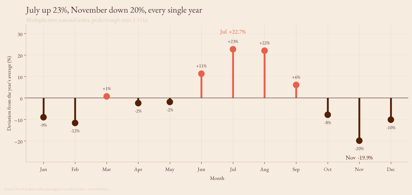
I expected December to be the trough, holiday-travel intuition talking. It is not. November is, with December sitting a hair higher at 0.899. The Christmas bump is real enough to lift December above its neighbors.
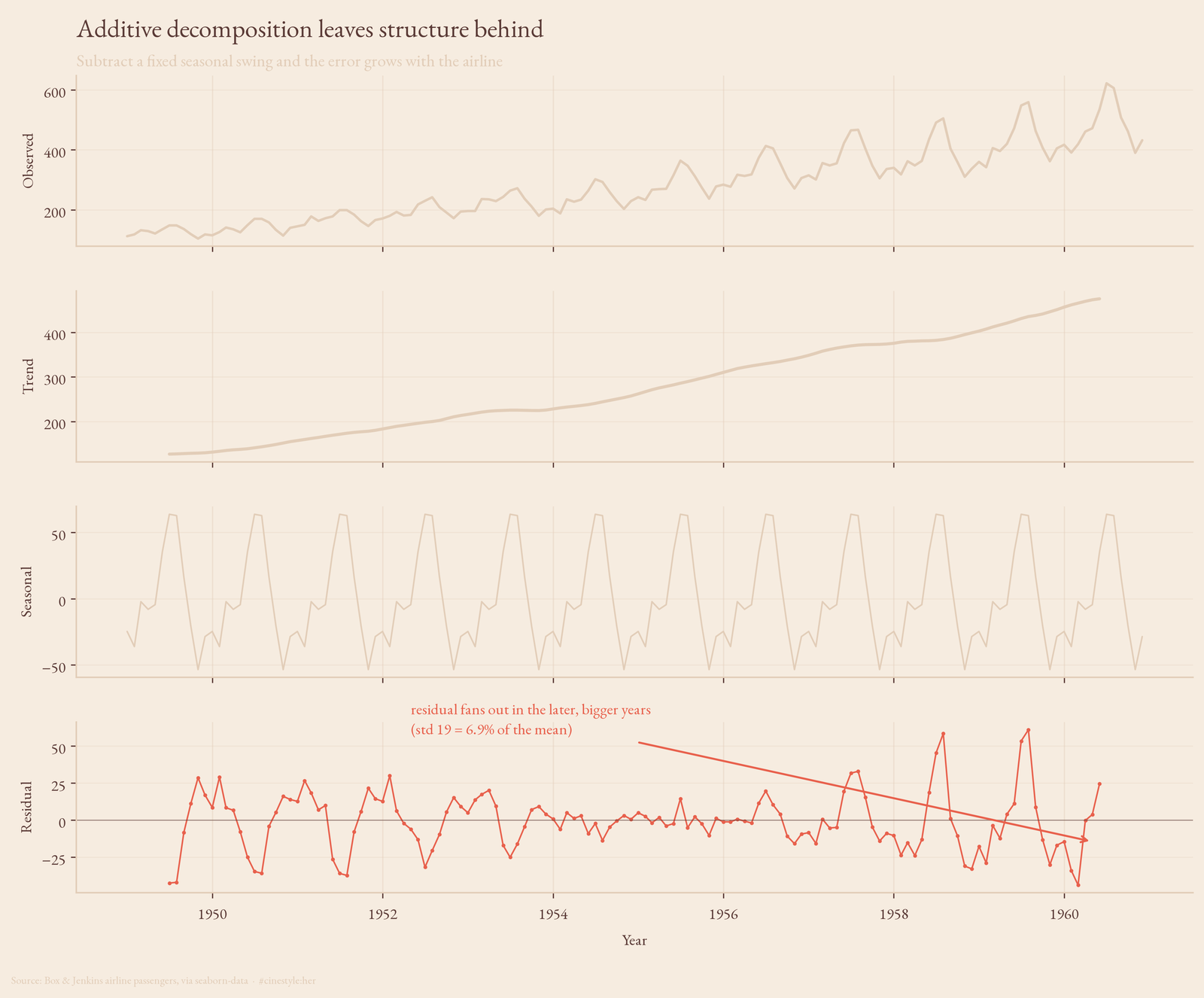
The tell is in the residual panel of the additive fit
Look back at that first figure, the additive one, and check the bottom panel. The residual is supposed to be structureless noise once you have stripped trend and season. It is not. It is small and flat through the early years, then it starts to fan out, the wiggles getting bigger as you move right. The additive model leaves a residual whose standard deviation is 19.3 passengers, about 6.9% of the mean level, and that error is not spread evenly across time. It is bunched in the later, bigger years.
That is the additive model failing in a specific, legible way. It assumed the summer bump is a fixed number of passengers. The bump is not a fixed number. It is a fixed fraction. A 22.7% July is 22.7% of a small airline in 1949 and 22.7% of a big one in 1960, and 22.7% of a bigger number is a bigger number. The additive fit keeps subtracting the same seasonal constant and keeps coming up short in the years where the real swing has grown past it.
So I measured the fanning directly. For each year, take the within-year range, busiest month minus quietest, and watch it against the year’s average level. The correlation is 0.991. Bigger years have wider swings, almost perfectly in lockstep. Fit a line and every extra 100 passengers of average traffic buys about 56 more passengers of seasonal range. A model that ignores that link will misfit exactly where the airline matters most.
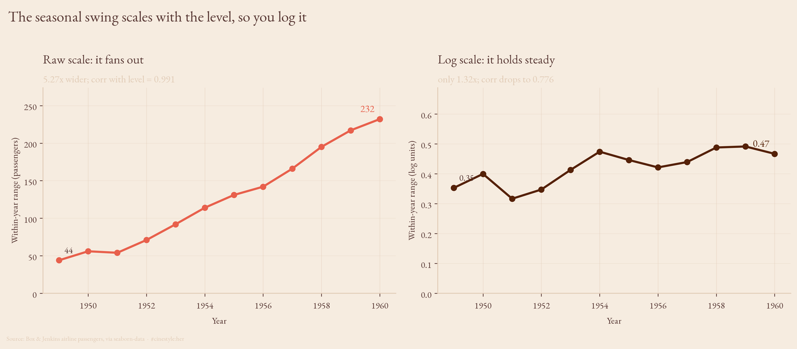
Why you model the log
When the swing scales with the level, you take logs, because logs turn multiplication into addition. Multiply the airline by 1.5 and the swing multiplies by 1.5 too. In log space that becomes adding a constant, and a constant gap is exactly what an additive model wants to see.
Does it work here? Mostly, and the left-versus-right panel above shows it. On the raw scale the within-year range runs 44 to 232, a 5.27x blowout. On the log scale the same ranges run 0.353 to 0.467, growing by only 1.32x. The coefficient of variation across the twelve yearly ranges drops from 0.498 raw to 0.131 in logs. The log transform flattened a fanning band into a nearly level one.
Nearly, not perfectly. The correlation between level and the log range is still 0.776, down from 0.991 but not zero. Logging did the heavy lifting and left a residue, which is the honest version of “multiplicative”: this series behaves enough like a constant-ratio process that logs are obviously the right move, not so cleanly that the last trace of structure disappears.
The proof is in how little is left. Run STL on the logged series and the trend-plus-seasonal layers explain 99.64% of its variance. The residual standard deviation is 0.0265 in log units, which translates to roughly a 2.7% wobble on the raw scale. The multiplicative seasonal_decompose agrees: its residual has a standard deviation of 3.34%, with the single worst month landing 10.6% off. After you account for “the airline is growing 12.8% a year” and “July is up 23%, November down 20%,” you have described 99.6% of what the data does. The remaining 3% or so is the genuinely unpredictable part: a strike, a fare change, weather.
That is the case for decomposition as a first move, before any forecasting. Two human sentences, it grows about 13% a year and it swings 20% with the seasons, reconstruct nearly the entire series. The only real modeling decision is whether those two effects add or multiply, and the residual panel of the additive fit tells you, in plain sight, that they multiply. Which is the whole reason you log it first.