// article
Forecasting Air Travel
Losing to Holt-Winters by 4.6 points was the good news
On a 24-month holdout of the airline-passenger series, a seasonal-naive forecast (copy the value from twelve months ago, nudge it up for growth) scored 11.22% MAPE. Holt-Winters on the logged series scored 6.65%. The fancy model won, by 4.57 percentage points. I went in half-expecting the baseline to come within spitting distance and embarrass the statsmodels call. It did not. But the more useful number is the one in between: a plain seasonal-naive, with no growth correction at all, came in at 15.52%. The single act of scaling the copy-paste forecast for the trend cut its error by almost a third. That is where the real lesson lives.
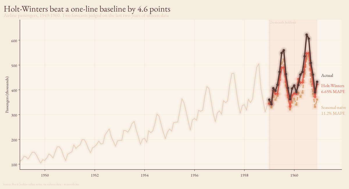
The whole argument is in that one chart. Both forecasts trace the right shape, December dips and summer peaks, but the naive line rides consistently below the actuals because a flat 3.4% growth bump cannot keep up with traffic that is still accelerating. Holt-Winters bends with the acceleration and the two years of held-out data reward it for it.
The data is the Box & Jenkins airline series via seaborn-data: 144 monthly totals, January 1949 through December 1960, passenger counts climbing from 104 in the trough to 622 at the peak. It is the canonical seasonality dataset, which means it is also a teaching toy: 144 points, one airline industry, the Eisenhower administration. Do not read a 2026 capacity-planning strategy off it. Read the method off it.
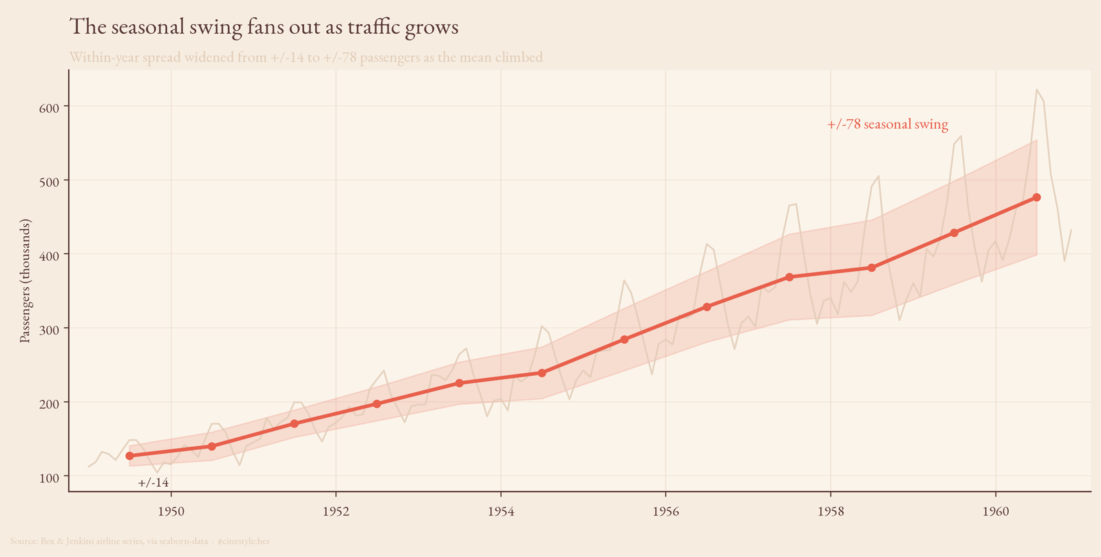
The swing grows with the level
Plot the raw series and the shape jumps out: every year is December-low, summer-high, and the gap between those two gets visibly wider as you move right. In 1949 the within-year standard deviation was 13.7 passengers. In 1960 it was 77.7. Over that same stretch the annual mean went from 127 to 476. The swing did not stay put and let the trend slide underneath it. It grew with the trend.
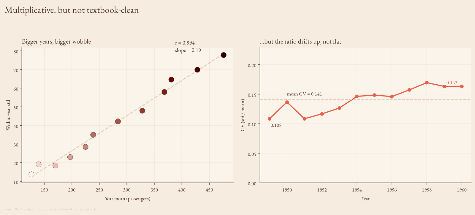
That is the signature of multiplicative seasonality, and you can pin a number on it. Correlate each year’s mean against its within-year standard deviation and you get r = 0.994. Bigger years have bigger wobble, almost perfectly. Fit a line through it and the slope is 0.19: every extra 100 passengers of average traffic buys you roughly 19 more passengers of seasonal spread.
If the seasonality were additive, a fixed summer bump of a fixed size no matter how big the airline got, that correlation would be flat and the coefficient of variation (std over mean) would shrink as the denominator grew. It does not shrink. The CV runs from 0.108 in the first year to 0.163 in the last, averaging 0.141. So here is my honest caveat against my own framing: the CV is not dead flat. It drifts up a little. A purist would say the structure is mostly multiplicative with a touch of something extra going on, not a textbook constant-ratio process. The correlation evidence is overwhelming; the CV evidence is strong but not pristine. Both can be true.
Why you log first
When variance scales with the level, you take logs. Multiply the level by 1.5 and the swing multiplies by 1.5 too. But in log space multiplication becomes addition, so a constant ratio turns into a constant gap. The fanning-out flattens into a band of even width.
You can see it and you can measure it. Side by side, the raw series flares while log(passengers) marches up at a steady amplitude.
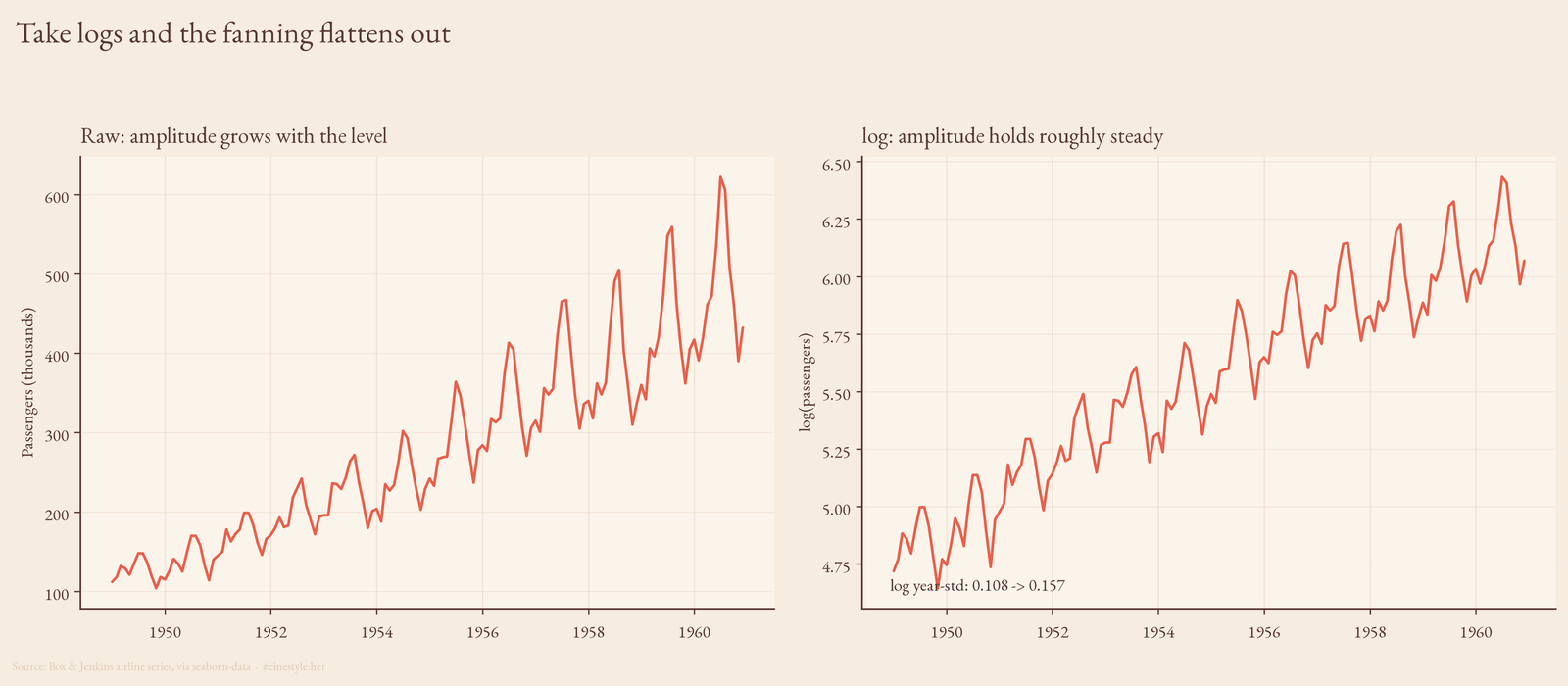
Did it fully work? Mostly. The within-year std of the logged series went from 0.108 in 1949 to 0.157 in 1960, closer together than the raw 13.7-to-77.7 blowout but not identical. And the correlation between year-mean and logged year-std is still 0.855, down from 0.994 but nowhere near zero. The log transform did the heavy lifting and left a residue. That residue is the same thing the CV drift was telling us: this series is not a perfectly clean multiplicative process, it just behaves enough like one that logging is the obviously right move before you fit anything.
The bake-off, honestly
I trained on the first 120 months (1949 through 1958) and held out the last 24 (1959 to 1960). Two contenders.
The seasonal-naive baseline: for each month in the horizon, take the value from twelve months back and multiply by an annual growth factor. I estimated that factor from the train tail (mean of the last twelve months over the mean of the prior twelve) and got 1.0342, about 3.4% a year. Square it for the second forecast year. That is the whole model. No fitting, no optimizer, eight lines of array indexing.
Holt-Winters: additive trend, additive seasonality, twelve-month period, fit on the logged training series and exponentiated back. Additive-on-log is multiplicative-on-raw, which is exactly the structure we just established the data has.
| Model | MAPE | RMSE |
|---|---|---|
| Seasonal-naive, plain | 15.52% | 77.0 |
| Seasonal-naive, scaled for growth | 11.22% | 56.4 |
| Holt-Winters on log | 6.65% | 37.0 |
Holt-Winters wins clean: 6.65% against 11.22%, a 4.57-point gap, and RMSE 37 against 56. On this series the baseline does not sneak up and steal the show. I will own that; I expected a closer race and the holdout said no.
But look at what scaling did. The plain naive, copying last year’s shape with zero trend adjustment, lands at 15.52%. Add one growth multiplier and it drops to 11.22%, a 4.3-point gain from a single ratio, almost as large as the entire gap to Holt-Winters. The lead chart shows why. The naive line tracks the shape of every peak and trough correctly, it just sits a touch too low because a 3.4% flat annual bump cannot quite keep pace with traffic that is actually accelerating. Holt-Winters models that acceleration directly, which is the 4.6 points it earns.
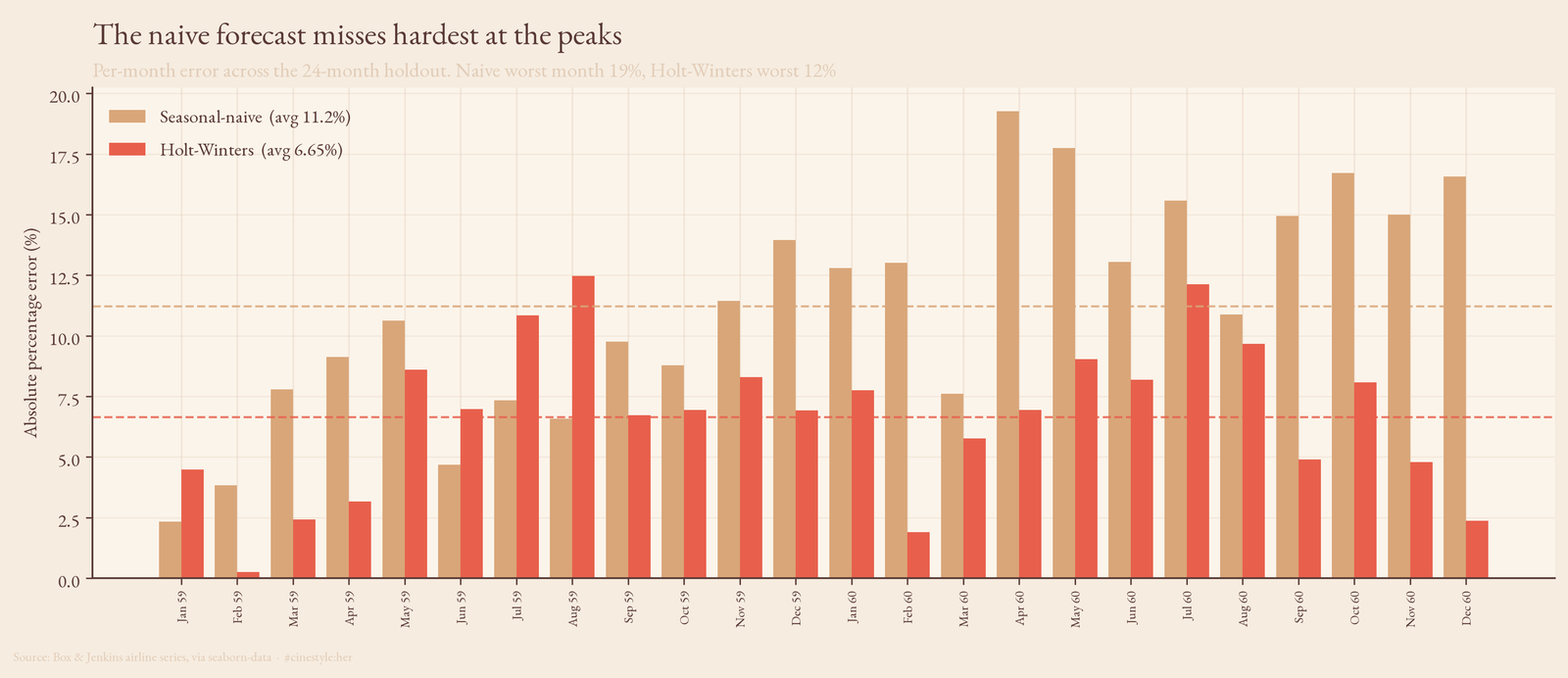
Break the error out month by month and the failure mode is obvious: the naive bars spike at the summer peaks, where the under-scaling hurts most, topping out near 19% in a single month against a Holt-Winters worst of 12%.
So the ranking is real and Holt-Winters deserves it. The thing I would carry to a series I had not seen before is the slope underneath the ranking: most of the error in a naive seasonal forecast is trend you forgot to add, not seasonality you got wrong. Get the level right and a one-liner is already inside 11% on two years of unseen data. Whether the extra 4.6 points is worth a fitted model is a question only your error budget can answer. On 144 points of 1950s data, I would not bet the budget on it generalizing anywhere.