// article
The Dow's Fat Tails
The Dow's worst month was a 5-sigma event a bell curve says is impossible
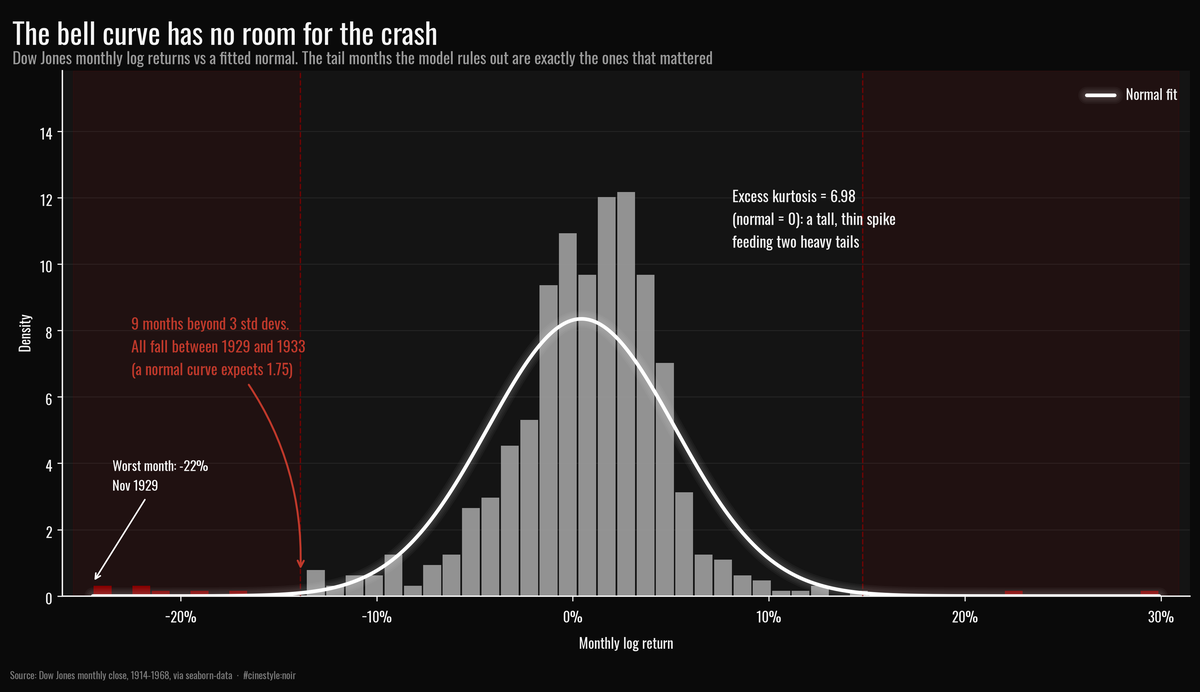
The bell curve is a fine model for monthly stock returns right up until the month that ruins you. Fit a normal to 648 monthly Dow returns and count what falls outside three standard deviations: nine months, where the curve budgets 1.75. Every one of those nine sits between 1929 and 1933. The model is not a little off in the tails. It has essentially nothing out there, and what it is missing is the part that bankrupts people.
Three months in this dataset moved more than five standard deviations. A normal distribution, fit to the same 648 monthly returns, expects that to happen 0.0004 times. Not three. Not once. Across the lifetime of the universe a few times over, basically never. So either I got monstrously unlucky with a coin that lands fair, or the coin is not fair. It is the coin.
The data is the Dow Jones index, monthly closes from December 1914 to December 1968, pulled from the seaborn-data historical set. That is 649 price points, 648 log returns, one per month over 54 years. This is monthly data, not daily. The median gap between observations is 31 days. So when I say volatility clusters, I mean month to month, and the tail events are whole bad months, not flash crashes. It is also a 54-year window that ends in 1968: pre-decimalization, pre-electronic-trading, pre-most-things. I am not giving investment advice off a series that stops during the Johnson administration. The question is whether the standard assumption, that returns are normal, independent, and identically distributed, survives contact with real prices. It does not.
The tails are the whole story
Excess kurtosis of the monthly log returns is 6.98. A normal distribution has excess kurtosis of exactly zero. Picture the distribution as a tall thin spike pinned over the mean with two long arms reaching out sideways: most months pile up near the 0.44% mean, and then occasionally the floor drops out.
Count the months the model cannot explain. Using the sample mean and standard deviation (4.78% monthly), 9 months moved more than three sigma from the mean. A normal distribution over 648 draws predicts 1.75 such months. The data has roughly five times as many three-sigma months as the textbook allows. Push to five sigma and it gets absurd: 3 observed, 0.0004 expected. The Jarque-Bera test, which keys directly off skew and kurtosis, returns a statistic of 1391 and a p-value of 1e-302. That is not “probably non-normal.” That is a number so small the float underflows on its way to zero.
The flagship histogram above makes it concrete. The grey bars are the real returns; the white curve is the best-fit normal, and the bars beyond three standard deviations are shaded red. The center spikes well above the curve, because calm months are more common than normal predicts. Out past -15% on the left edge, the normal curve has flatlined to nothing, but there are still bars standing there. Those red bars are 1929, 1931, and 1932, the Crash and the slow bleed after it. The normal model spends its probability on moderate moves that happen less often than it thinks, and keeps nothing in reserve for the catastrophes that actually occur.
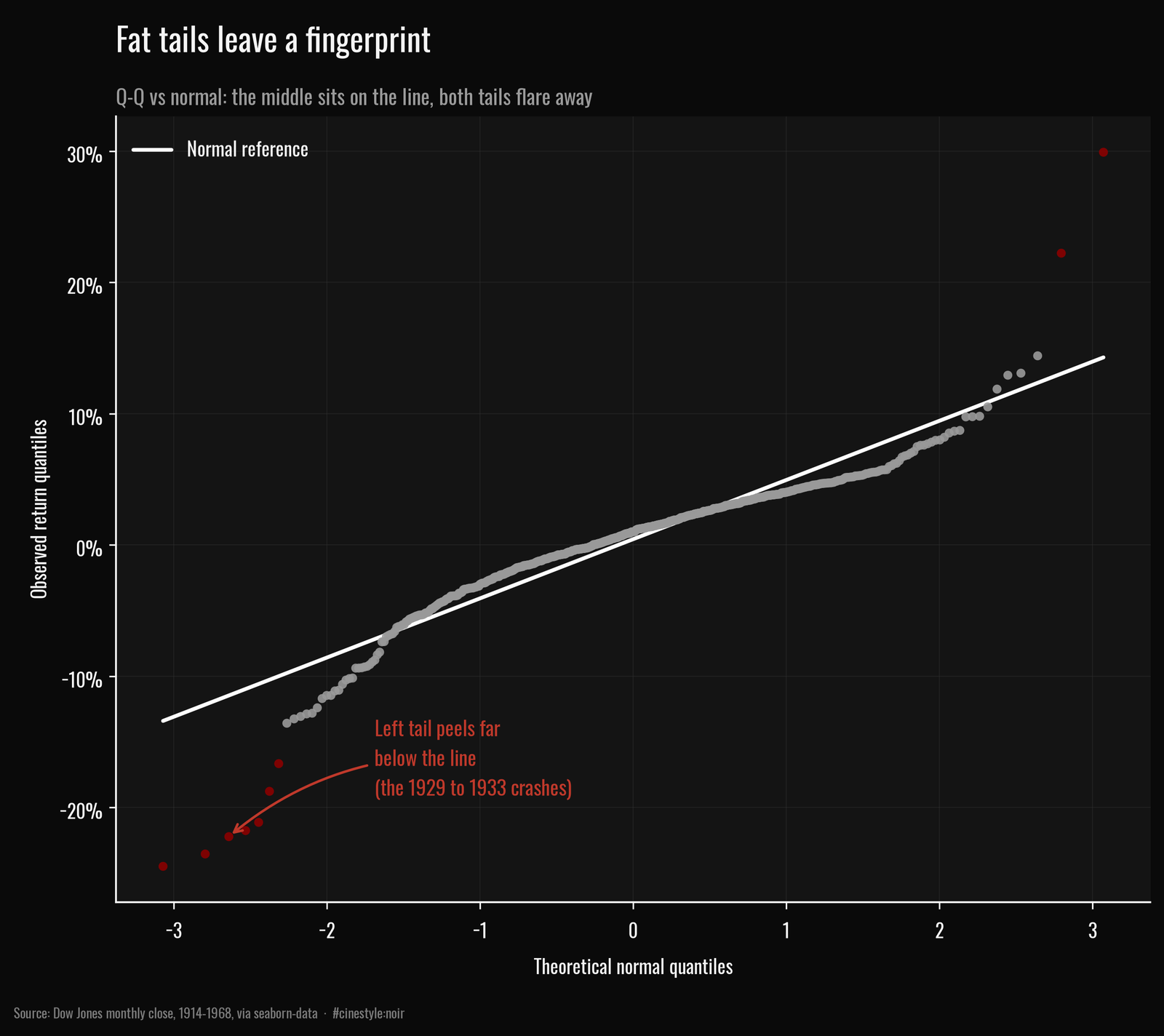
The Q-Q plot is the cleaner tell. If returns were normal, the dots sit on the white reference line. In the middle they roughly do. But both ends peel away: the bottom-left points (flagged red) crash down below the line, the left tail far heavier than normal, and the top-right lift above it. That S-shape, both tails flaring out, is the fingerprint of a fat-tailed distribution. What I find honest about this chart is how boring the middle is. For most of the range the normal approximation is fine. It fails exactly where failure is expensive.
Calm begets calm
Now the clustering. The claim is that volatility is sticky. A violent month tends to be followed by another violent month, and a sleepy month by another sleepy one, even though the direction of returns is close to a coin flip.
The standard way to show this is two autocorrelation functions. One on the raw returns, which captures whether up-months predict up-months. One on the absolute returns, which captures whether big months predict big months regardless of sign. If the textbook held, both would sit inside the white-noise band.
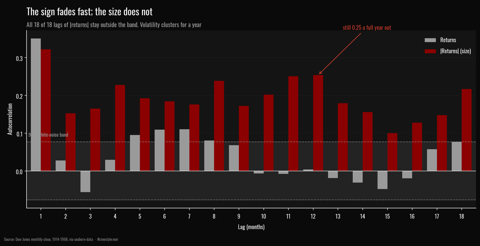
This dataset threw me a curveball here, and I am keeping it in. The raw-return ACF (grey) is not clean white noise. Lag-1 autocorrelation of returns is 0.35, and 5 of the first 18 lags poke outside the 95% band. That is real positive momentum at the monthly horizon, partly genuine and partly the smoothing you get from monthly-sampled index levels. So the “returns are uncorrelated” half of the stylized fact is only loosely true here. I had expected a flatter grey series.
But the absolute-return ACF (red) is the point, and it is emphatic. Every single one of the first 18 lags sits outside the band. Lag-1 is 0.32, and instead of decaying to zero it is still 0.18 at six months and back up to 0.25 at twelve. Think of a struck bell: the pitch fades fast but the ring carries. Volatility does not just persist month to month, it echoes a full year out. Squared returns tell the same story (lag-1 of 0.32). The size of a move carries information about future move sizes long after the sign has stopped mattering. The market has regimes, and it stays in them.
The 87% hole
The worst single month in the series is November 1929, a log return of -24.5%, a -21.7% drop in the index level. That alone is the kind of move the normal model rules out. But the months did not arrive in isolation, which is the clustering point made painful.
From its September 1929 peak at 362.35, the index fell to 46.85 by June 1932. That is a maximum drawdown of 87.1%. Nearly three years of losses, stacked, one bad month feeding the next. If returns were independent draws, a run that long and that deep would be vanishingly unlikely. They are not independent. Bad volatility clustered, the regime held, and the index gave back nearly everything.
So the two stylized facts are not separate curiosities. The fat tail and the cluster are the same phenomenon seen from two angles: extreme months exist, and they show up next to each other. A model that assumes independent normal returns gets both the size and the timing wrong, and it gets them wrong in the exact corner, deep and sustained losses, where being wrong costs the most.
What I cannot tell you from 54 monthly points that stop in 1968 is whether the shape of the tail is stable, or whether it is just one historic crisis doing all the heavy lifting. Every one of the nine three-sigma months falls between October 1929 and May 1933, the Crash and the Depression-era whipsaws. Pull those four years out and the tail thins dramatically. With 648 returns and a handful of five-sigma months, the tail estimate rests on a tiny number of observations. That is the uncomfortable thing about fat tails: the events that define them are, by construction, the ones you have almost no data on.