// article
A Diamond's Four Cs
Two of a diamond's measurements are basically decoration
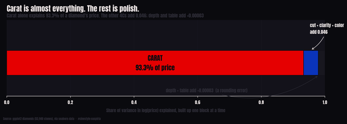
Carat sets a diamond’s price. On 54,000 stones, carat alone explains 93.3 percent of the variation; everything else a jeweler will walk you through, depth and table percentages included, is polish on top of that one number. Two of those measurements add nothing you can detect at all.
Add depth percentage and table percentage to a model that already knows the 4Cs, and the R-squared goes up by 0.00003. That is three hundred-thousandths, not three percent. On 53,920 diamonds, two whole columns of careful gemological measurement buy you a rounding error.
I went looking for which of the standard diamond attributes actually move price, expecting the answer to be “all of them, a bit.” It is one attribute doing the heavy lifting, two more chipping in, and a couple you could delete from the spreadsheet without anyone noticing.
The data is the ggplot2 diamonds set, 53,940 stones, loaded through the catalog (source: ggplot2 diamonds, via seaborn-data). The columns are the 4Cs (carat, cut, color, clarity), the price in dollars, plus the physical dimensions x, y, z and two ratios, depth and table. Depth is the stone’s height as a percent of its width; table is the flat top facet as a percent of width. Both are things a cutter sweats over. I dropped 20 rows with a zero in x, y, or z, physically impossible and clearly data errors, then worked in log price, the space the first pass at this dataset already showed is the right one.
The staircase
Build the model up one block at a time and watch the R-squared climb. Each step is an ordinary least squares fit on log price. I encoded cut, color, and clarity as integer ranks from worst grade to best, so a positive coefficient means better grade, higher price.
Log carat alone gets you to 0.933. Add cut and you reach 0.936. Add clarity and color and it jumps to 0.979, a gain of 0.043, the second-biggest move in the whole exercise. Then add depth and table: 0.97925. Then add the three physical dimensions: 0.97927.
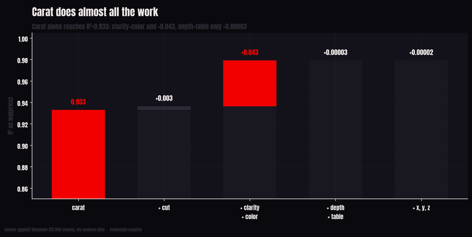
Picture the bars at true height. The first bar is a wall, the clarity-and-color step a visible ledge, and the last two are nearly the same height. Depth and table together moved the explained variance by 0.00003. The x/y/z block, all three dimensions, added another 0.00002 on top, and most of that is just carat wearing a different hat, since a bigger stone is a wider stone. Size keeps showing up no matter how you slice the columns.
Why depth and table flatline
A skeptic would say a model already at 0.979 has no variance left to explain, so of course new columns add nothing. So I refit the whole thing with every predictor standardized, which makes the coefficients comparable, each one the effect of a one-standard-deviation move in that feature on log price, and pulled the p-values from statsmodels.
Carat’s standardized coefficient is 1.06. Clarity’s is 0.20, color’s 0.13. Depth’s is -0.003. Table’s is -0.0005, with a p-value of 0.52, fully consistent with no effect. Table percentage, conditional on everything else, has no detectable linear relationship with price. Depth scrapes statistical significance (p = 0.0008) purely because 54,000 rows will flag almost anything, but a standardized coefficient of -0.003 is economically nothing. Move a diamond a full standard deviation in depth and its price moves by three-tenths of one percent.
The permutation check agrees. Shuffle log carat in the held-out set and test R-squared drops by 2.16. A drop bigger than 1 is not an error: with carat scrambled, the model predicts worse than a flat line at the mean, so held-out R-squared goes negative. Shuffle clarity, it drops 0.079; color, 0.034. Shuffle depth or table and the drop is -0.000002 and -0.000003, negative, meaning the model got trivially better with the column scrambled.
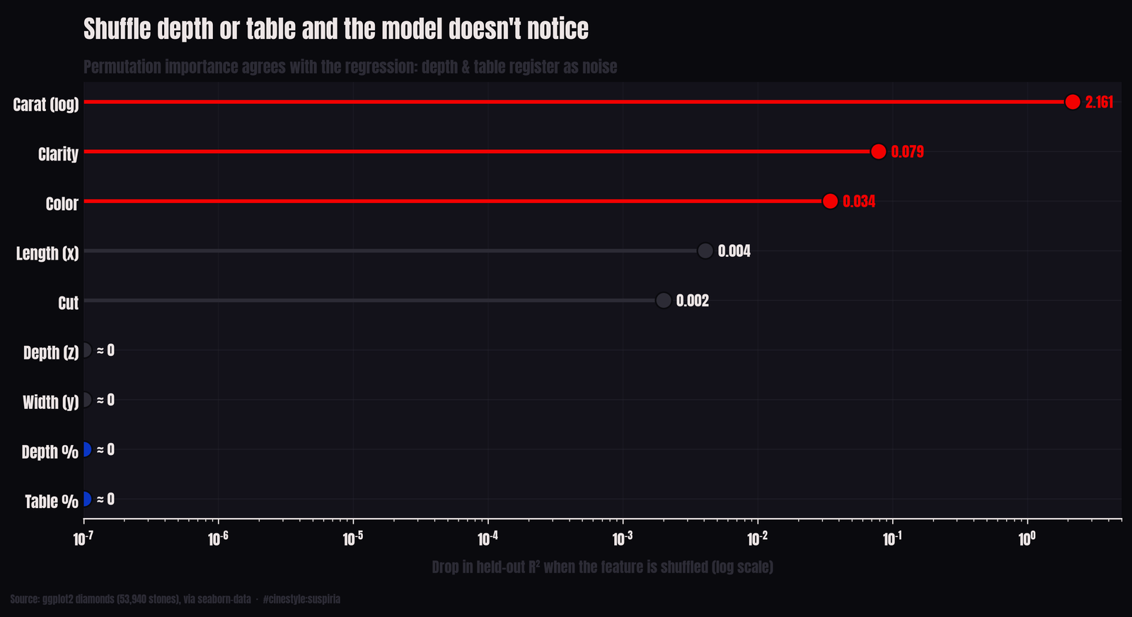
This is not saying cut quality is irrelevant. Depth and table are inputs to the cut grade; a well-cut stone holds them in a good range. But the dataset already hands you the cut grade as its own column, so the raw ratios are redundant, and even the cut grade itself only earns a standardized coefficient of 0.034. The thing buyers say they care about barely registers once size is on the table.
One warning about the size coefficients. Log carat and the x, y, z dimensions all measure size, so they share credit. Drop each column from the full model and measure what R-squared it alone adds, and clarity (0.0323) contributes more unique fit than log carat (0.0116), because x picks up most of what carat would otherwise explain. Its standardized coefficient of 0.0416 is larger than cut’s. The 1.06 for carat is size’s coefficient, split with the dimensions, not carat’s alone.
What clarity is actually worth
The flip side of “carat dominates” is that the confound hides everything else. In the raw data the grades are tangled with size, so a grade comparison is mostly a size comparison. To see clarity clean, I held carat nearly fixed (the 0.9 to 1.1 carat band, 10,325 stones, median 1.01 carat) and looked at median price across clarity grades.
The gradient is steep and monotonic. I1, the worst clarity present, runs a median of $2,657. IF, internally flawless, runs $10,056. Same size, and the cleanest stones cost 3.78 times the most-included ones, a spread of $7,398 on a one-carat diamond. Every step up the clarity ladder adds money: SI2 to SI1 to VS2 to VS1, climbing the whole way.
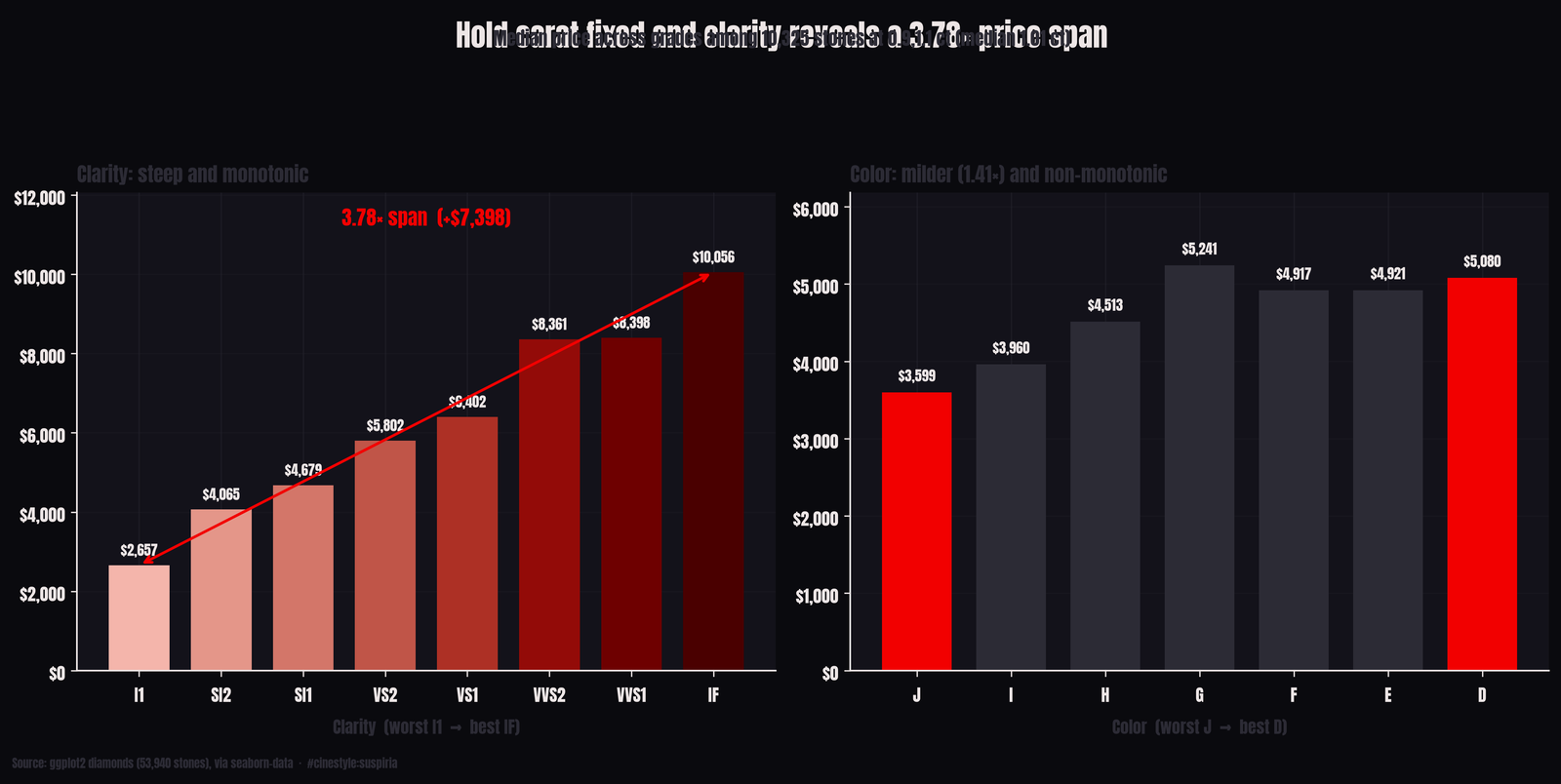
Clarity matters, but it only shows once carat is held fixed.
Color is where I have to keep myself honest. Run the same fixed-carat exercise and the worst color, J, medians $3,599 while the best, D, medians $5,080, a 1.41x premium, real but milder than clarity. The catch is that the color gradient inside this band is not clean: G medians $5,241, higher than D. That is almost certainly the other grades leaking in. A G stone here might carry better clarity than the D stones it is compared against. It is exactly the kind of wrinkle a single-variable median cannot fix. The full standardized model, which controls for everything at once, still puts color’s coefficient (0.13) below clarity’s (0.20), so the ranking holds even where the crude median wobbles.
If you are spending money on one of these stones, the model’s advice is blunt. Carat sets the price, and clarity then color are the upgrades worth paying for. Cut grade barely moves the number, and depth and table, the two ratios a jeweler will happily walk you through, are, as far as 54,000 prices can tell, decoration.