// article
The Deadliest Mountains
The deadliest mountain is not the one you think
Everest is the famous one, the tall one, the one with the queues, and not the dangerous one. Across 76,519 climber records in the Himalayan Database, Annapurna I kills 4.3 percent of the people who go up it. Everest kills 1.4, almost exactly the 1.445 percent average across every peak in the record. The peaks that frighten the people who actually climb them are rarely the peaks that frighten everyone else.
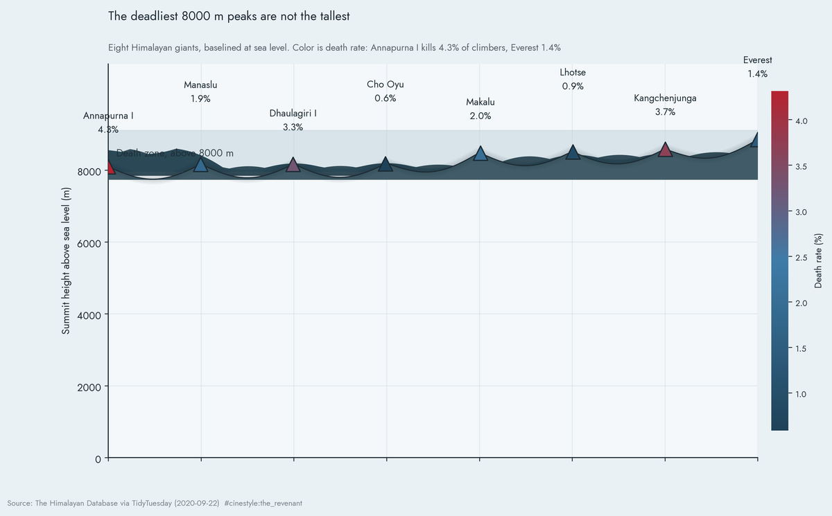
Eight giants, all within about ten percent of each other in height, drawn honestly from sea level so none of them towers over the rest. Height cannot tell them apart, so I threw height away as the signal and colored each summit by how often it kills. The red summits, the killers, are not the tall ones.
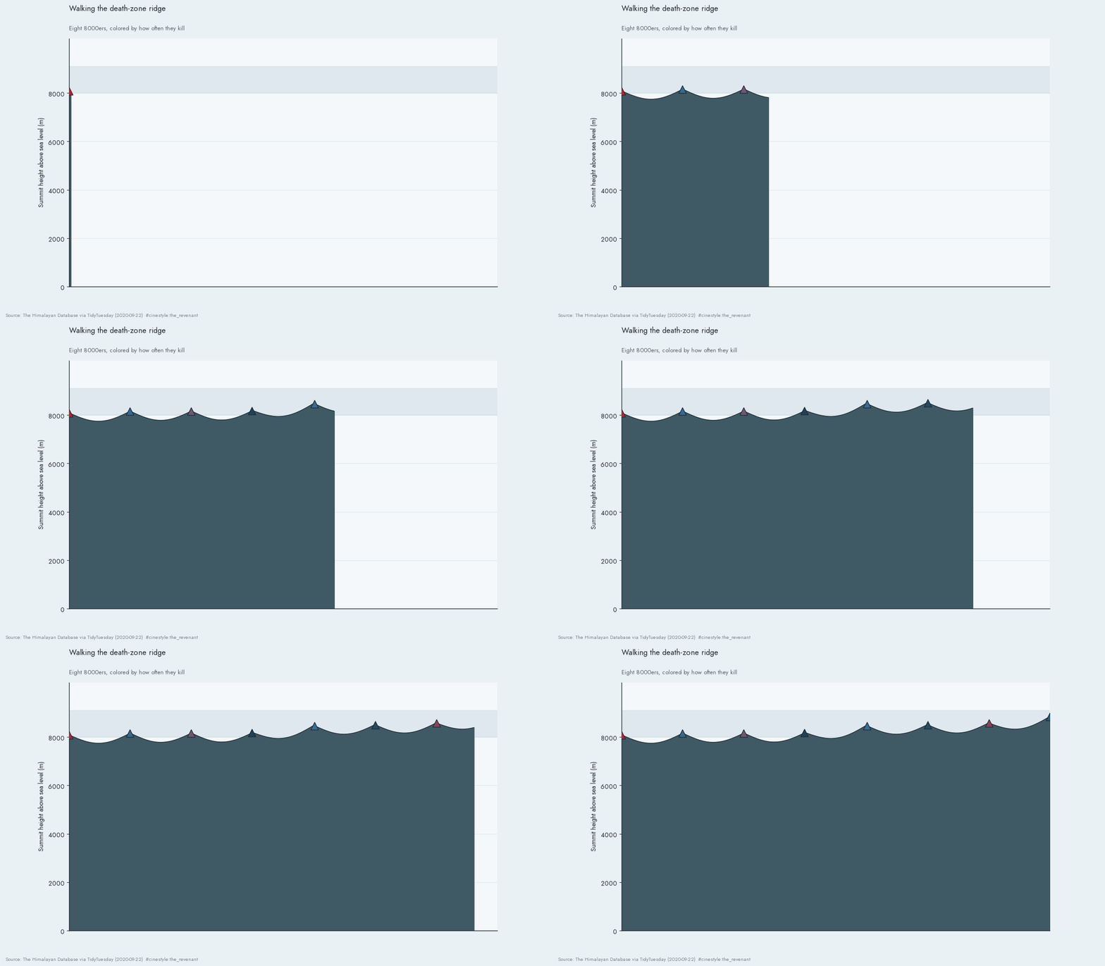
A short climb of the same ridge, if your reader wants the terrain to assemble itself:
Why a mountain chart has to start at sea level
There is a tempting version of this chart that crops the y-axis to start at 8000 metres. It looks dramatic, and it misleads. The tallest of these peaks, Everest at 8850 metres, is only 1.09 times the height of the shortest in the group, Annapurna I at 8091. Baseline the chart at 8000 and only the slivers above 8000 survive, and Everest looks about nine times taller than a peak it beats by nine percent. The silhouette would be carrying a ratio the data does not contain.
So the baseline sits at zero. Every summit is a thin band near the top of the frame, because that is what these mountains actually are: heights that barely differ, packed into the last tenth of the climb. When the thing you want to show does not vary, stop encoding it as size. Color carried the death rate instead, and the chart stopped lying.
The killers
Rank the peaks by death rate and the order has nothing to do with fame.
- Annapurna I: 4.3 percent
- Kangchenjunga: 3.7 percent
- Dhaulagiri I: 3.3 percent
- Everest: 1.4 percent
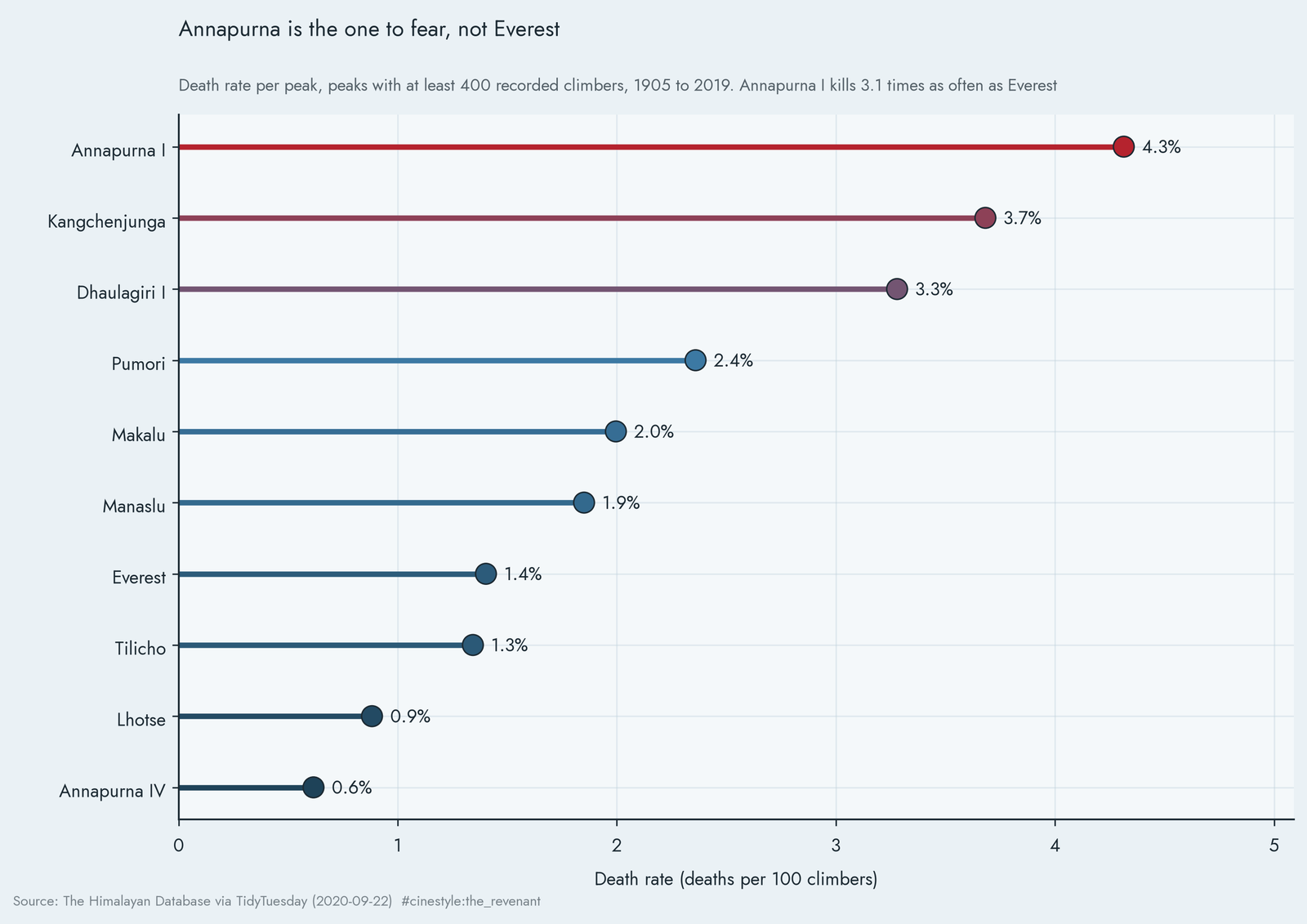
I restricted this to peaks with at least 400 recorded climbers, because death rate is a ratio and ratios go haywire on small samples. One fatal accident on a peak climbed twice reads as a fifty percent death rate, which tells you nothing. With that floor in place, Annapurna I sits at the top with 72 deaths across 1,669 attempts. Everest, for all its 21,813 climbers and 306 deaths, lands seventh. The mountain that gets the documentaries is roughly three times safer than the one that does not.
What makes Annapurna worse is not height. It is the terrain above the climbers. Annapurna’s normal routes run under enormous hanging seracs and avalanche-loaded faces, and a wall of ice does not care how strong you are. Everest’s standard routes are high but comparatively predictable; the death rate follows what hangs overhead, not the altitude.
The oxygen line
Now the cleanest natural experiment in the dataset. On Everest, some climbers use supplemental oxygen and some refuse it, and the database records which. So I split Everest by that one choice, which holds the mountain fixed but not the route, the season, or who chooses to go without.
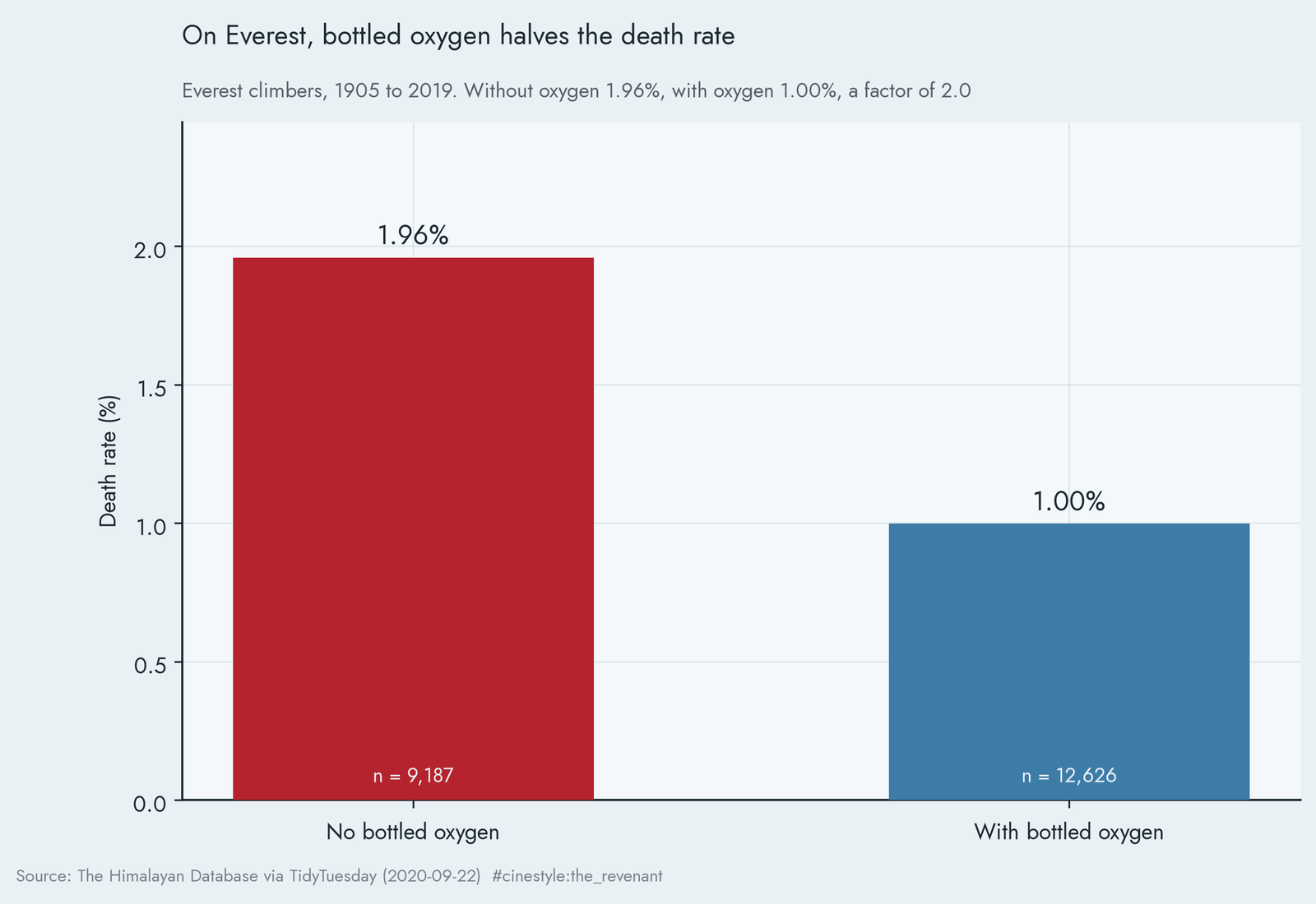
Without bottled oxygen, 1.96 percent of Everest climbers died, 180 deaths across 9,187 records. With it, 1.00 percent died, 126 deaths across 12,626. Each record is one expedition member, not one summit attempt, and it includes members who never went high on the mountain. The gas roughly halves your odds of dying on the mountain. This is not a randomized trial, and the people who skip oxygen are a self-selected, often more extreme group, so the true causal effect is tangled with who chooses what. But the raw gap is a factor of two on a sample of more than twenty thousand people, on one mountain. The body above 8000 metres is slowly suffocating, and a tank of oxygen is the only thing that argues with the altitude.
The mountains got safer
The last finding is the hopeful one. Bin every climber by the decade of their attempt and the death rate falls off a cliff.
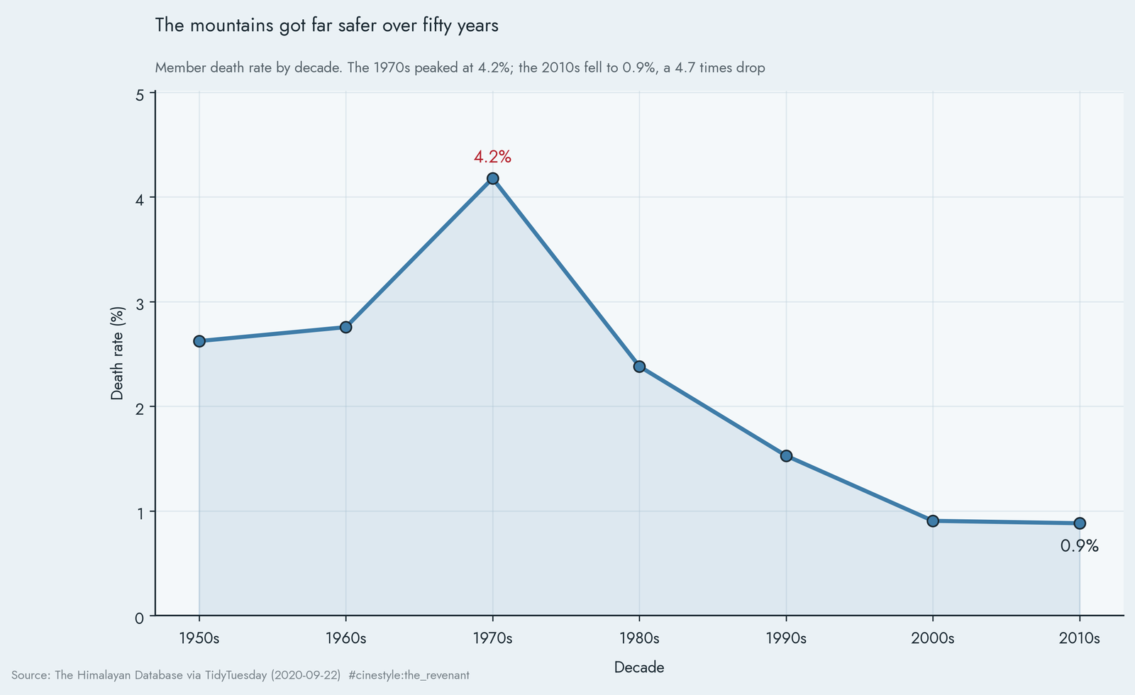
The decade rates run 2.62 percent in the 1950s, 2.76 in the 1960s, 4.18 in the 1970s, then 2.38, 1.53, 0.90, and 0.88 in the 2010s. The 1970s were the worst decade, and the fall from there to the 2010s is a 4.7 times drop. The last two decades are nearly flat, so most of the gain arrived by the 2000s. Better weather forecasting, fixed ropes, satellite communication, helicopter rescue, and decades of accumulated route knowledge all bent the curve down. The mountains stayed the same height; the climbers got better at surviving them.
None of this makes the high peaks safe. A 0.9 percent chance of death is still about one in a hundred, which is a number no other recreation would tolerate. But the trend is real and it is steep, and it runs against the easy story that the high Himalaya has become more dangerous as it got busier. Every decade since the 1970s, the same mountains have let fewer people die.