// article
Diagnosing on Three Features
Three of thirty features get you within 0.02 AUC of the full model
Most of the diagnostic signal in the Breast Cancer Wisconsin set lives in a handful of measurements. Three features out of thirty land a logistic regression at 0.979 ROC AUC on a held-out test set. The model trained on all thirty hits 0.998. That gap is 0.019 of AUC. I ran this expecting the usual “you can prune a few redundant columns” story and got something blunter instead: the signal is concentrated in a tiny, highly correlated cluster of measurements, and the other twenty-seven features are mostly paying rent on variance they do not own.
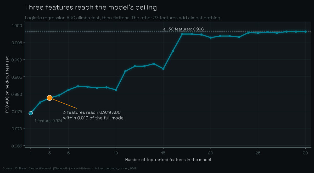
That curve is the whole article. Rank the features once on the training split, then retrain on the top k for every k from one to thirty. The climb is over by the third feature. Everything after it is flat.
The data is the WDBC set bundled with scikit-learn: 569 fine-needle-aspirate samples, 212 malignant and 357 benign, each described by 30 features computed from cell-nucleus images. Ten base measurements (radius, texture, perimeter, area, smoothness, compactness, concavity, concave points, symmetry, fractal dimension), each reported three ways: a mean, a “worst” (mean of the three largest values), and a standard error. One thing to check before trusting any of it. In this version target=0 is malignant and target=1 is benign, the reverse of what you would guess. I verified it from the data rather than the docs. Mean nucleus radius is 17.5 for class 0 and 12.1 for class 1, and bigger nuclei are the malignant ones, so class 0 is malignant.
The baseline, then the squeeze
I split 70/30, stratified, fixed seed, and standardized inside a pipeline so the scaler only ever sees training rows. Logistic regression on all 30 features: 0.9883 test accuracy, 0.9981 AUC. That is near-ceiling, and it is the number every reduced model has to be measured against.
To pick features without peeking, I ranked all 30 by mutual information with the label, computed on the training split only. The same ranking drives the whole sweep, so the feature choice never sees a test row. The top of that list:
- worst perimeter
- worst concave points
- worst radius
- worst area
- mean concave points
Notice anything? Four of the top five are “worst” measurements, and three of them (perimeter, radius, area) are three different ways of saying “this nucleus is big.” I cross-checked the ranking with a Welch t-statistic and got the same neighborhood, so it is not an artifact of one scoring method.
Retrain on just the top 3: worst perimeter, worst concave points, worst radius. Test accuracy 0.9240, AUC 0.9788. The AUC fell by 0.019. Accuracy fell more, about 6.4 points, which is the more honest number to lead a clinician with. Add two more features for a top-5 model and AUC climbs to 0.9812 while accuracy does not move at all, still 0.9240. That detail made me re-run the script. Going from three features to five buys you 0.002 of AUC and zero accuracy. The fourth and fifth features carry almost nothing the first three did not already supply.
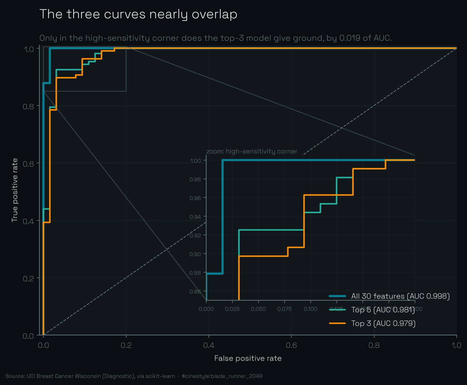
On the ROC plot the three curves are nearly stacked. You have to zoom into the top-left corner to separate them, and even there the top-3 line only sags below the full model in the high-sensitivity region, which for a cancer screen is exactly the region you care about. The 0.019 AUC gap is real and it lands where it hurts. Do not wave it off.
Why three features go this far
The features overlap, heavily. I computed the correlation matrix across all 30 and the structure is hard to miss.
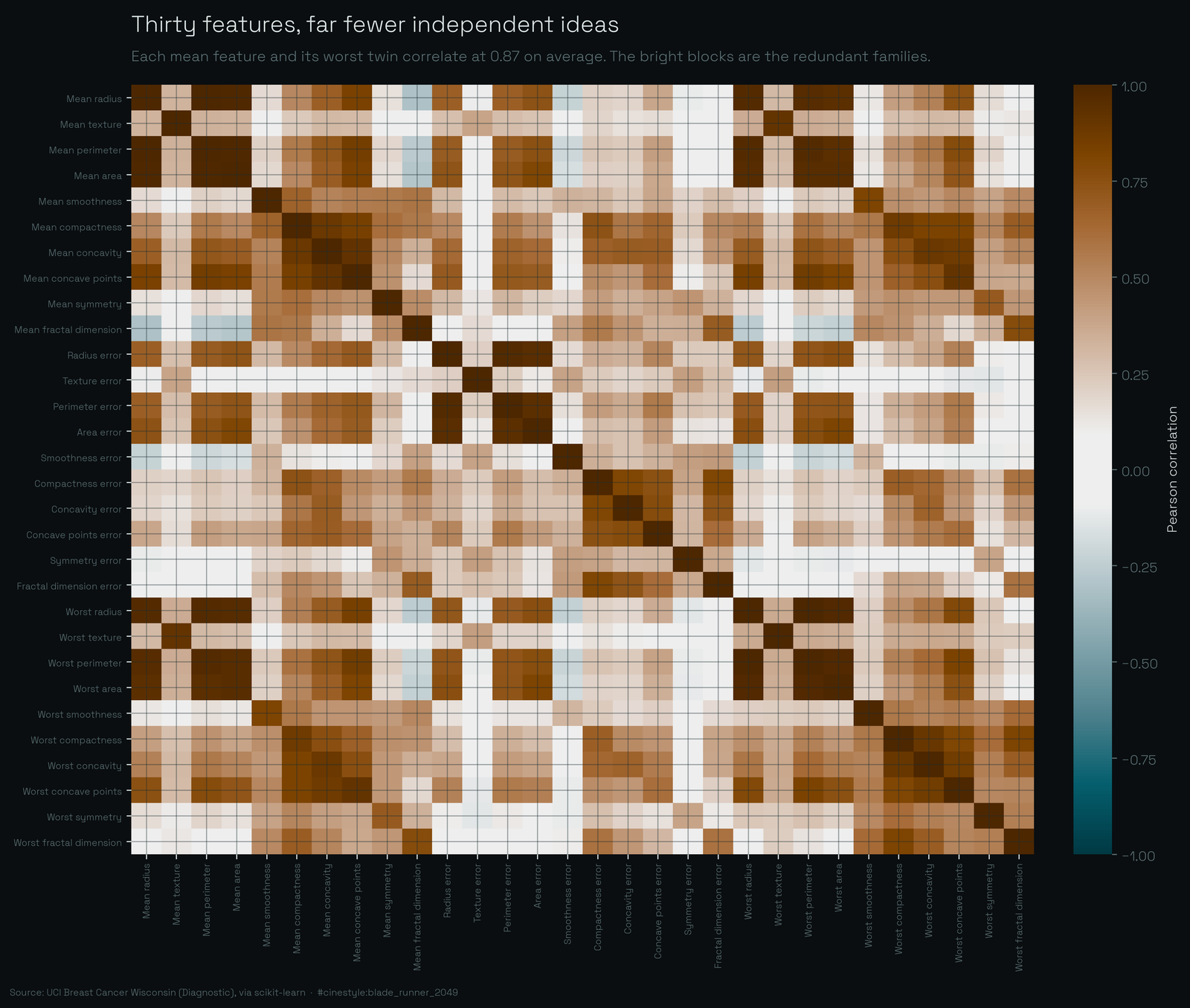
The bright blocks are the families. Each “mean” measurement and its “worst” twin are nearly the same column: averaged across the ten base quantities, a mean feature correlates with its worst counterpart at 0.874. For the size measurements it is worse. Mean radius to worst radius is 0.97, mean perimeter to worst perimeter is 0.97. Within my top 5 the average absolute correlation is 0.87, and the worst offenders, worst perimeter and worst radius, sit at 0.994. Geometrically they are the same fact: perimeter and radius of a roughly round blob move together by definition. The model keeps both because it costs nothing, but only one of them is informative.
That is the mechanism behind the headline. When your 30 features are really about 8 or 9 underlying ideas measured redundantly, a ranker that grabs the strongest representative of the biggest idea (nucleus size) plus the strongest representative of the next idea (concavity and irregularity) has already captured most of the separable signal. The third feature mops up. The remaining 27 are variations on the first three.
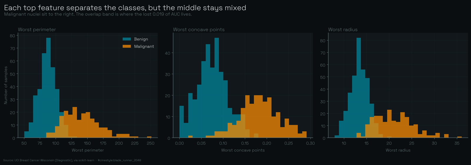
The distribution plot shows why even three is generous. Each of the top features separates the two classes well on its own, malignant cases shifted right toward larger and more irregular nuclei, but the overlap zone in the middle is genuine. No single feature cleanly splits the classes, and that messy middle is where the dropped 0.019 of AUC lives.
The caveats I would staple to this
This is a clean benchmark. The features were hand-engineered from segmented images by people who knew what malignancy looks like under a microscope, the classes are only mildly imbalanced (37% malignant), and there is no missingness, no label noise, no distribution shift between collection sites. Real clinical pipelines have all four. “Three features is all you need” is a statement about this dataset under this split. Change the seed and the third-ranked feature can swap with the fourth, because worst radius, worst area, and worst perimeter are nearly interchangeable.
And the 6.4-point accuracy drop is not nothing. On a screening test, trading accuracy for a shorter feature list is a clinical decision, not a modeling convenience. What I would actually claim is narrower and more useful: the WDBC signal is low-rank. If you are doing feature engineering here, stop adding size measurements after the first one. If you are benchmarking a fancy model against logistic regression on all 30 columns, know that three columns already get you to 0.979, so your “improvement” has about 0.002 of AUC to fight over before it is just fitting noise in the test set.
The interesting question this leaves open: how many of these 30 features survive if you de-correlate first, say, rank on partial information after regressing out nucleus size? That is a different experiment, and I suspect the count drops below three.