// article
Brain Signal Redundancy
62 signals, 21 real dimensions: redundancy that does not look like redundancy
Twenty-one components explain 80% of the variance in 62 brain signals. Thirty-three get you to 90%. So before you reach for anything heavy, the dataset is quietly telling you it has about a third fewer dimensions than columns. That is the headline. The interesting part is why, because when I went looking for the obvious culprit, a wall of strongly correlated columns, I mostly did not find it.
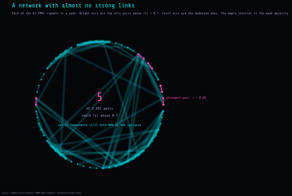
Put every signal on a ring and draw an arc for every correlated pair. Out of 1,891 pairs, five are strong enough to show as bright links. The rest of the ring is a faint haze or empty. A field that sparse should not compress, and yet 21 components still cover 80% of the variance. That gap is the whole article.
The data is seaborn’s brain_networks. It ships as a 923x63 table, and the first thing it does is lie to you about its shape. The top three rows are not data. They are a stacked header: network, node, hemi (left or right hemisphere). Row three is a blank separator. The leftmost column is just an unnamed row counter, not a signal, so it comes out too. The real time-series, 920 numeric rows, one per fMRI timepoint, starts underneath. So step one was untangling that by hand: drop the index column, pull the three header levels off, coerce the rest to float, drop the empties. After cleaning I had 920 rows by 62 numeric signals. Standardize everything, since these are BOLD-style measurements on different scales, and then the questions get interesting.
The PCA says compress, but not dramatically
I ran PCA on the standardized matrix and looked at where the cumulative variance crosses the usual thresholds. Six components reach 50%. Twenty-one reach 80%. Thirty-three reach 90%. PC1 on its own carries 16.8% of the total. Meaningful, but nowhere near the pattern where one giant component eats everything, the kind you see in a basket of stock returns during a crash.
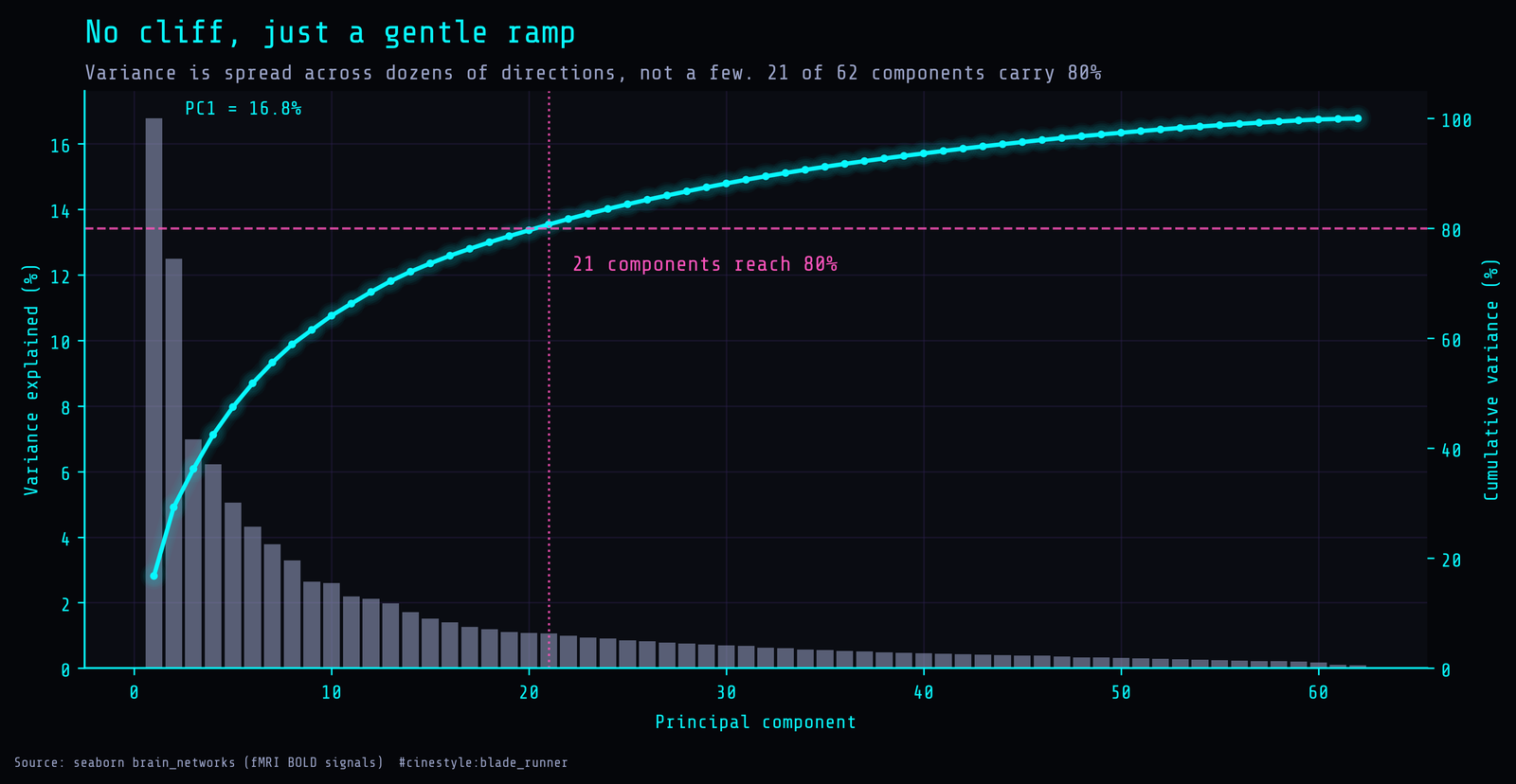
The scree plot is the tell. There is no cliff. The bars step down gently from PC1’s 16.8%, and the cumulative line is a smooth ramp, not a hockey stick that flattens after three components. The first five PCs together only get you to 47.5%. If I had been hoping to project 62 columns down to a tidy 2D scatter and call it a day, this chart says no. The compression is real. Going from 62 down to 21 for 80% is a reduction factor of about 3.0. But it is the boring, honest kind, where the variance is genuinely spread across a couple dozen directions. A dataset catalogued as “high-dimensional correlated signals” still refuses to collapse to a handful of axes.
Where is the redundancy hiding
So I went to the correlation matrix, expecting it to explain the compression. With 62 columns there are 1,891 unique pairs. I computed all of them and looked at the distribution of absolute correlation.
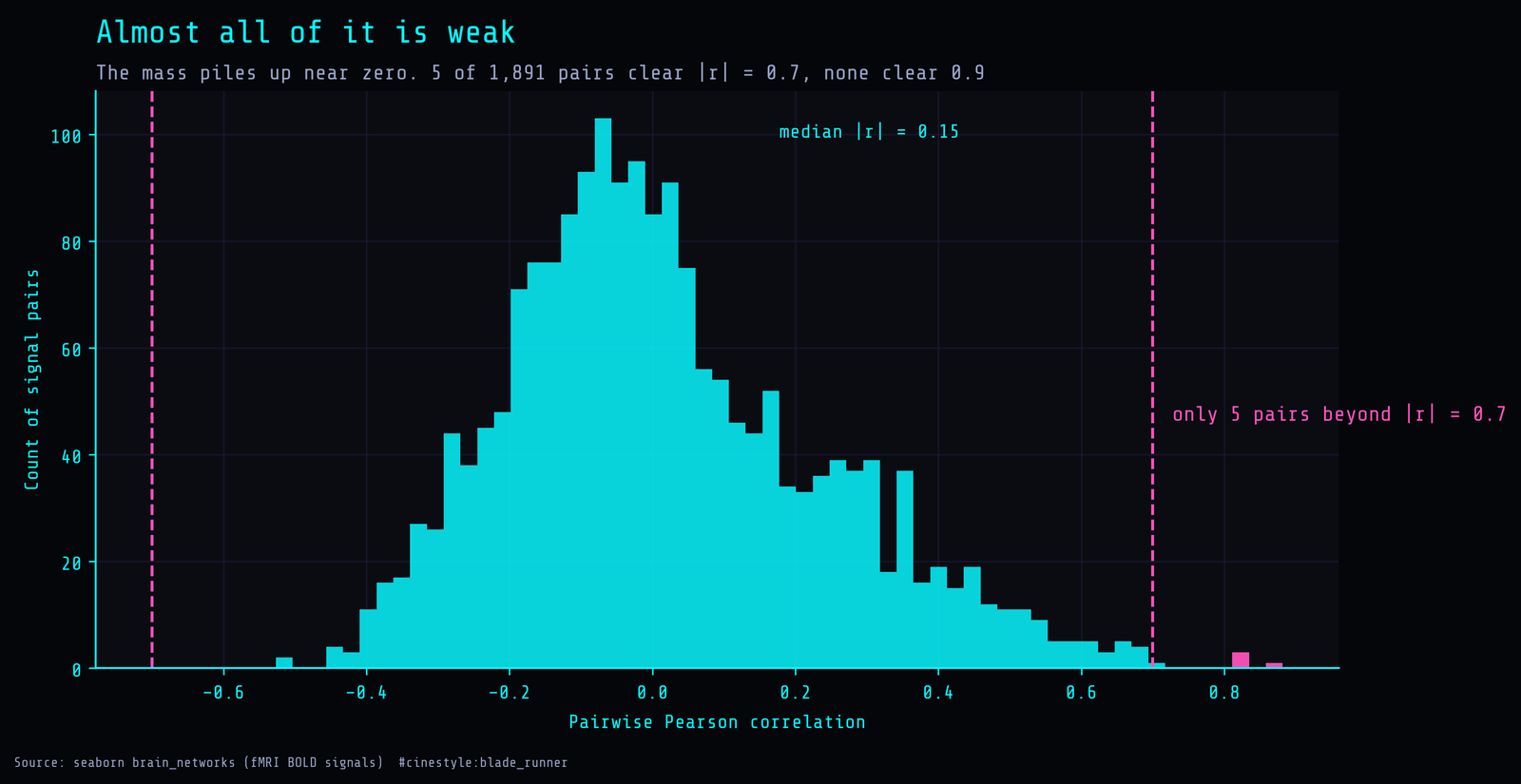
The histogram is centered low. Median absolute correlation is 0.145, mean 0.173. The mass sits between roughly -0.3 and +0.4. And the count of pairs above the redundancy line I usually care about is five. Five pairs out of 1,891 clear an absolute correlation of 0.7, the strongest topping out at 0.882. Zero pairs cross 0.9.
That is the part that made me re-check the script. Five strongly correlated pairs cannot, by themselves, explain why you need only 21 dimensions instead of 62. If redundancy were concentrated in a handful of near-duplicate columns, dropping a few would do the job and the scree plot would have a cliff. Neither is true here.
What is actually happening is subtler, and it is the real lesson. PCA does not need strong pairwise correlations to compress. Think of 62 people in a crowd, each leaning a few degrees in a shared direction. No two of them are touching, but the crowd as a whole drifts. PCA reads the drift. A median absolute correlation of 0.14 sounds like noise pair by pair, but when 62 signals all lean slightly in coordinated directions, those tiny overlaps add up into a few dozen genuine components instead of 62 independent ones. Variance redundancy is a global property of the matrix. Pairwise correlation is a local one. They do not have to agree, and here they openly disagree.
The block structure is there, faintly
To see the coordinated-but-weak structure directly, I reordered the correlation matrix by hierarchical clustering on one minus absolute correlation and plotted it.
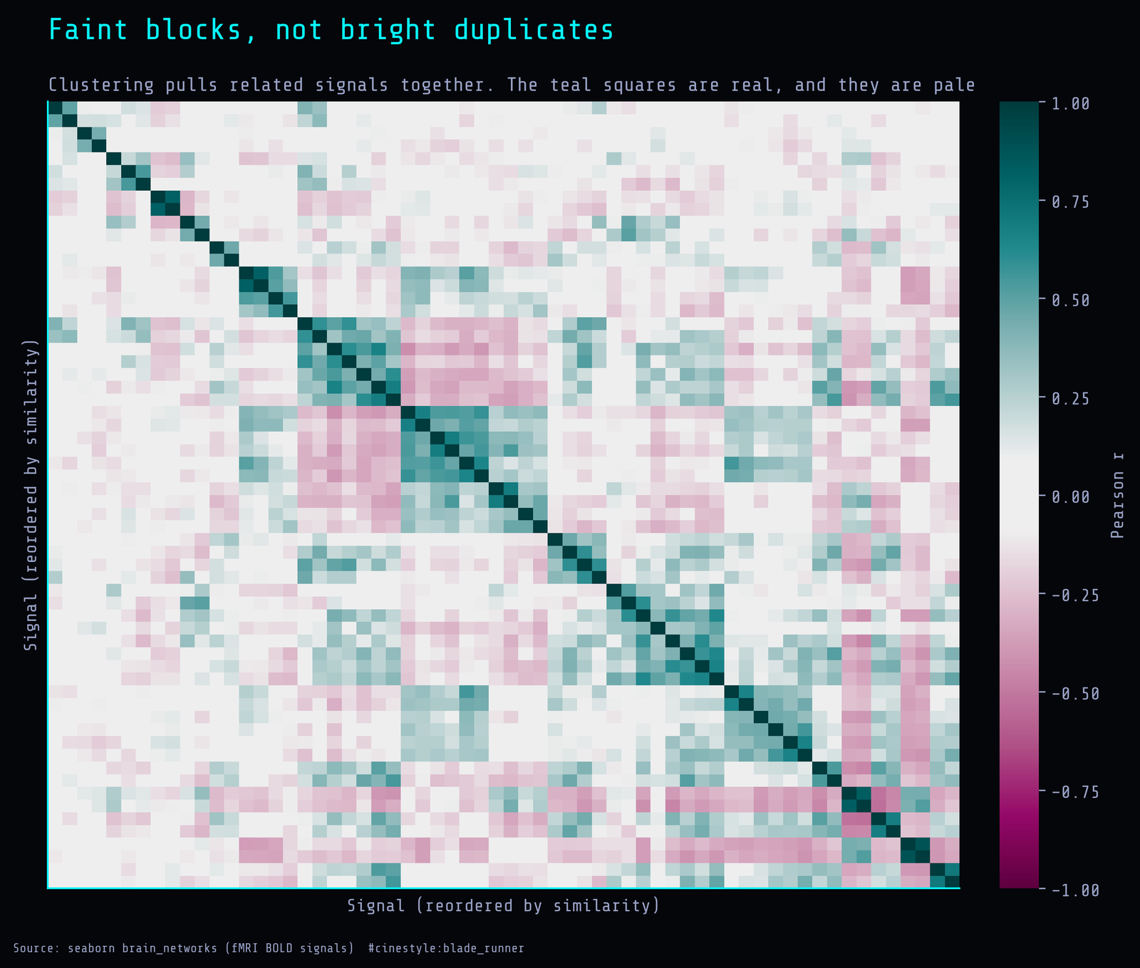
You can see blocks. Teal squares cluster along the diagonal where signals from the same network and hemisphere track together. But notice how pale most of those regions are. These are correlations in the 0.3 to 0.5 range, not 0.9. The block structure is real, it is just gentle. It is exactly the picture you would predict from the histogram: organized, low-amplitude coordination rather than duplication. The off-diagonal is mostly the washed-out colors of near-zero correlation, which is why the matrix does not collapse to two or three super-components. Weak and organized still compresses; it just refuses to do it in a way pairwise inspection can see.
What I would take to a real problem
The practical move is the same one I would make whether the redundancy were dramatic or mild: do not treat 62 columns as 62 degrees of freedom. Here the effective count for 80% of the variance is 21. If you were about to throw a 62-input model at something and reach for capacity to handle the dimensionality, the data says the dimensionality is closer to two dozen, and a standardize-then-PCA front end, or just regularization that assumes correlated inputs, buys you most of that for free. The expensive model is not fighting 62 independent things. It is fighting maybe 21.
One caveat I want to keep honest. This is a demonstration dataset. Seaborn ships it precisely because it is good for PCA and clustering, and the network, node, and hemisphere layout means some correlation is baked in by how the brain regions are grouped. The exact numbers, 21 and 33 and five strong pairs, are properties of this particular file, not a universal law about fMRI. What does generalize is the gap I keep coming back to: a correlation matrix that looks mostly weak, sitting on top of a variance structure that still compresses 62 to 21. If you only ever check pairwise correlations before deciding how big your model needs to be, you will miss it in both directions, overestimating redundancy when a few pairs are strong, and underestimating it when many pairs are quietly aligned.
Run the PCA. The pairwise view alone will lie to you.