// article
Anscombe's Quartet
Four datasets agree on every number and agree on nothing else
Summary statistics compress eleven points into one number, and compression throws away exactly the thing you need to see. I took four small datasets, eleven points each, and ran the same five summaries on all of them. Mean of x: 9.00 every time. Mean of y: 7.50. Variance of x: 11.00. Variance of y: 4.12 or 4.13, depending on the set. Correlation between x and y: 0.82. Fit a straight line by ordinary least squares and you get y = 3.00 + 0.50x, with R-squared = 0.67. The same values appear four times, identical to two decimals on every statistic but one, and that one differs by 0.005.
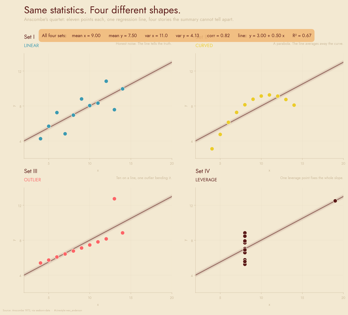
Every set shares the banner across the top, and below it the four shapes share nothing. This is Anscombe’s quartet, which F.J. Anscombe built in 1973 to make exactly this point, and yes, the matching statistics are engineered on purpose. The engineering is the demonstration, not a flaw. I am rerunning it from the seaborn-data copy, 44 rows in four sets of 11, because you should watch the numbers line up with your own eyes before you trust the lesson. The spread across all four sets is microscopic: mean of x is exactly 9.00 in every set, correlation ranges only from 0.8162 to 0.8165, and the slope sits between 0.4997 and 0.5001. To any rounding a human would use, they are the same dataset. The pictures are four different worlds.
Set I is the honest one
Top left is what you hope the summary describes: a noisy upward cloud, points scattered on both sides of the line, no single point doing anything dramatic. If all four sets looked like this, the regression would be telling the truth, and I would have no post. R-squared = 0.67 means the line explains about two-thirds of the variation, and eyeballing it, that feels about right. This is the baseline. Hold it in your head, because the other three copy its statistics exactly and mean something completely different by them.
Set II is a curve wearing a line’s clothes
Top right bends. The points climb, flatten, and start coming back down, a clean parabola. The straight line cuts through the middle of it and earns the same R-squared = 0.67, but that number is meaningless here because the model is wrong about the shape, not just the noise.
So I fit a quadratic instead, y as a function of x and x-squared. R-squared goes from 0.6662 to 0.99999. The residuals essentially vanish. The x-squared coefficient comes out at -0.127, which is the downward curvature you can see with your eyes. There is almost no noise in set II at all. It is a near-perfect parabola, and the linear fit was busy averaging away a relationship it could not represent.
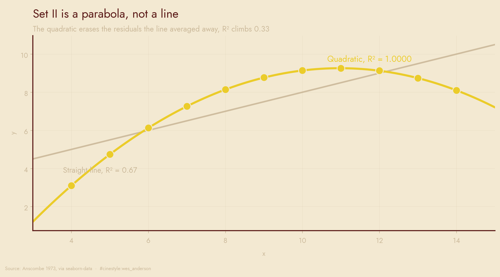
A linear correlation of 0.82 on curved data is not wrong, exactly. It is answering a question nobody should have asked.
Set III is ten points and a saboteur
Bottom left is the one I checked twice. Ten of the eleven points fall on a dead-straight line. The eleventh, at x=13, y=12.74, floats way up off it. The least-squares line, which hates large squared residuals, tilts upward to compromise with that single stray, and lands at the familiar slope of 0.50.
I flagged that point by influence, not by eye. Its Cook’s distance is 1.39, while every other point in the set sits at 0.30 or below. Drop it and refit the remaining ten, and the slope drops to 0.35, the intercept climbs to 4.01, and R-squared jumps to 0.99999. The ten survivors were always on a line of their own. The outlier was dragging the fit toward a slope that no honest subset of the data supports.
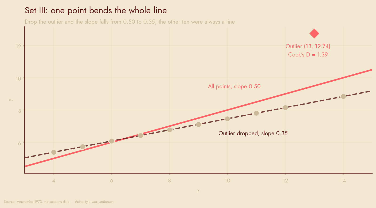
One point moved the slope by thirty percent while the correlation stayed at 0.82.
Set IV is a magic trick with one moving part
Bottom right is barely a scatterplot. Ten of the eleven points are stacked in a vertical column at x=8. One point sits alone, far to the right at x=19, y=12.5. That lone point has a hat-value of 1.00, against 0.10 or less for everyone else. The hat-value measures how much a point pulls the fitted line toward itself, and a value of one means the fit must pass through it.
Here is the part I would put on a slide. Remove that single point and the variance of x in what is left is exactly 0.00. Every remaining point shares the same x, so the slope is undefined. The line you see, slope 0.50 and all, is determined entirely by one observation. The other ten contribute nothing to the trend except a y-average at x=8.
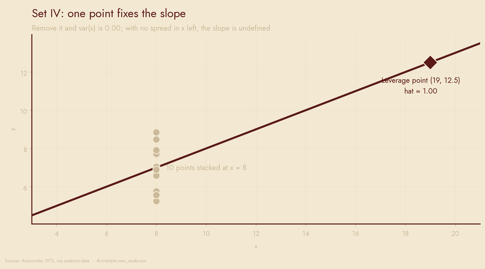
So a slope of 0.50, a correlation of 0.82, an R-squared of 0.67. Numbers that read like a moderate, believable linear relationship, and here they describe a dataset with effectively one informative point and no replication of x anywhere else. Knock that point out and you do not get a weaker model; you get no model.
What I actually take from this
Four datasets, one summary, four diagnoses: honest noise, a missed curve, a single outlier, and a fit balanced on one point. The summary statistics could not tell them apart because each statistic compresses eleven points down to one number, and compression is lossy in ways that Anscombe arranged to cancel out across these four constructions.
The fix is cheap. The flagship above took one figure. I have shipped regressions where I trusted R-squared and a coefficient table and never drew the scatter, and I have been burned by exactly the set III situation, one influential row, no plot, a slope I would have defended in a meeting. Now I compute Cook’s distance and look at hat-values before I believe a coefficient, because the mean and the correlation will sit there and lie to your face with a straight one.
Plotting first costs one figure. Skipping it can cost the conclusion.
Data: Anscombe’s quartet, Anscombe 1973, via seaborn-data. All figures and numbers from analyze.py; values in results.json.