// article
America's Farm Exports
Five states ship a third of America's farm exports, and none of them grow the same thing
Five states out of fifty account for 37.2% of US agricultural export value. Stretch it to ten states and you are at 54.9%, past half the country’s farm exports concentrated in a fifth of its states. I went into the USDA’s 2011 state export table expecting a farm belt that blurred together, a smear of corn and soy across the middle of the map. I found a handful of specialized economies that happen to share a census category.
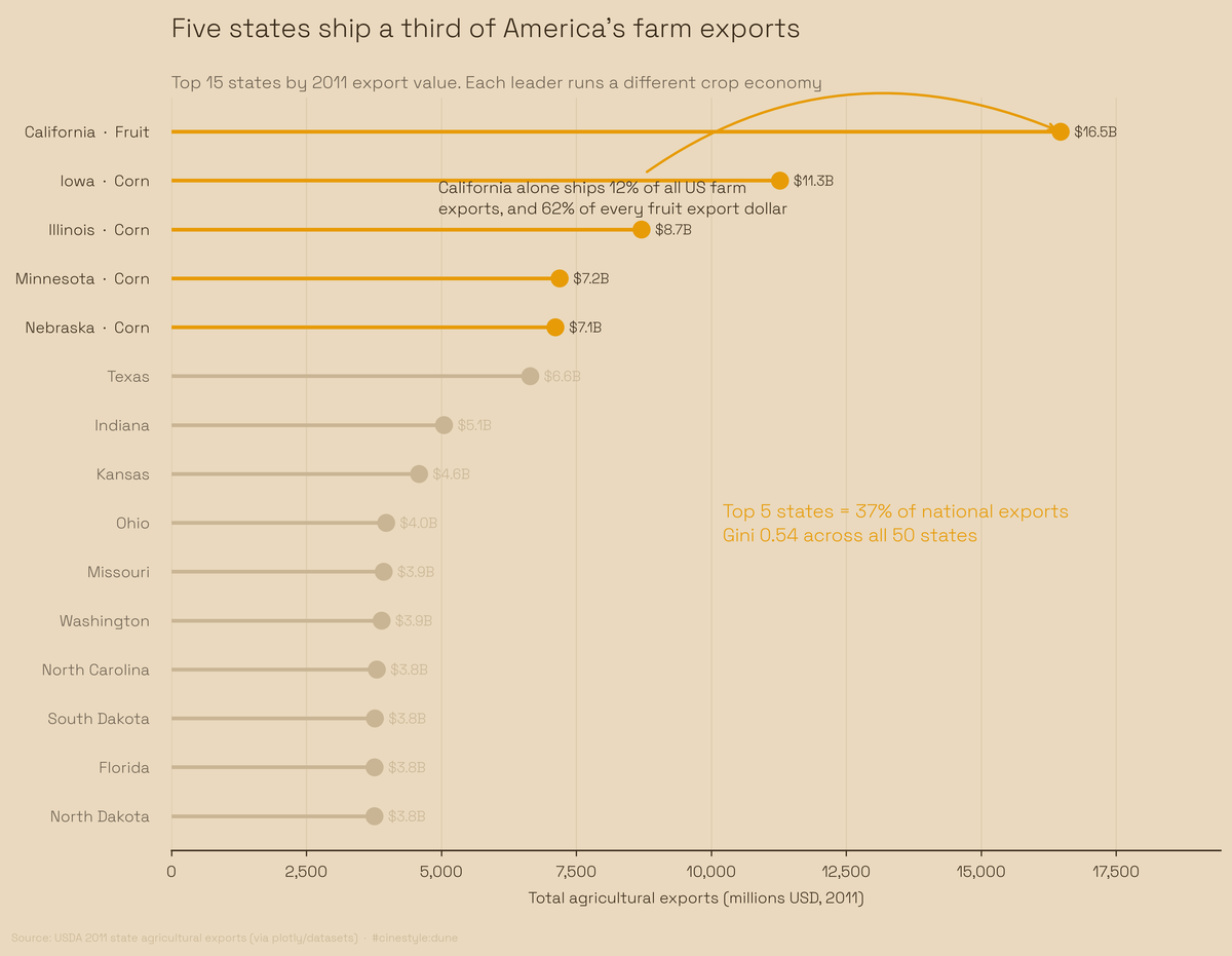
Plotted as a ranked lollipop, the states form a short amber head, a long sand tail, and California floating off on its own. Read the crop tags on the leaders: Fruit, Corn, Corn, Corn, Corn. The bars next to each other are not measuring the same thing.
The data is the USDA 2011 state agricultural exports table, via plotly/datasets, one row per state, 50 states, no DC. Each row carries a total export value in millions of dollars plus a breakdown into beef, pork, poultry, dairy, fruits, vegetables, corn, wheat, and cotton. I worked off the un-rolled product columns so the totals would not double-count the “total fruits”-style aggregates. National total across all states: $136.4 billion.
How lopsided is it, really
The Gini coefficient of total exports across the 50 states is 0.54, on a scale where 0 means every state exports the same amount and 1 means one state exports everything. Picture the states lined up shortest bar to tallest: the bottom half barely clears the floor while the top runs off the page.
California sits alone at the top with $16.47 billion, 12.1% of the entire national figure by itself. The next state, Iowa, does $11.27 billion. So California out-exports the number-two state by 1.46x, and it does it with a completely different product mix. I had assumed the leader would be a bigger version of everyone else, and it is not.
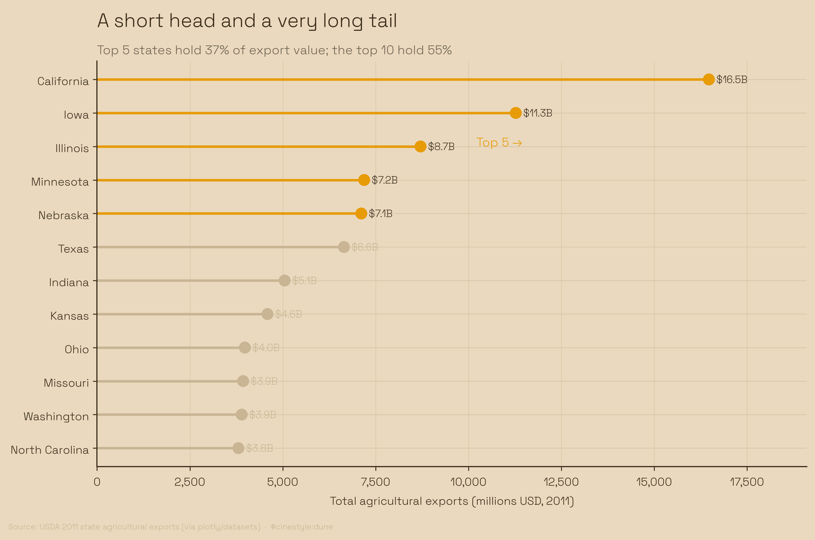
The ranking makes the cliff obvious. California and Iowa stand apart, then a tight cluster of Illinois, Minnesota, Nebraska, and Texas, then a long gentle slope into the states that round to nothing. The chart hides that the clustered bars have similar heights and different crops.
Everybody has a signature
For each top state I found its signature product, the single category that is the largest slice of its own export basket. This is where the several-specialized-economies idea earns its keep.
California’s signature is fruit. Fruit is 64% of California’s own basket, and California alone supplies 62% of all US fruit exports. Iowa’s signature is corn at 51% of its basket, and Iowa is 19% of national corn exports. Texas breaks the pattern entirely: its signature is cotton, half its basket and 27% of the national cotton total. Kansas leans on wheat, 50% of its basket and 13% of the national wheat figure.
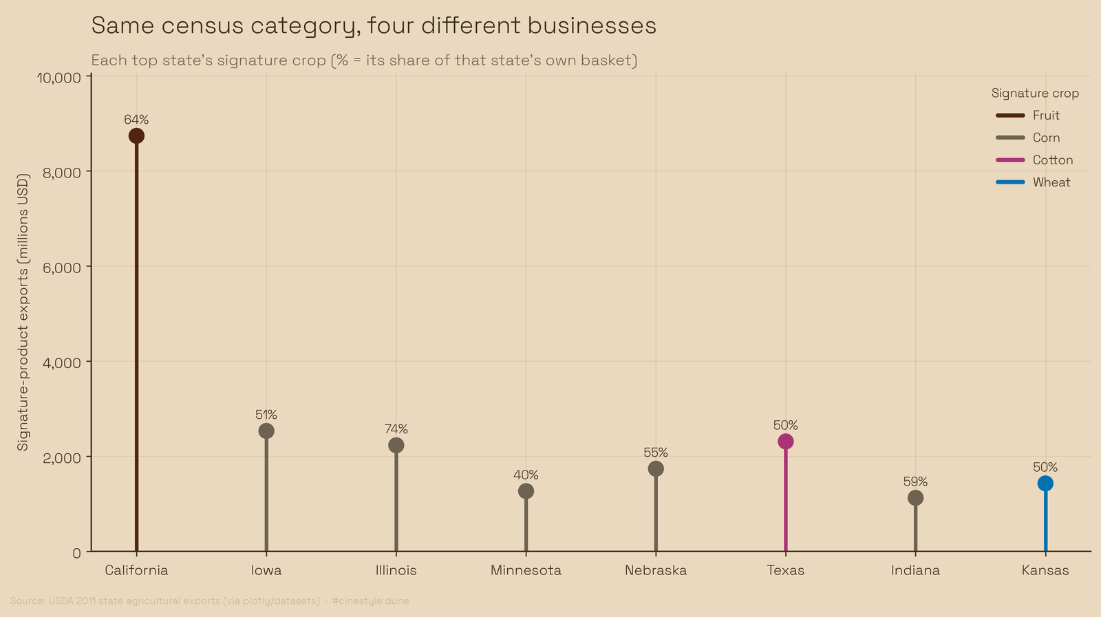
There is a corn cluster, no question. Iowa, Illinois, Minnesota, Nebraska, and Indiana all name corn as their signature, and Illinois is the most corn-dependent of the bunch at 74% of its basket. The middle of the country really is a corn monoculture by export value. But California and Texas sit outside it, and California is the largest exporter of all. The farm belt as a single thing is two corn-and-grain blocs, the Midwest and the wheat plains, plus a fruit-and-vegetable economy on the West Coast plus a cotton economy in Texas, four businesses in one table.
The most concentrated crop in the country
The most geographically concentrated product is fruit, and it is not close. California holds 62% of national fruit exports. One state, nearly two-thirds of the crop. The Gini for fruit across states is 0.90, about as concentrated as a product can get short of a literal single-state monopoly.
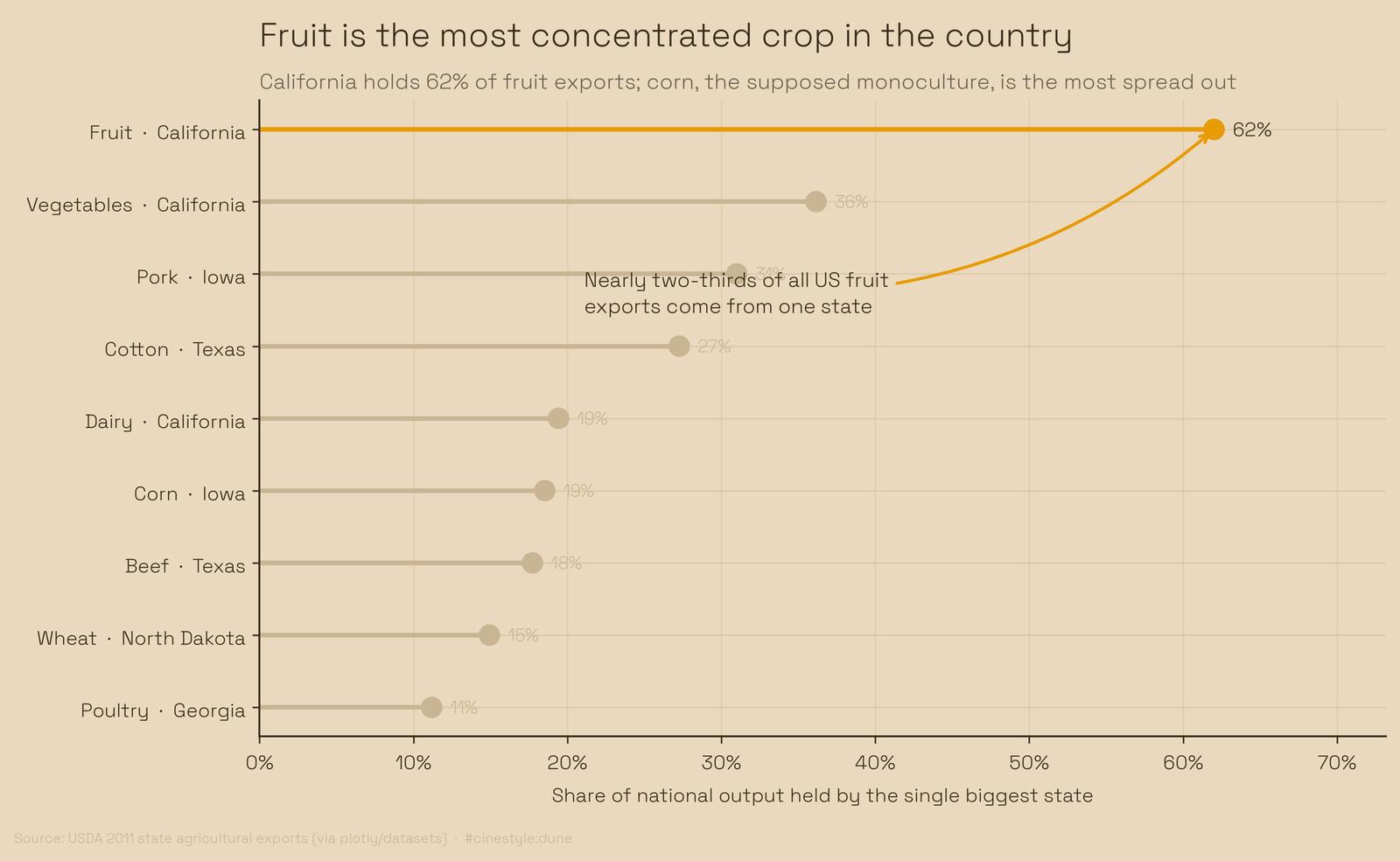
Vegetables are next, again California, at 36%. Then pork, where Iowa holds 31%. Cotton sits at 27% in Texas. Corn is where the two measures disagree. By top-state share it looks spread out: Iowa leads with only 19%. By Gini it is the fourth most concentrated of the nine products, at 0.78, above vegetables at 0.73. Many states export some corn, and a few export most of it. The product that is actually spread out is poultry, where Georgia leads with 11% and the Gini of 0.67 is the lowest of the nine. California tops three of the nine products, fruit at 62%, vegetables at 36% and dairy at 19%, which is what a one-state fruit economy looks like from the other side. No single state owns corn, but corn is not evenly shared either.
One honest caveat, and it matters. This is a 2011 snapshot, a single year, and it is export value in dollars, not physical production or tonnage. A high-value, low-volume crop like tree fruit punches above its weight against bulk grain measured this way, and that is part of why California looks so dominant. Prices in 2011 were what they were; a different year reshuffles the cluster around the edges. I would not bet the exact percentages hold today. But the shape, a few states each with its own signature, a fruit economy that is basically one state, is structural enough to survive a decade of price swings.
So the next time someone talks about “the farm vote” or “farm country” as one bloc, ask them which farm. Iowa’s corn and California’s almonds are not in the same business, and the data does not even pretend they are.